a good chart takes time
In this post, I show and discuss a makeover from my presentation at the Grant Managers' Network Conference.

simple vs. sexy
I recently tested out the Circos tool for visualizing matrix data. In this post, I discuss my trial and some general considerations (both pros and cons) when it comes to using "sexy" or novel data visualizations.
FlowingData challenge
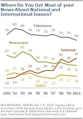
My makeover of a Pew Research Center graph in response to a recent FlowingData visualization challenge.
from points to poignant
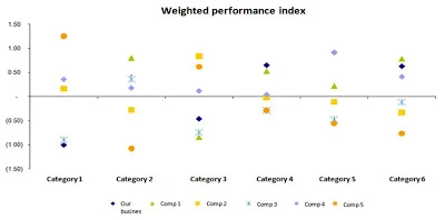
I love a good makeover challenge. I received the following graph in response to my call for visuals ahead of my visit to a Midwest retailer last month to run a session on data visualization. Check out this post for my thought process when it comes to visualizing this data and my resulting redesign.