

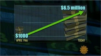
displaying numbers of different magnitudes
In my workshops, one common question is how to best display numbers of very different magnitudes. In this post, I explore several potential approaches, remaking a less-than-ideal visual from the media.
![I like [candy] bars better than donuts](https://images.squarespace-cdn.com/content/v1/55b6a6dce4b089e11621d3ed/1438217933465-DI67KK4MEEW0YKAMMFUR/image-asset.jpeg)
I like [candy] bars better than donuts
See my makeovers for Naomi Robbins' Forbes blog 2012 makeover challenge. This post features two remakes, the first a pair of donuts and the second a big table of data.

to stack or not to stack
This post features a couple remakes of a graph shown in the Wall Street Journal summarizing a recent Forrester report that concluded Microsoft is late to the market expansion into mobile and has lost its dominant position.
start with a blank piece of paper
I think this might be one of my best pieces of advice when it comes to communicating effectively with data: start with a blank piece of paper. Check out this post to learn why!