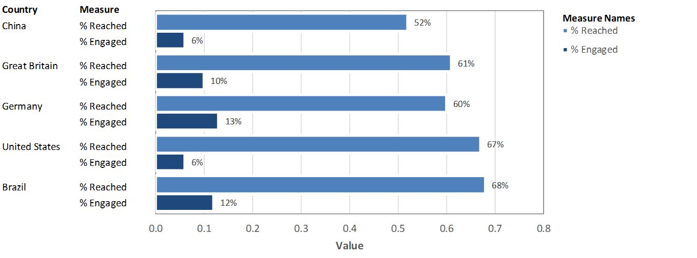
#SWDchallenge: basic bars
March’s challenge was a bar chart. Whether vertical, horizontal, stacked or divergent, bars are one of our best friends when it comes to visualizing categorical data. Click the link below to see the full details, including an example and submission instructions.

education visualized
February’s topic was focused on education - as part of a month-long celebration of diversity and Black History Month. Click the link below to see the full recap post, including each submission and related commentary.
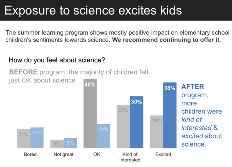
#SWDchallenge: education, color, and words
February’s challenge was to practice effectively using color and words. These are often the easiest to implement and perhaps most often overlooked tactic for effectively communicating with data. Click the link below to see the full details, including an example and submission instructions.
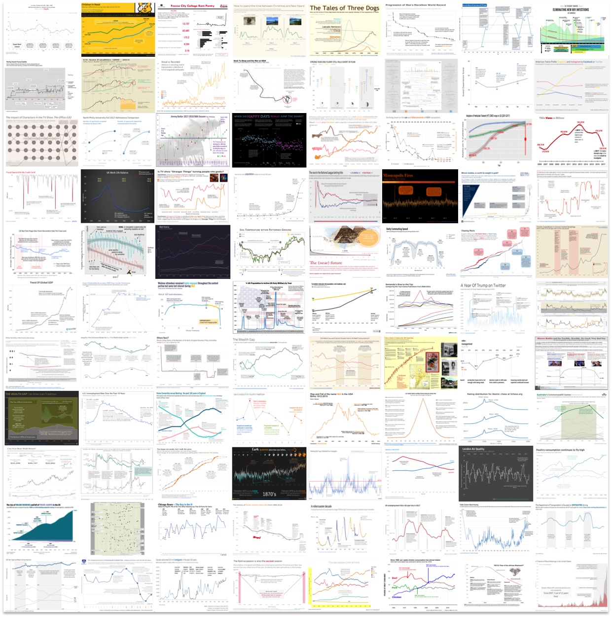
88 annotated line graphs
In our first challenge, 88 people submitted annotated line graphs with huge variety of tools. Click the link below to see the full recap post, including each submission and related commentary.