#SWDchallenge: visualize THIS data!
There is no single “right” way to graph data. Any data can be visualized multiple ways, and variant views of the data allow us to see different things. This month’s challenge is to see this in practice: we challenged our readers to show us how they’d visualize the same dataset.
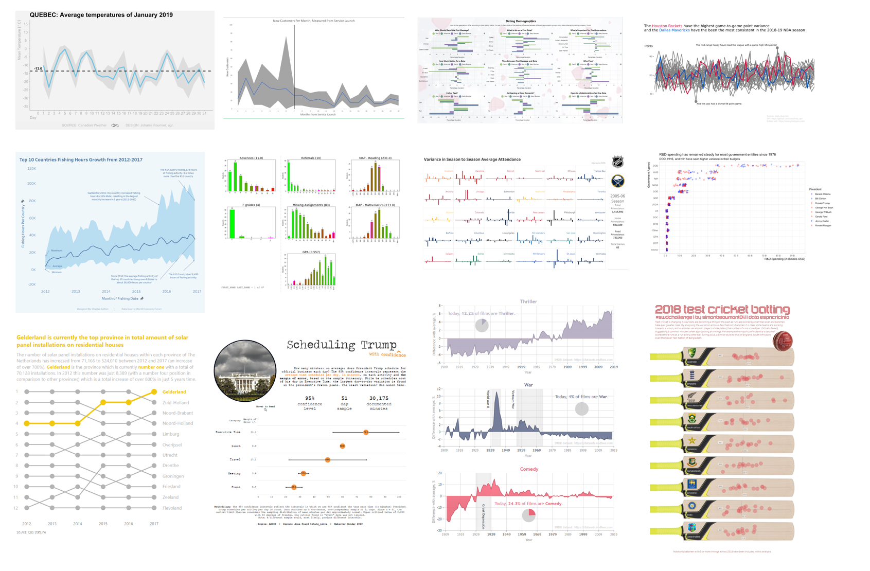
various views of variability
Wow, tons of variation in the ways people chose to display variability! Check out 41 visualizations of variability in data—featuring box plots, histograms, violins, reference bands and more—with topics ranging from weather to sports to love. Click to see the recap post that includes all the submissions.


#SWDchallenge: visualize variability
Is an average always the best way to summarize data? No! It can be useful to look at the underlying distribution of data and sometimes makes sense to show the variation. This month’s challenge is to visualize the variability in data. There are numerous ways to do so: the recap post this time around should be a good collection of approaches!
new year, new tools!
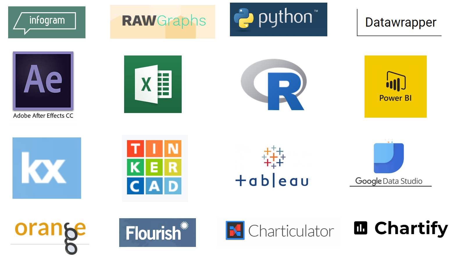
We saw a wide variety of tools used in the first challenge of 2019: from the familiar to new players on the market and from drag & drop GUI solutions to programming languages. Read on to see the wide array of instruments available for visualizing data and learn from others as they attempt these tools for the first time.
#SWDchallenge: happy new year! let's try something new
It’s a new year: time to reflect and consider how can we push ourselves out of our comfort zones? I’m an advocate of productive discomfort and trying new things. In this challenge, I encourage you to try a new tool for visualizing data and share your results and related commentary.

happy holidays!
Holiday music, cookie calories, winter temperatures, and more! Many tools, graphs, and festive encodings were used to visualize data related to the holidays. Hope you enjoy browsing the great variety of topics and designs—happy holidays!