#SWDchallenge: when every point matters


The visualisation tools we have at our disposal do a great job of summarising our data. We can aggregate it ourselves with formulas (like averages, counts or sums) or we can let a viewer apply filters to customise the view. These techniques can make a visual more digestible for our audience.

Occasionally, we might find it tempting to share all of the data in its purest form, with no aggregation or restriction. In most cases, it doesn’t make practical sense to share all this information in one visualisation.  (A good friend once told me—when I tried to visualise every professional golfer’s tee-off shot over the course of ten years—it can resemble “a hot mess.”)

Quite some years ago now, I succumbed to the temptation of sharing everything. I built and proudly presented a scatter plot showing the performance vs the activity of 300 individual sales people. I can still picture the raised eyebrows and titling heads of my audience, as they struggled to make sense of the page in question. I can assure you, it isn’t a cherished memory. 

As I reflect, though, I don’t believe that the visual was necessarily the wrong choice. My downfall was in failing to clarify the insights I had observed when analysing the content. I could have pointed out the sales reps in a particular area who were struggling, highlighted the individuals who valued sales over activity, or drawn attention to those who spent too much time talking with clients without ever closing the deal. 

Challenge

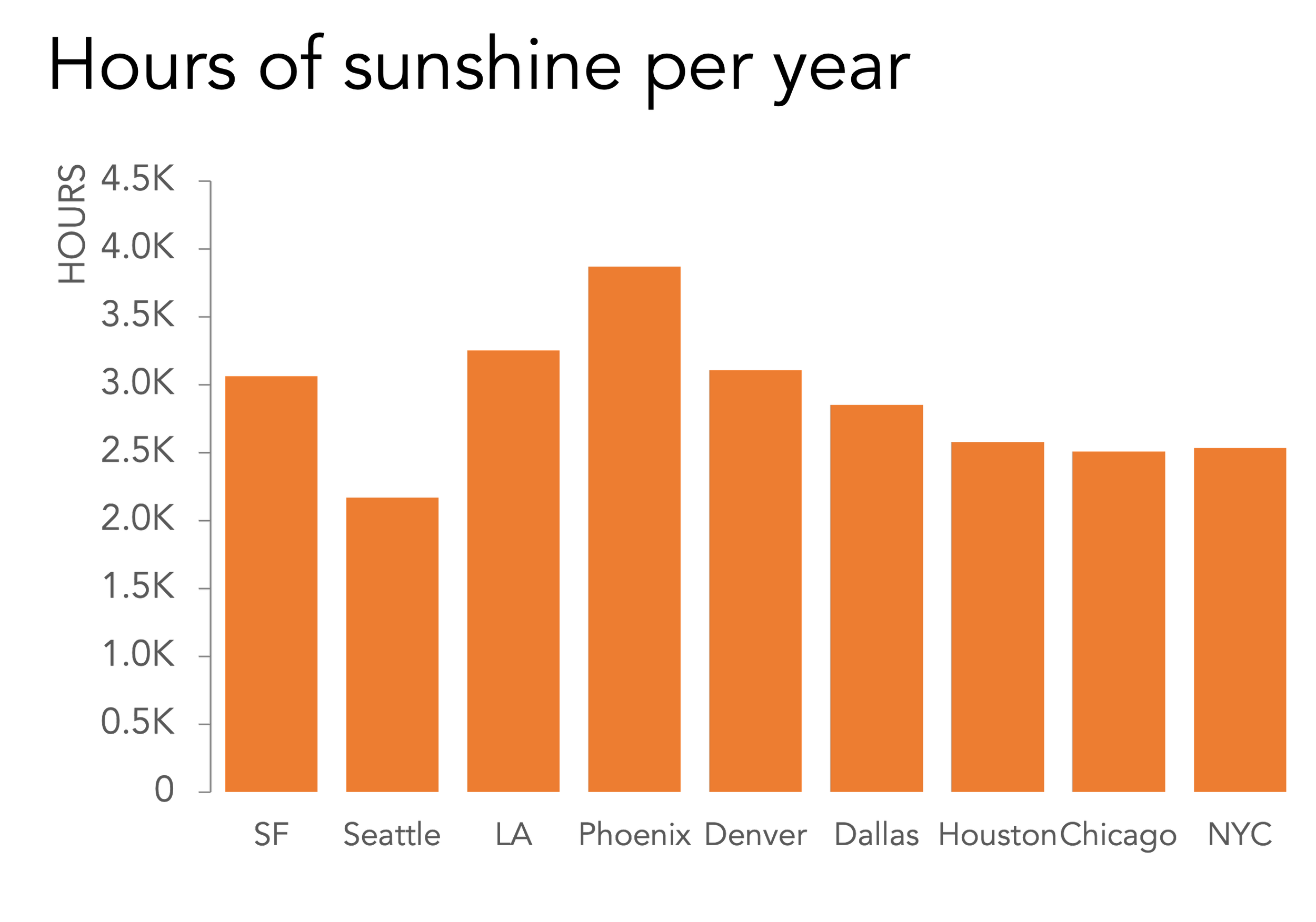
Using a data set of your choice, create a visualisation that shares the data in its purest, unaggregated form. (For example, instead of showing a count of customers per region, each customer should be represented. Or, to provide a non-business example, rather than sharing the average number of shots per game a soccer striker has taken, plot the location of each of these shots.)

But, here comes the critical part of the challenge! Don’t fall into the trap I did by sharing this content without a clear message and risk overwhelming your audience. Ensure your design delivers a compelling message, using whatever techniques you prefer to make that insight clear. 

Share your designs in the community by May 31st at 5 PM PT. If there is any specific feedback or input that you would find helpful, include that detail in your commentary. 

Related Resources

Resources are light for this month’s challenge so get creative and design something original and unique to you. If you need help getting started, check out this list of publicly available data sources. You’re also welcome to use a real work example if you can anonymise appropriately. (if there are other great examples you’d like to share, feel free to include links in your submission commentary).

everything they need, nothing that they don't

I’ve always had a fascination with the discipline of “wayfinding,” which is a term describing the ways architects, city planners, designers, and artists make it as easy as possible for people to navigate unfamiliar places.

Think back to the last time you visited an amusement park, attended a sporting event or large concert, or passed through an airport or a public transportation system. These venues are visited by tens of thousands of people in a single day, many of whom have never been there before. For the enjoyment and safety of everyone, it’s critical (and, in many cases, legally required) that there be clear, visible, and authoritative signage physically present to help people get around the space and find what they’re looking for.

What’s fascinating to me is that wayfinding is so frequently context-specific. Rather than just posting maps of the whole airport, amusement park, or stadium, wayfinding is based much more around where you, the visitor, are standing at that moment. From there, the best wayfinding provides clear signage and path markings for the most likely things you might want to do, information you might need to know, or places you might want to go, based on the simple fact that you’re in that specific spot at that specific time.

It reminds me of being a kid in the pre-smartphone area, and how we used to provide one another personal wayfinding information. I grew up in the 80s, and if I were trying to tell a friend how to get from their house to my house, I couldn’t just fire up Google Maps on my phone—my phone was a landline, permanently connected to the wall of my family’s kitchen. I also wouldn’t pull out a Rand McNally road atlas, or visit my local American Automobile Association chapter to build a customized TripTik.

Instead, I would draw my friend a little map. I’d put some landmarks on there—maybe the streets they would need to go onto to get to my house, a couple of notable buildings they would pass along the way, and maybe some other context as needed. What they’d be left with is a piece of paper that contained everything they needed, and nothing that they didn’t. 

Here’s an example of a map I’d draw to tell my friend how to bike from our high school (1) to my house (6). “Turn left out of the high school parking lot and (2) go down the big hill. Be careful because of the (3) railroad tracks at the bottom. (4) Cross Main Street; St. Anthony’s will be on the left. At the split (5), if you go right you’ll end up at the Harbor, so go left instead until you see my house (6) on the left. It’s a green house with a blue door. If you get to (7) the police station you’ve gone too far.”

This is what we should aspire to include in the communications we show to our audiences. Sharing all of our data and all of our analysis in our presentation slides is like putting a giant, static satellite map at the entrance to an amusement park, and expecting that to be sufficient for visitors to find their way.

Far from being enough, that map would be overwhelming and way too detailed, and would only cause frustration and confusion. After all, when you’re in unfamiliar territory, you just want someone to point you towards what you need and where you’re supposed to go.

Keep this model in mind when you create slides or graphs for your audience:

  1. Follow the principles of wayfinding—give people only as much as they need, based on where they are. By putting yourself in the shoes of the people listening to your presentation and thinking about what they need, you’ll better position the content you deliver to meet their specific interests.

  2. Literally and figuratively, a simplified, custom map is easier to follow than a comprehensive and detailed one. A satellite map, while absorbing and visually interesting, contains so much detail that it can overwhelm and distract your audience. Start instead from a literal blank page, and think critically about what information needs to be included in the specific map you’re creating—and more importantly, what can be left out.

With this approach, much like the wayfinding systems we’ve grown to rely upon, your presentations will be even better positioned to provide the timely direction and guidance your audience needs.

it's okay to use multiple graphs

A tip I regularly share when providing data visualization feedback is to use multiple graphs instead of packing several series into a single chart. Although it is important to be concise, people are often surprised to hear that when it comes to the number of graphs we share, fewer isn't always better.

Let's consider an example.

A project manager is overseeing the final stages of an effort to implement a large number of feature requests for their software. The team aims to tackle the backlog of request tickets by the end of the year. They update their progress at a bi-monthly meeting, starting with an overview of ticket volumes. Once they've shared the big-picture figures, they update meeting attendees on the backlog workflow, which is divided into three stages: In Queue, In Progress, and Documentation. Below is the slide they updated and shared at the December 14th meeting.

I have some immediate thoughts on how to improve this data communication. For example, the graph is busy. It would benefit from removing visual clutter like the multiple colors, data labels, legends, gridlines, and lack of alignment. The text on the right could be better integrated into the communication so that it doesn’t feel like a separate entity.

While these suggestions could help improve the effectiveness of this communication, my biggest concern is that a single-line chart doesn’t support the two-part narrative shared above.

This is an instance where we’d be better served with two graphs—one for totals, and one for the backlog—instead of one that tries to cover everything all at once.

I already appreciate the benefits of having multiple charts. 

For one, it’s easier to process. Having fewer series makes each graph simpler to understand. I can also more easily see how the series relate to one another. The backlog total and closed tickets sum to the ticket total. The series in the right-hand-side graph sum to the backlog total shown on the left. While someone with the patience to do math could arrive at a similar understanding using the original view, why make them do extra work?

I’ll also point out that the project manager’s update typically starts with a big-picture discussion on how the total volume of tickets has changed, and then moves into the backlog details. Having a graph for each part of the narrative makes it easier for the audience to focus on the data being discussed. 

Second, there is more flexibility in design. Within a single graph, each line has to be formatted similarly. However, with two graphs, I have more flexibility in designing each narrative component separately.

For example, the vertical axis range of 0-600 is too broad to see the smaller volumes of the backlog trends, which range from a minimum of three to a maximum of 46. Pulling these lines into their own view allows me to adjust the range to something more appropriate, like 0 to 60. 

Also, I have the freedom to use different chart types. I might want to emphasize the underlying part-to-whole relationship between the closed and backlog series aggregating to the total. I can do that with a stacked bar chart.

Neither of these changes would have been possible when using just one graph.

An important consideration when multiple graphs are shown together is to visually connect them so the reader understands how they relate. In this case, I’ll do so by using a single color (bright blue) for all of the backlog series. I’ll also take the opportunity to reduce the visual clutter mentioned at the start of this critique and add the descriptive text from the original. 

My final redesign looks like the following.

While this redesign incorporates changes beyond using more than one graph, many of these improvements wouldn’t have been possible if I had not first decided to use multiple graphs.

The next time you visualize several series with different levels of detail or varying magnitudes, consider whether your communication would be better served by breaking it into two or more views. As fellow data storyteller, Mike, often says, pixels are free! 

No rule says we have to limit ourselves to a single visual. It might seem like a more efficient use of space and time to create less, but efficiency should not sacrifice the ability to communicate clearly.

#SWDchallenge: Napoleon's April

The other day I was watching the recent Apple-produced movie Napoleon, featuring Joaquin Phoenix as Napoleon Bonaparte and Vanessa Kirby as his first wife Joséphine. 

I’m not a history buff by any means, but I have a passing knowledge of the French Revolution and of Napoleon’s brief reign in the early 19th century. While I did not necessarily know the details of each step in his various conquests and power consolidations, I was aware that the decision to invade Russia would be disastrous for Bonaparte.  

How did I know this? It’s because one of the world’s most famous data visualizations is specifically about his catastrophic march to Moscow, and subsequent winter retreat, in 1812.

Charles Minard’s famous visualization of Napoleon’s march to, and retreat from, Moscow in 1812.

Charles Minard’s visualization, hailed by many (Edward Tufte, most vocally) as one of the greatest achievements in graphic representation of data, shows us in brutal detail the shrinking size of Napoleon’s army as he marches from France all the way to Moscow, and then back home again in defeat. The width of the line shows the number of French soldiers; the map shows their position as well as the date the army passed each location; other dimensions included in the visual are the temperatures during the winter portion of the army’s march, the geographic features (such as rivers) affecting travel, and the moments when the army split into multiple forces of varying sizes.

Far be it from us to say we could improve upon this highly regarded visual. But that’s not to say that there aren’t other ways to visualize some or all of this data—and some of these approaches may be better suited for particular audiences or scenarios. As a statistical data visualization, Minard’s map succeeds in showing multiple aspects of a single time series within one unified, static view. At the same time, it demands its readers spend considerable time to engage with it, to learn how to read it, and to synthesize every aspect of the visual at one time—which may be a challenge.

Speaking of a challenge…

This month’s challenge

This month, your challenge is to use the same data Minard used for his map. Create an alternative visualization for Napoleon’s ill-fated march on Moscow. You could choose to build a map, a static visual, an infographic, an interactive website, a PowerPoint presentation, a dashboard, or a video…just about anything you like. 

NOTE: While you may be tempted to simply rebuild a replica of this famous graph in your own visualization tool of choice, that is NOT what the challenge is about. We are asking you to create, not re-create.

Share your creation in the SWD community by Tuesday, April 30 at 5PM PT. Take some time to browse others’ submissions and share your input via comments and datapoints during the month. We look forward to seeing your creative approaches!

Related resources

order in the sort!

When you’re visualizing categorical data, sorting the bars in your chart is usually a straightforward task. Or is it?

In most cases, you probably take the category with the largest value and stick that in the prime spot, the leftmost slot on the horizontal axis. Then, you proceed from left to right in descending order of value. Easy peasy.


OK, sure, sometimes you want to emphasize a metric where a lower value is better or more important, and in that case you might sort by ascending bar values instead.


Or perhaps you have a large number of categories, and you want to make it easy for a wide audience to find any particular category quickly. In that case, you may choose to sort your bars alphabetically by category, rather than based on any particular value.

Be careful, though! All of these sorting options presume that each of your categories is of equal weight, and that there’s no inherent natural or implicit order to them. When that isn’t the case, you can unintentionally confuse an audience by sorting your charts in a way that feels unnatural.

For example, which of these two charts feels “correct” to you?

Even though there’s a descending sort in the left chart, the categories themselves are ordinal—they represent a position in a sequence. It’s strange to see time, or ages, presented in a way that doesn’t follow their usual sequence. In the Western world, we typically perceive time as flowing from left to right, so an audience will likely find it challenging to consume a visual that depicts it otherwise.

What about these two charts? Which one feels more correct?

Again, there’s a natural sequence in these height ranges. A reader would expect them to be in that order in the graph, regardless of the values encoded in each bar. The version on the left is jarring to read, while the version on the right, with heights in a consecutive order moving from left to right, feels fully intuitive.

How about these?

This one is a bit more of a gray area. Does it make more sense to depict these cities in geographic order, from westernmost to easternmost? It might, if the data itself were related in some way to longitude or geography in general. While this dataset, sunny days per year, is somewhat related to geography, it doesn’t have much of a west-to-east bias. Sorting these bars by value, rather than location, makes more sense here.

Finally, what about these graphs?

We might sort the actors who have played James Bond in the order they first took the role, rather than by the number of appearances. Is that preexisting sequence important enough to take precedence over ordering the chart by movie count? Perhaps you want to show that after the iconic Sean Connery, finding the next long-term Bond took a couple of tries, or that something similar happened after Roger Moore as well. It all depends on your audience and the particular message you want to deliver.

Although it’s often suggested that categorical data can be sorted and displayed in any order, it’s worth taking the time to think through our chosen layout. By considering any natural or commonly-understood ordered relationships among our categories, and weighing those against the message we want our audience to come away with, we’ll be able to select the ideal sort order for our chart, and avoid any unnecessary or unintentional confusion.