visualizing student loan debt
The latest edition of the Economist (Oct 29-Nov 4) includes a short article on US student loans. It describes the increase in student loan debt now vs. ten years ago: aggregate student loan debt is expected to exceed the $1 trillion mark when the next official estimate comes out later this year, surpassing credit card borrowing. The assumption that student loan programs were structured around - that a graduate's future earnings flow will more than cover the costs of a degree - is being called into question given the extended period of unemployment in the current economic environment. The article advocates 1) the changing of bankruptcy laws to forgive student loan debt (they currently do not) and 2) the repricing of student loan debt to either institute mortgage-like repayments (on a fixed schedule) or a movement to income-based payment amounts, with the forgiveness of remaining debt after a given period (e.g. 20 years).
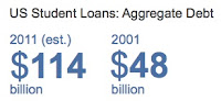
The article includes the following graph. Two questions: 1) Does it fit with the story? 2) What changes would you make?

It's not a bad graph. It's clean and easy to read. But, like most, there are things about it I'd like to change. If it were my visual, here are the minor modifications I would make:
- Simplify: remove segmentation. I'm not sure the distinction between public and private student loan debt is interesting or relevant. I'd get rid of the segmentation and just show the overall debt so as not to call undue emphasis to the public vs. private piece. If this is indeed relevant but not high priority, a small footnote could be added to state that "x% of student loan debt is public and the remainder is private" and that the percentage hasn't changed meaningfully over the past 10 years.
- Simplify: label points directly. The graph is easy to read, but you still have to read it. We could make a couple minor changes to make taking in the information even less work. Rather than have the x-axis across the top, you could remove it and label the bars directly. This would take away the step where you look at the bar and then trace up to the axis to understand the number.
- Focus attention on the important part. The main point I think the graph is meant to make is how much larger US student loan debt is now vs. ten years ago. Given this, I'd recommend switching the order of the bars so that the 2011 estimate comes first and attracts attention.
- Cut the clutter. Remove the light blue background (it doesn't add informative value and makes the data stand out a little less) and remove the y-axis line or push it to the background by making it grey.
Here's what the graph looks like when these changes are made (note that I didn't have the underlying data, so estimated the figures visually from the graph provided in the article):

Let's also consider another option. Question: do we need a chart to show this information? One lesson I teach in my class is that when you only have one or a couple of numbers to highlight, often simple text is the best way to do this, because putting the numbers in a graph can cause them to lose some of their umph. Is that the case here? Let's take a look. Here's one way we could visualize the numbers directly vs. in a graph:
I think arguments can be made for either of the above approaches. I do think you get some value from seeing the magnitude of difference with the bars. What approach would you take?