from points to poignant
I love a good makeover challenge. I received the following graph in response to my call for visuals ahead of my visit to a Midwest retailer last month to run a session on data visualization. It should be noted that the creator was not submitting this as a graphical standard, but rather was looking for advice on how to better show the data in a way that would make sense. (Note: I've changed the data and generalized the series names so as not to give away any sensitive information.)
BEFORE:
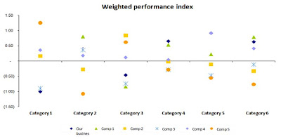
Behind this data is a scorecard. The data in this scorecard is used to calculate the weighted performance index by category across the given business (let's call it Our Business) and 5 competitors. I would assume the goal of the visual, then, is to show how Our Business stacks up against the competition to highlight relative strengths and areas for concern.
The graphic above does that, but not in an easy-to-read way. To make sense of the data, the reader has to basically read each column of data points. It's very difficult to see the relative performance of Our Business across the different categories, especially since sometimes our series marker is totally obscured behind other data. There must be a better way.
The following shows my attempt at a revamp.
AFTER:
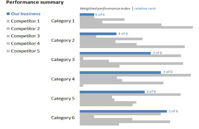
One thing that was really challenging about the original dataset is that the weighted performance index was on a range from -1.5 to +1.5, which means when you plot it, you have data going in two directions. The first thing I did was to change the scale such that it would range from +0 to +3. In this case, the actual number is less important than the relative ranking, so I got rid of the numbers altogether and show the relative difference between Our Business and the various competitors visually.
In the above, you get two visual comparisons easily: 1) you can focus on just the blue bars to see how Our Business is doing across the various categories on a relative basis and 2) within a given category, it's easy to see how Our Business is doing relative to the competition. I decided to show this both through the horizontal bars, as well as by labeling the rank of Our Business relative to the competition in each category for a quick summary stat.
Labeling the rank directly meant that I could leave the competition in the same order in the subsequent bars, so I wouldn't have to complicate the deciphering of the visual by making each a different color (which would both complicate the interpretation of the graphic and make Our Business stand out less) and could just label the relative order once in the legend on the left.
Leave a comment to let me know what you think!