I like [candy] bars better than donuts
I've recently hosted a couple data visualization challenges (here and here), but it's been a while since I've made a contribution to one. That is about to change. Recently, Naomi Robbins announced a makeover challenge in her Forbes blog (details here - open until 12/9 if you want to participate). The challenge included two visuals. My discussion and makeover of each follows.
Makeover #1: I like [candy] bars better than donuts...
The first visual included two donut graphs (the pie chart's even less effective cousin; see here for a related post on donut charts):

It took staring at this for awhile for me to figure out what was going on. Based on the title, it seems we're meant to compare the segments of the donuts across the two charts. This is not an easy comparison - in addition to having to measure angles and areas (something our eyes aren't very good at), the slices are also in different places due to the difference in magnitudes within the donuts, making the comparison even more challenging.
I also question the takeaway called out - that LinkedIn referral traffic is 16x higher for B2B companies. The proportion it makes up of total is 16x higher, but that's not necessarily the same thing, since total referral volume for B2B vs. B2B could be very different. Unfortunately, we aren't given the context of total referral volume here. I also hesitate to call out an increase like this, since the initial comparison point is 1% - a small number, making the 16x increase not necessarily as impressive as it at first sounds.
To Gavin's dismay, I'm going to go with a bar chart here (but bear with me, no bar charts for the next makeover, I promise!). Yes, I use bar charts frequently. It's because they are so easy to read!
Here's where I landed:

In this case, we can easily compare the relative breakdown of referrals by source for B2C vs. B2B. For me, Facebook's dominance across both comes across more clearly here than it did with the pies. (I'm still questioning the use of %s here vs. absolute numbers, but given that's the data we had to work with, I'll let that concern go for now).
Makeover #2: Cole's first slopegraph
The second visual set forth in the contest is a table, accompanied by the challenge to "suggest a graphical representation" of the information displayed. The table shows expenditures for homeowners vs. renters in 1986 vs. 2010 across a number of categories:

In a recent workshop I facilitated, one of the participants asked about using line graphs when you only have two time periods and whether this is advisable. I think if I'd been asked a couple of weeks ago, I would have probably responded no. But I recently finished reading Alberto Cairo's The Functional Art (my book review post is forthcoming), where he features a couple examples of this done really well. I drew an example on the board in the workshop to illustrate when this can work. Here's my first go at creating one for real:
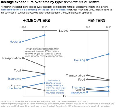
For me, the interesting story here is around which categories increased (depicted in blue above) and which decreased (grey). I think the slopegraph depicts this well. To reduce the business of the visual, I chose not to show all of the categories depicted in the original table. I omitted Entertainment and Other (since they both remained relatively flat) and included a note on this in the footnote. I also chose not to show the subcomponent pieces of the categories included in the table, but rather included some comments on what I found to be the interesting observations from those on the visual directly.
I'd love your feedback on the above visuals. I think in both cases, the story comes across much more clearly in the madeover visuals compared to the originals. If you have other ideas on how to visualize this data, leave a comment with your thoughts (or even better, submit an entry to the challenge!).