failure in design(er)
Yesterday evening, our recently purchased, lovely new couch arrived. Or, rather, the large boxes that contained our recently purchased, lovely new couch arrived. Suddenly, it was very clear what we gave up by not springing for "white glove delivery".
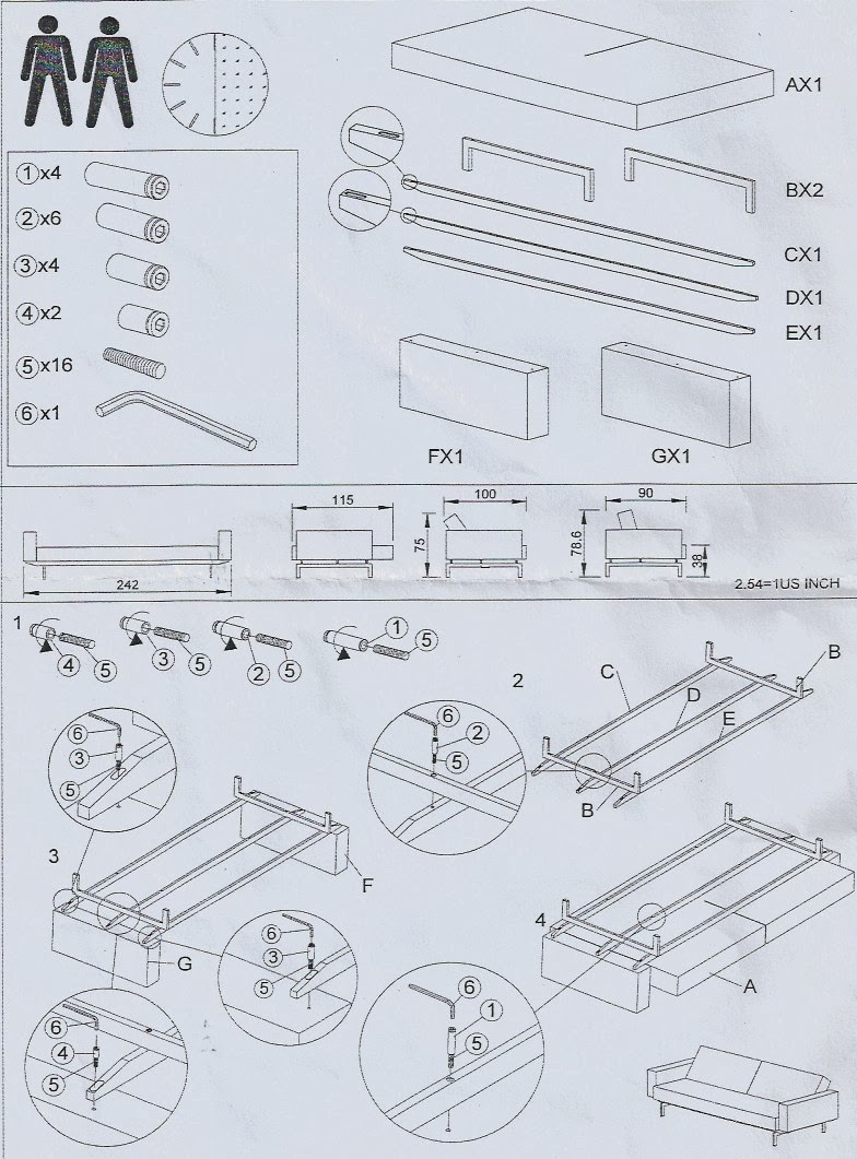
Not to fear, though. It came with instructions. My husband and I can both read and follow instructions.
Right?
Easier said than done, it turns out. These were certainly not the worst assembly instructions that I've ever seen, but they left a lot to be desired. Perhaps a very lucky or clever individual could get it right the first time (we were neither of those, as it turns out). But you'd have to know which details were important to pay attention to.
We had several false starts, turning the diagram round and round to say: Ah, now I get it! Wait, no, now the one frame piece is too long. Oh, now I see the problem. Oops, no, now the holes don't line up. After several such instances, we recognized that the bars in the frame are not equidistant apart (and it matters which two are closest together), we realized that two of the frame bars had four holes each and the third had two holes each and that the relative positioning of the bars with respect to one another is important, we learned that FX1 and GX1 are in fact not interchangeable (even though at the top they're shown with FX1 clearly on the left and GX1 on the right, but then below are less prominently switched).
Now that we've assembled the couch correctly (finally), we could do it again without breaking a sweat. We know exactly which are the important parts in the diagram to pay our attention. But why was it so difficult the first time around?
I'm in the middle of a book I'm enjoying, The Design of Everyday Things. In it, Donald Norman asserts that when you have trouble with things, you shouldn't blame yourself (even though that tends to be people's natural tendency). Rather, it's the fault of the design and you should blame the designer. While this book focuses mainly on product design, I think many of the insights are true in the data visualization space as well. In this case, the corollary is clear: if you are struggling to understand a visual representation of data, don't blame yourself; blame the designer. Odds are, they didn't adequately take your needs as the audience into account in their design process. For those designing visual displays of information, this is a reminder to always keep your audience in mind, for, as Donal Norman says, "well-designed objects are easy to interpret and understand."
I unabashedly blame the designer of the instruction diagram for our difficulty assembling something that could have easily been straightforward. If the designer had thought about the intended users and leveraged affordances to make it clear which details were important and should be paid attention to, my husband and I would have had a much less frustrating process assembling our (now truly lovely) couch.
What design issues cause you frustration? What can we learn from this to apply in the world of data viz?