the great pie debate
You can't title a talk "Death to Pie Charts" and not expect to spur some debate on the topic. Sometimes being a little provocative can help generate interest and keep people's attention. It seemed to work last night at a talk I gave at the University of San Francisco as part of their Data Visualization Speaker Series.
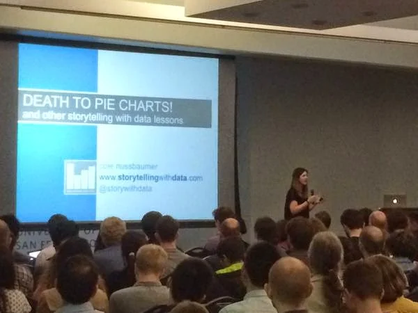
We had an awesome turnout and I covered a condensed overview of the key lessons I teach in my workshops: understand the context, choose an appropriate visual display, identify and eliminate clutter, draw attention where you want your audience to focus, and tell a story. As part of the lesson on common visual displays, I noted one graph you won't see from me: the pie chart. We looked at an example to illustrate some of the challenges reading pie charts and discussed some alternative ways to visualize the data. Then we went on to cover the remaining lessons, followed by some lively Q&A.
The debate started with a simple question that went something like this:
I've recently become interested in data visualization and I've been reading a lot about the field. Specifically on the use of pie charts, I've read some things that denounce them and others that say they have a place. Are you aware of any research comparing the takeaways that people get from pie charts compared to bar charts, for example?
My response went something like the following.
This is a difficult space to study. Many of the studies that come out demonstrating one thing are opposed via counter-studies that show the opposite. My personal dislike of pie charts is more anecdotal - when I see them used in a business setting, inevitably they fail.
I didn't talk about this last night, but upon further reflection, as I think back through the many pie charts I've encountered over time (hundreds, at least), I can think of only two cases where I tolerated them:
- At Google when we first started sharing diversity stats on the workforce internally - the team wanted to show the general breakdown of men vs. women (for example) but didn't want to communicate the specific numbers. In this case, the fact that our eyes don't do a great job of accurately measuring two-dimensional space worked in their favor. So in a way, they were taking advantage of one of the pie chart's biggest disadvantages.
- More recently, I encountered this data visualization highlighted in Best American Infographics 2013 - ten years of art history. Each pie represents an individual painting with the five most prominent colors shown proportionally. You can see the shift in color usage over time. Art via pies. I actually really like this!
Personally, I don't use pie charts because when I pause and think about what I want to show, I've always found a way that seemed to get the information across better than the pie chart.
That said, intelligent people will disagree with me and point out use cases for the pie. I welcome this diversity of perspective! Last night, after giving my viewpoint, I opened the question up to the audience. Santiago Ortiz (Moebio Labs) was in attendance and offered some great perspective. I'll paraphrase the viewpoint he shared:
There are studies, and usually bar charts win in terms of people remembering the numbers. But it's difficult to research the Gestalt feeling of a "percent of whole" where pie charts are actually effective. So is the story about the specific numbers, or the relative amounts, as a percent of the whole? If it's the latter, then pie charts can work.
(I'll note also that this is a similar point to one raised by Robert Kosara as part of his highly valued feedback on my forthcoming book).
Still, I'm standing firm. I won't use pies.
Does that mean you shouldn't use pies? Not necessarily.
First and foremost, always think about what you want your audience to be able to do with the data you are showing. Choose a visual that will make this easy. I often recommend the following. If you find yourself reaching for a pie, pause and ask yourself why. If you can answer that question, you've probably put enough thought into it to make it work. I should point out that this is something you should do for any type of visual you are using. Making yourself articulate why the chosen visual works for your needs is one way to help ensure that it actually does.
We didn't solve the great pie debate last night and we won't solve it here. People stand on different sides of the fence and I actually think that is ok. When it comes to data visualization, rarely is there an absolute right or wrong. You should constantly be applying your critical thinking skills. Don't do something blindly because of a statement you read or hear. Think about your audience, what point you are trying to make, and how you can do that in an effective way. If unsure, create your visual and seek feedback.
Big thanks to the event organizers and sponsors for last night's event: Scott, Sha, Alark, Sophie, Chris, all of the student volunteers, and everyone else who helped. Thanks also to those who participated in Q&A and everyone who showed up to the talk. I had a great time and I hope you did, too!