the power of categorization
I am writing this post on the heels of a lovely albeit short European trip. It included a few days in London, where I had the opportunity to conduct a day-long workshop and also present at Tucana Global's 2015 People Analytics conference. In our spare time, my husband and I ventured out to one of our favorite restaurants: Ottolenghi. As I was perusing the wine list, I was reminded of the importance of categorization (yes, apparently my data-brain is on even at dinnertime). Let's take a quick look at how categories help us make sense of things: both in life and in data visualization.
Here's a pic of the drink menu that inspired this post:

In the case of the drink list, categories ease our processing of the information. They appear on the left: aperitif, sparkling, rose, white, orange (!!), and red. Can you imagine how increasingly difficult the task of picking something to drink would be without this categorization to help us make sense of the list and understand where to focus our attention? There would also be a greater potential for misinterpretation - for example, without the categorization, I might have (incorrectly) assumed Dabouki to be a red wine. I certainly would have (again, incorrectly) believed Bianco Amphora to be a white wine. The processing of the information was made easier (and with less room for error) because I had a well-labeled construct to use as I interpreted the information.
Categories can be similarly useful when it comes to helping your audience interpret your data visualization. Let's look at one of the examples I discussed briefly at the People Analytics conference.
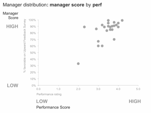
In the example below, data is plotted in a scatterplot across two dimensions. Imagine your organization collects information about its managers via an upward feedback survey, ultimately quantifying a manager's capabilities (as assessed by his or her team) with a single number. Your company also has a performance management process, through which everyone receives a performance rating. It might be useful to look at the upward measure (how employees feel about their boss) and the downward-looking measure (how the manager performs, as determined by their manager) together. This is shown below.

The vertical y-axis shows the manager rating. The horizontal x-axis shows performance rating. Each manager in your company is a point on the scatterplot.
We can add additional labels on each axis to help with the interpretation of the information. With this setup, the audience need not know that a higher % favorable on the Upward Feedback Survey indicates a better manager (in the same way that I didn't need to know that Dabouki is a white wine because of the categories on the drink menu).
We can take this a step further and add categories onto the x-y plane directly:

I'll admit that this final version does look a bit intimidating at first. For this reason, there can be value in starting with less and adding more, explaining what you're doing to your audience at each step so they can follow along with you, making the final visual feel less intimidating than it might otherwise. In my presentation, I started with a blank graph with only the axis labels and first described what I would plot (before showing any actual data; this can be a nice way to create anticipation among your audience as well). In the next view, I added the points to the previously blank graph. Then I emphasized the average. Following that, I drew the quadrants by adding vertical and horizontal lines based on the average. Then I drew attention to the points at the bottom left by making them red and adding the label Low/Low. Finally, I ended with the version shown above with all quadrants labeled and light shading at upper left and lower right.
In this final view, note also how the added labels on the graph make the data easier to talk about. With the quadrant titles, I can focus conversation on the cases where managers are scoring low from both the upward or downward perspectives (Low Perf/Low Mgr Score in red at the bottom left). Or there might be some interesting discussion in the cases where the signals don't align - Low Perf/High Mgr Score at the top left or the opposite on the bottom right.
Meta-lesson: categories (and more generally, descriptive and pithy labels) can help your audience interpret the data you show. You can download the Excel file with the above graphs here.
My other European destination this trip was Paris, where my husband and I enjoyed more amazing food, saw many sights, and perused many more drink menus. The overall trip was great, only too short. I hope to travel to Europe again this summer for a longer stay. If you are reading this and interested in discussing a potential workshop for your European team or organization, reach out to me at cole.nussbaumer@gmail.com.
I'll close with a couple pics of Parisian adventures with my favorite travel partner.

Eiffel Tower in the distance!

Musee D'Orsay