the use case for less common graphs
In my book, I write about the 12 types of visuals I find myself using most frequently for communicating data in a business setting (here is a list of the 12 with links to examples; here is a related post on storyboarding for the chapter on visual displays in my book and the final graphic depicting the various visuals). For the most part, the graphs I find myself turning to regularly aren't anything crazy. They are line graphs and bar charts—graph types with which people are familiar. There is a good reason for that: when you use a graph that people already know how to read, you face less of a learning curve with your audience for getting the information across. In other words, instead of spending their brain power figuring out how to read the graph, they can focus on what interesting or useful information they can get out of it.
But does that mean there aren't use cases for other types of graphs?
Certainly not.
My view is there is absolutely room to play and be creative when it comes to visualizing data. But novelty shouldn't be prioritized over effectiveness. In general, the goal should be to visualize the data in a way that's going to get your audience's attention and keep it long enough to get your point across.
To talk about this more concretely, let's look at some specific examples of less-familiar graph types. I'll put these into two categories: effective examples (I'll highlight a few) and ineffective ones (a single poor example from my own work). For each, I'll talk about some related general considerations when determining how to visualize data.
Effective examples of less common visuals
You should expect that with less common visuals, it will take the audience some time to understand what they are looking at. But in cases where this is done well, it shouldn't take very much time, because it's intuitive and/or due to the visual cues and text (or live narrative) you've included to ease this process of understanding. For me, a less common visual is successful if it doesn't take me long to "get it" and once I do, I'm left thinking "that is clever."
Here are a few examples that meet the above criteria for me (click on any of the images for more details):
pitchinteractive.com

flowingdata.com

krisztinaszucs.com
Ineffective example of less common visual
For an example failure when it comes to using a less common graph type, I'll look to my own work. In a prior life, I worked in banking managing home equity fraud. Fraud management is often discussed and measured in terms of the eight stages of the Fraud Management Lifecycle: deterrence, prevention, detection, mitigation, analysis, policy, investigation, and prosecution.
To show progress in each of these areas for a number of different types of loan fraud, I though the spider (or "radar") graph would be perfect: the greater coverage on the graph, the greater coverage we had in a given area. This would help us understand and highlight strengths and weaknesses, which could be used to help determine priorities going forward. I created a visual similar to the following:
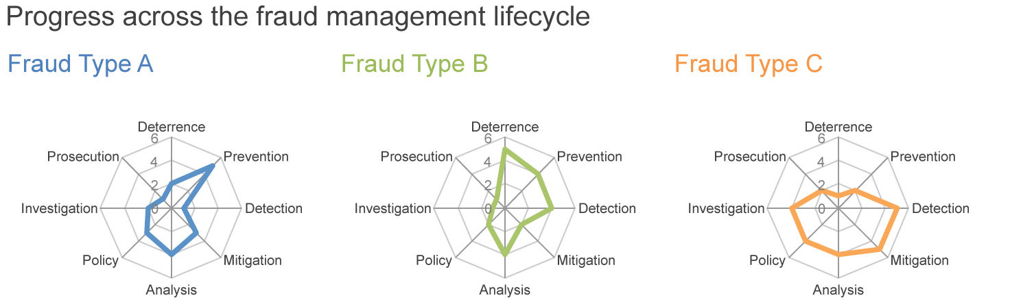
I wanted this visual to work very badly. It seemed to me that it was the perfect use case for the spider graph. But I found I was having to spend a significant amount of time explaining how to read the graph each time I used it. Even after doing so, I wasn't having great success getting my point across. I ended up creating a graph to explain how to read the graph (note that the last effective example shown above does this as well, but in a quick-to-understand way, so I think it actually works in that case, though it didn't in mine).
At this juncture, I finally realized that my visual was failing. It wasn't intuitive to my audience—no matter how much I wanted it to be!
Trying to force my approach on my audience was not a recipe for success. Rather, it actually distracted from the message I wanted to communicate. So I had to go back to the drawing board and figure out what I most wanted my audience to be able to do with the graph, then brainstorm and iterate to find a way to get that information across more intuitively. Here is a related post with an alternate view of the data using one of my go-tos: the horizontal bar chart.
When you find yourself fighting against your audience in the way you're visualizing the data, it isn't working. Don't blame your audience. Blame your design.
Meta-lesson: audience is king! Don't be afraid to try new or novel ways to visualize information, but be willing to reassess and change approach if needed. Your main goal when communicating with data is to get your message across to your audience, so chose an approach that will allow you to effectively do this!
If you are aware of other effective examples of less-common visuals—there are certainly many more out there—please leave a comment with the link.