accessibility considerations for visuals
A question we hear frequently in our workshops is how to address color blindness when selecting colors for data visualization. Readers of storytelling with data and this blog will know that we frequently use blue to signal positive and orange for negative, which allows for accessibility for colorblind audience members who may have trouble distinguishing between red and green. It’s more common than you may realize!
This image demonstrates how color-sight deficiency renders itself. The image on the top left shows how these tomatoes appear to a person with normal vision. The rest of the images show how they appear to someone with the many different types of color blindness.

Recently, I was guest lecturing for a university audience and received a similar question, but one more broad: how can you incorporate accessibility when designing for those who are not just colorblind, but visually impaired? I set out to do some research on this topic and found out that again, it’s more common that I realized. According to the World Health Organization (WHO), 253 million people globally live with some visual impairment, which range from cataracts and glaucoma to complete blindness.
The purpose of today’s post is to share with you what we’ve found when it comes to designing communications for the visually impaired.
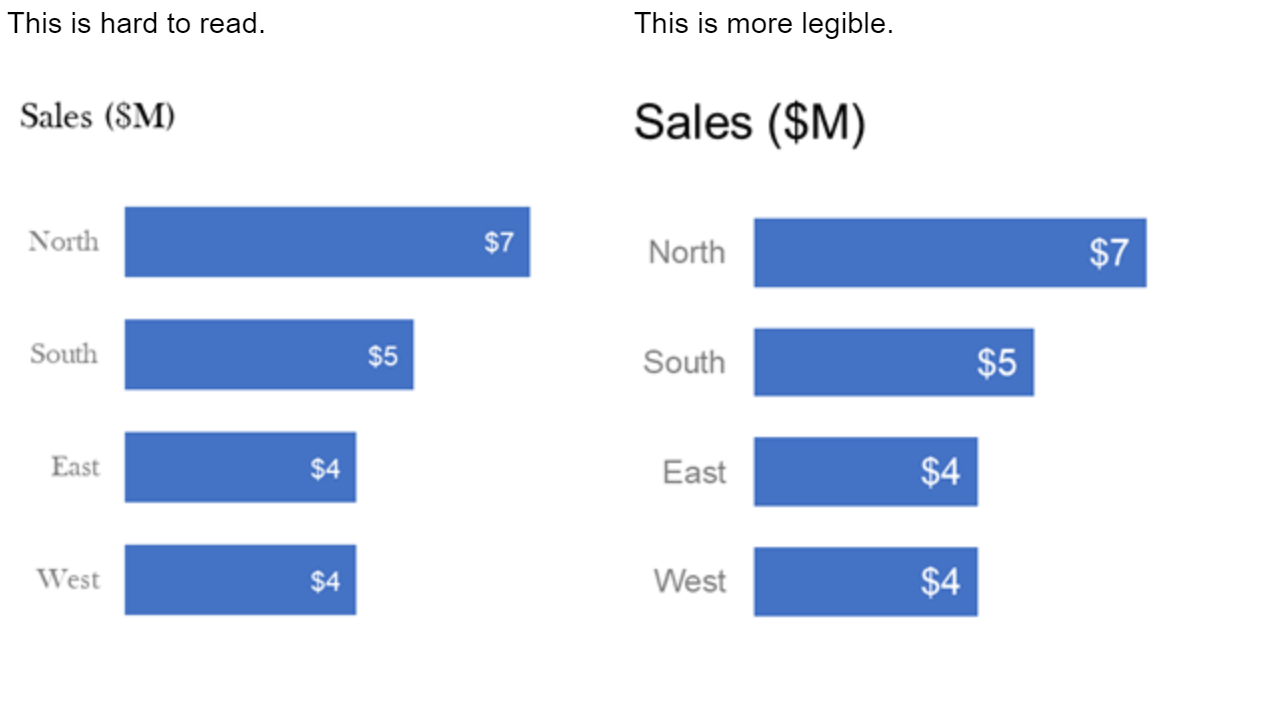
Importance of contrast
Using contrast of color can be a visual cue to our audience, helping them understand where to look in our visuals. If there is one thing that is really important in our visual, we should consider how creating contrast can be a signal to make that one thing very different from the rest. This becomes even more important with an audience member who may struggle to distinguish color or picking up subtleties font and background (i.e. white font on a light grey background).

CheckMyColours is a great tool for checking if foreground/background colors provide sufficient contrast in your visual.
Choose a heavier, bigger font
Avoid fancy fonts for the sake of being unique or pretty. Unless your organization has specific branding or stylistic guidelines, we recommend at a minimum 12 point font size for all elements of a visual: axis titles, data labels, axis labels and 20 point size for chart title. This could be increased for a visually impaired audience.
Provide narration if possible
For a visually impaired person, the option to listen to the content can overcome many visual design issues. Consider if you might have the opportunity to present to your audience live, utilizing the storytelling techniques (plot, narrative arc, tension). To hear what that sounds like, have a listen to the latest episode of the SWD podcast ("Say It Out Loud"). If presenting live is not an option, many slideware presentations (including PowerPoint) have the ability to record yourself narrating a presentation and save as a video, which can be a nice option.
Many web designers design for screen readers, which are software programs that allow a visually impaired person to read the content to them. For more reading on screen readers, check out this article.
Use a colorblind simulator
There are many sites and simulators that allow you to see what your visual looks like to a colorblind audience, such as Vischeck and Color Oracle. Google Accessibility has a Chrome extension which is a customizable color filter applied to websites to improve color perception for people who are partially color-blind.
I used a color-blind simulator to render how “Our Corporate Dashboard” might look like to someone with one type of color deficiency (Red-Blind/Protanopia).

Are you aware of other tools or accessibility considerations when communicating with data? Leave a note in the comments section!