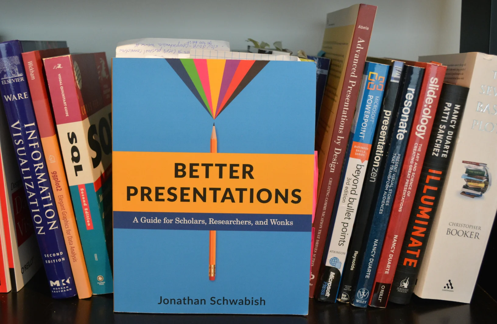
the functional art

It's a little beat up and has scraps of paper sticking out in various directions marking pages I want to refer back to: it's my copy of the functional art by Alberto Cairo, and it's been everywhere with me over the past month - from LA to DC to Milwaukee, and several places in between (yes, that probably means I'm a slow reader). I finished it on my latest plane ride home. In a word: it was awesome.

As the subtitle declares, the focus of the book is information graphics and visualization. Alberto has a conversational, super accessible writing style. His research is augmented with his extensive experience in data journalism and the book is filled with illustrative stories and examples.

the functional art begins with a section on Foundations - what visualization is and does, the importance of building a narrative structure, and introduces a visualization wheel to evaluate competing priorities. It then moves into Cognition - discussion of the eye, the brain, and how people see. The third section focuses on Practice - the infographic creation process and interactive graphics. While I enjoyed the entire book, the final section, Profiles, was my personal favorite - it recaps Alberto's interviews with various practitioners working with infographics. I also enjoyed examining the various examples throughout the book and seeing the progression from sketches to final product.

The book was inspiring, as is Alberto's work in general. I had the pleasure of speaking with him a couple of months ago, when he was getting ready to launch the first massive online course on an Introduction to Infographics and Data Visualization through the Knight Center. This 6 week course filled up quickly, so a second was recently announced that begins in January (details here). Alberto also teaches at the University of Miami and blogs at www.thefunctionalart.com. His passion in this space is clear and from what I've seen, permeates through all that he does.

For those interested in infographics or data visualization in general, I highly recommend the functional art; you can purchase a copy of it here.

visualize this

Nathan Yau writes one of my favorite data visualization blogs, FlowingData. His recently published book has been sitting on my shelf untouched for much too long. Earlier this week, I decided to remedy that.

His book is Visualize This. Subtitle: The FlowingData Guide to Design, Visualization, and Statistics. It's written in the first person and is super accessible, full of examples and anecdotes to make the lessons real. The book includes references to a lot of publicly available data and also has links to each dataset used, so the reader can follow along through the steps that are explained.

After starting with an introduction on telling stories with data (obviously near and dear to my heart), the book jumps into the practical question of how. There are step by step instructions for scraping data from websites, using Python to reformat it, and the strengths and weaknesses of various out of the box applications and programming languages for analyzing and visualizing data.

By his own words, Nathan's book is "example-driven and written to give you the skills to take a graphic from start to finish." It accomplishes this goal. The middle chapters each focus on a different kind of visualization problem: visualizing patterns over time, visualizing proportions, visualizing relationships, spotting differences, and visualizing spatial relationships. Yau follows a thorough, hands on approach. For example, in the chapter focused on time series, he goes through what to look for, the best types of graphs to use in different scenarios, how to load the data into and plot in R, and how to fine tune the visual using Illustrator. Relevant statistical methods are incorporated as makes sense, for example, smoothing and estimation.

While there is some very solid foundational material, the majority of the book is focused on the practical question of how to actually analyze and visualize the data. It seemed to me most tailored to the person who is looking to move beyond Excel and the like and get started using R and Illustrator (with some time devoted to interactive graphics as well).

Throughout, Nathan's graphics are beautiful and accessible - great examples of effective data visualization. He follows the rules he sets forth in every one:

  • explain encodings,
  • label axes,
  • keep your geometry in check,
  • include your sources, and
  • consider your audience.

The final chapter focuses on designing with a purpose. He says he always assumes that people are showing up to his graphics blindly and puts the onus on himself as the designer to prepare the audience with the relevant context and insights. "After you learn what your data is about, explain those details in your data graphic. Highlight the interesting parts so your readers know where to look. A plain graph can be cool for you, but without context, the graph is boring for everyone else."

Well said, Nathan!

beautiful visualization

I have a growing collection of books on the topic of data visualization. I seem to accumulate them more quickly than I can read them. But every once in a while I have an opportunity (an uninterrupted hour or two) to narrow the gap. I encountered one such occasion this afternoon. I had checked all of my to dos off my to do list and decided to give my eyes a break from the computer screen to look at actual physical pages for a bit. My eyes appreciated the change in visual medium; my brain appreciated the content.

The book I occupied myself with is called Beautiful Visualization: Looking at Data Through the Eyes of Experts. It's a collection of writings on various topics from experts in the field of infoviz. Some of the names I am familiar with (Jonathan Feinberg has a section on Wordle, Aaron Koblin and Valdean Klump do a deep dive on flight patterns, Martin Wattenberg and Fernanda Viegas write about visualizing Wikipedia), but many are new. For my afternoon reading, I chose two from this latter category.

The first (which, technically is the last, at least in the order in which the book is written) is Jessica Hagy. Interestingly, finding her name in this book was the second time I encountered her work today. I had lunch with a connection from one of my speaking events and we were chatting about our favorite blogs; one of hers is Indexed, written by Jessica Hagy. The blog consists of a daily posting of an index card, on which Jessica has drawn a clever (and often quite amusing) visual display of data. It might be my new favorite blog. In Beautiful Visualization, Jessica uses this same style to discuss the ever increasing amount of data in our world and the power of images to make that data more accessible in a much faster way than words can. If you want to understand the parallel between an elephant and visualization, you need to read the book (the likeness is uncanny!).

After starting at the end of the book (very unlike me, by the way, I typically do everything in order), I went back to the beginning. The first section, by Noah Illiinsky, is titled On Beauty. By his definition, a beautiful data visualization is one which is novel, informative, efficient, and aesthetic. His guidance on how to achieve this is as follows (descriptions are in my own words except where noted and highly condensed):

  1. Step outside default parameters. My favorite line from this section (actually, from everything I read): In most situations, well-defined formats have well-defined rational conventions of use: line graphs for continuous data, bar graphs for discrete data, pie graphs for when you are more interested in a pretty picture than conveying knowledge. (Making fun of ineffective pie charts pretty much speaks directly to my heart!). His point here is that to be beautiful, a visual must be novel and create shock and awe. I'm not sure I agree with this sentiment, but more on that in a bit.
  2. Make it informative. I certainly can't argue against this one. Noah says that a clear understanding of message and the needs of the audience are key here (um, yes). If you can't state those concisely, you're nowhere near the point of trying to put together a visual.
  3. Make it efficient. Every bit of visual content will make it take longer to find any particular element of the visualization. In Duarte language, this is the step where you dial up the signal and dial down the noise. Visually emphasize what matters and get rid of the stuff that doesn't or push it to the background so it doesn't distract.
  4. Leverage the aesthetics. Use the basic components of the graph (titles, axes, etc.) to increase the utility of the visualization. Make the visual something that's comfortable for your audience to look at. They're more likely to look at it.

My one hesitation with the above is the first rule. In some cases shock and awe is good, but I think whether or not that is a necessary condition for a beautiful visualization is highly context dependent. Perhaps it's my penchant for bold, blue bar graphs, but in business communication, I generally find simple graphics to be the most beautiful (perhaps due to their relative rarity?). Though I suppose in reality what I'm generally aiming for is not beauty, but rather effectiveness. In that case, my personal spin on the above would be to say that necessary conditions of an effective visual display of data are that it must be informative, efficient, and aesthetic.

It's certainly great food for thought. I'm looking forward to the remaining 18 sections!