when to use a dotted line
When visualizing and communicating with data, one design element we can play with is line style. Most tools default to and we most often use and see solid lines. But a dotted line is another possibility. What considerations should we think about with a dotted line? When should we use one? In this post, I’ll outline my thoughts and illustrate the scenarios in which I find myself using dotted lines through examples plus will share some commentary on how to do this in your tools.
considerations with dotted lines
Dotted lines are super attention grabbing. They also convey a sense of uncertainty that can be useful. The challenge is that dotted lines introduce some visual noise. From a clutter standpoint, we’ve taken what could have been visualized as a single visual element (a line) and chopped it into a ton of pieces (many little lines, dashes, or dots). Because of this, I recommend against using the dotted line as a way to attract attention (rather use less noisy means of contrast, such as position, size, or color for this). Preserve the use of dotted lines for when there is a target or goal we are trying to hit or remain a certain side of or when there is uncertainty to depict (a forecast or prediction). In these cases, the visual differentiation and sense of uncertainty that the dotted line helps depict makes up for the additional visual noise it introduces. Let’s look at an example of each of these use cases and some dotted lines in action.
dotted line for a goal or target
I was recently working with a graph similar to the following that depicted time to fill a given type of role at a company:
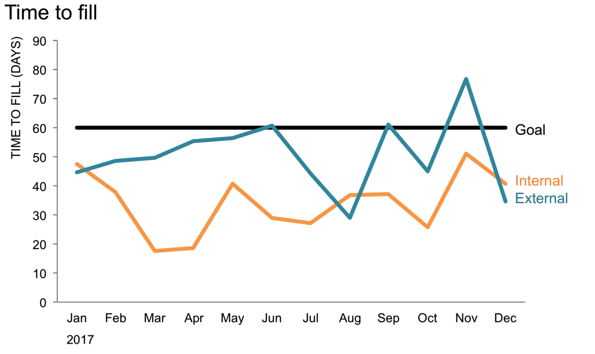
There are three lines in the graph above: (1) the Goal—which you likely looked at first both due to position and because it’s bold black, which stands out more than the other colored lines, (2) average days to fill roles for Internal candidates (orange), and (3) average days to fill roles with External hires over time (teal). The Internal and External lines represent data that we’ve collected and summarized, whereas the Goal is something we have set and in this case we’d like to stay below. To set the Goal apart—and here I'm interested in making it less attention grabbing but still want it there for reference—we could use a dotted line. Dotted lines come in different styles, both in terms of the thickness of the line and how large or small the individual pieces are. We also have some other design elements at our disposal when it comes to the formatting of the line and the text that goes with it. Here’s an example of how I iterated to land on a combination I liked:
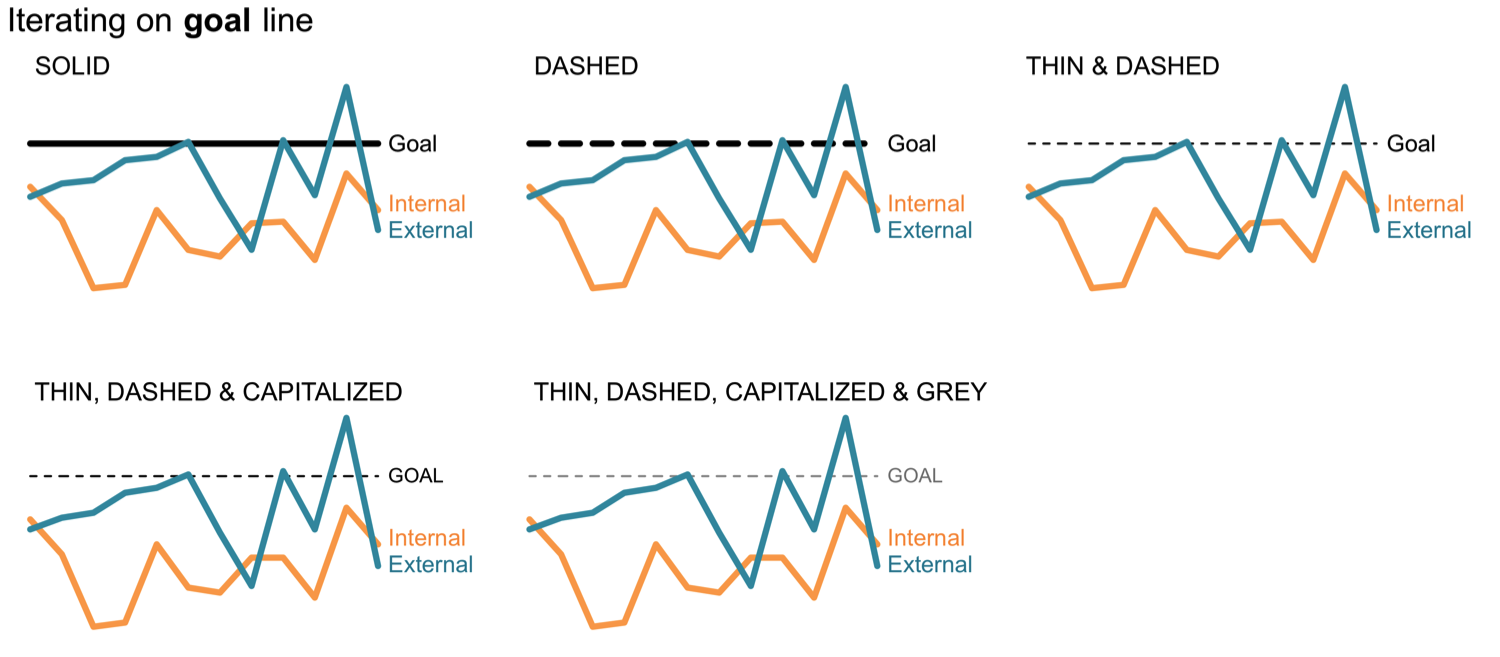
I prefer the final view, where the dotted line is thin and grey, effectively pushing it to the background (in spite of the noise that this line style introduces). I should probably mention that there are other styles of dotted lines as well (for example, some that combine dashes and dots)—I recommend avoiding these because they look quite messy and instead choose a style where the segments (whether dashes or dots) are consistently spaced. Here is what my final iteration looks like in the full graph:
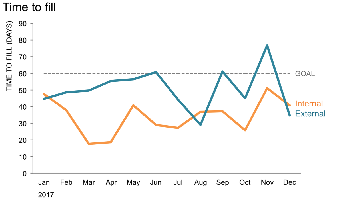
I like this. The GOAL is clearly stated and still the first thing I see, but due to the formatting it feels more like reference or context, while the thicker solid lines are the clear focus of the graph. Also—and perhaps it's just me, but—there's something about this view that makes it feel easier to compare each of the individual lines (Internal and External) to the GOAL than in the original view when all of the lines were of similar thickness.
dotted line to depict uncertainty
I often see graphs where some data is actual and some is forecast and there isn’t anything done to differentiate the two, like the following example.

Given that we are standing in 2018, some of the data in the graph above clearly hasn’t happened yet and so must be forecast. But how much? Was this graph recently made using actual data through 2017 and forecasting thereafter? Perhaps, but we’d have to make that assumption, because nothing in the graph tells us. Or maybe there was a footnote hiding down at the bottom of the original that articulated this (there wasn't, but in case there were); I shouldn't have to read the fine print in order to know how to read the graph. Don’t make your audience question, make assumptions, or hunt for detail like this—make it clear.
One option is to use words to differentiate between actual and forecast. In the following, I added supercategories along the bottom to indicate which dates are associated with actual data and which are forecast (check out the recent post illustrating the step-by-step on how to achieve in Excel if that’s of interest). Since we're on the topic of dotted lines, I could also add a dotted line to further visually differentiate actual vs. forecast data:

Even better, though, if I preserve my use of the dotted line to depict the uncertainty directly for the portion of the line that represents forecast data. If I do this, I don’t need to add the additional line at all. Here’s what it could look like:

In this case, both the line style and the words on the x-axis make it quickly clear which data points represent actual data and which are forecast. I'm a big advocate of thick, bold, solid lines and data markers for actual data and thin, dotted lines (and sometimes non-filled in data markers, though I felt that looked too messy here) for forecasts and predicted data because of the way it helps us intuitively understand what we are looking at when executed well.
In the above, I’m assuming the forecast data points are important enough to label directly (in other words, that the specific numeric values are important; if that weren’t the case, you might approach this differently, perhaps only labeling the 2017 and 2022 points, or not labeling any of them and rather letting the y-axis for general magnitude be good enough). I can imagining different people making different choices here depending on both what you want the audience to focus on as well as personal aesthetic preferences. The meta-point: be thoughtful when it comes to design details in general, and your use of dotted lines in particular.
the tactical: how do I do this in my tool?
Changing the formatting of a single line from solid to dotted—like in the first example above—is possible and pretty straightforward in most tools. This is typically achieved through a menu or code to change the line style. If you aren’t sure how to do this, some smart Google searching with the name of your tool and something like “change line in graph to dotted” should point you towards a solution.
Changing just part of a line from solid to dotted is slightly more complicated, but there are a couple of solutions for that. There is the brute-force method of physically formatting each individual data point (for example if you are working in Excel, you would click once to highlight the series, then click again to highlight an individual data point, and then can format that data point or associated line individually as you would like it). As you can imagine, this can be time-consuming. Another way is to make what will appear to be a single line actually two different data series, allowing you to format them separately. In the Sales example above, I’d have a column of dates that goes from 2010 to 2022 to set my x-axis. Then my first series for the ACTUAL data would have values from 2010 to 2017. I’d have a second series for my FORECAST line that has values from 2017 to 2022 (note the overlap with 2017 having values for both ACTUAL and FORECAST to avoid a gap in the line). I imagine you could use a similar approach in other tools.
You can download the Excel file with the above examples (including both the brute force and more elegant solutions described above for the second example).
These are the two use cases in which I find myself using dotted lines and promoting their use. Are there other cases where you’d recommend using a dotted line? Or additional considerations we should have in mind when choosing line style? Leave a comment with your thoughts!