visualizing gender identity
At a recent custom client workshop, the question was raised: how do we best visualize the results of our gender identity survey?
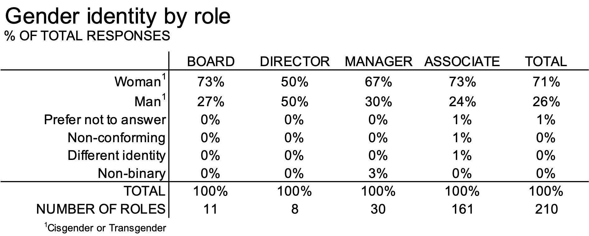
The organization had collected data on gender self-identification from four categories of employees: the board, directors, managers, and associates. Their responses are summarized in the table below (details have been slightly modified to protect confidentiality.)
Before we jump straight to visualizing this data, let’s spend a minute familiarizing ourselves with the responses. To do this, I’ll introduce some visual elements into this tabular data, to draw attention to some interesting things.
A heatmap allows us to convey the relative magnitude of the numbers with color saturation. We could do this within a single column:

Or, across multiple columns:

A heatmap alleviates some of the cognitive burden of processing tabular data.
However, there’s an interesting piece of the data that might be better served with a different visual: the wide range of magnitude in responses. Scanning down then columns, the minimum value is zero, then some single-digit values (1%), and a maximum value anywhere from 50% to 73%.
Along our rows at the bottom, where we are counting the absolute numbers of people in each role, the range is even greater, from a low of eight directors to a maximum of 161 associates:

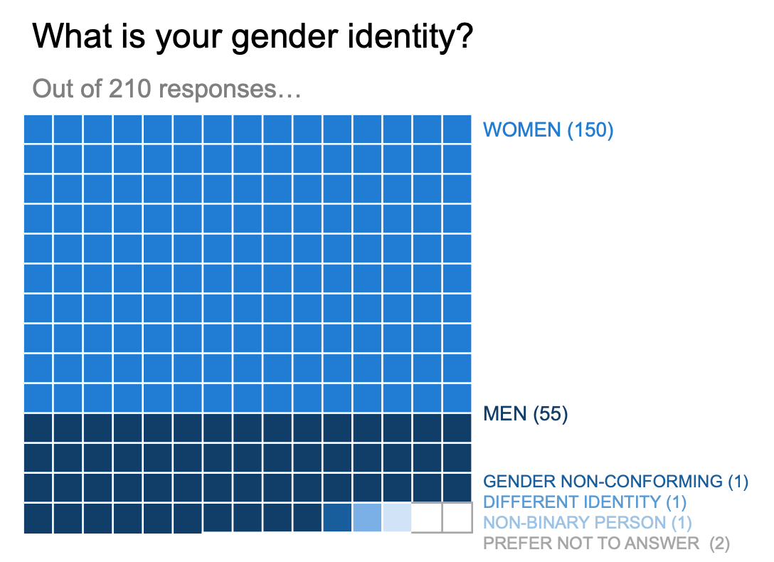
One benefit of switching from a table to a graph would be to help a viewer understand the overarching shape of the data, which is less apparent when visualized in tabular form. While there’s many ways we could graph this data, I opted for a square area chart for its versatility in displaying numbers of different magnitudes.

A square area chart is an example of a unit graph: a single square represents one unit. The benefit of this type of graph is that you can visualize more information—two dimensions encoded as width and height—in less space.
I used Excel to create my square area graph, first illustrating the survey population:

Then displaying the overall breakdown with color saturation:
I could split this into 4 separate graphs to show the breakdown by role—and where the number of roles is concentrated.
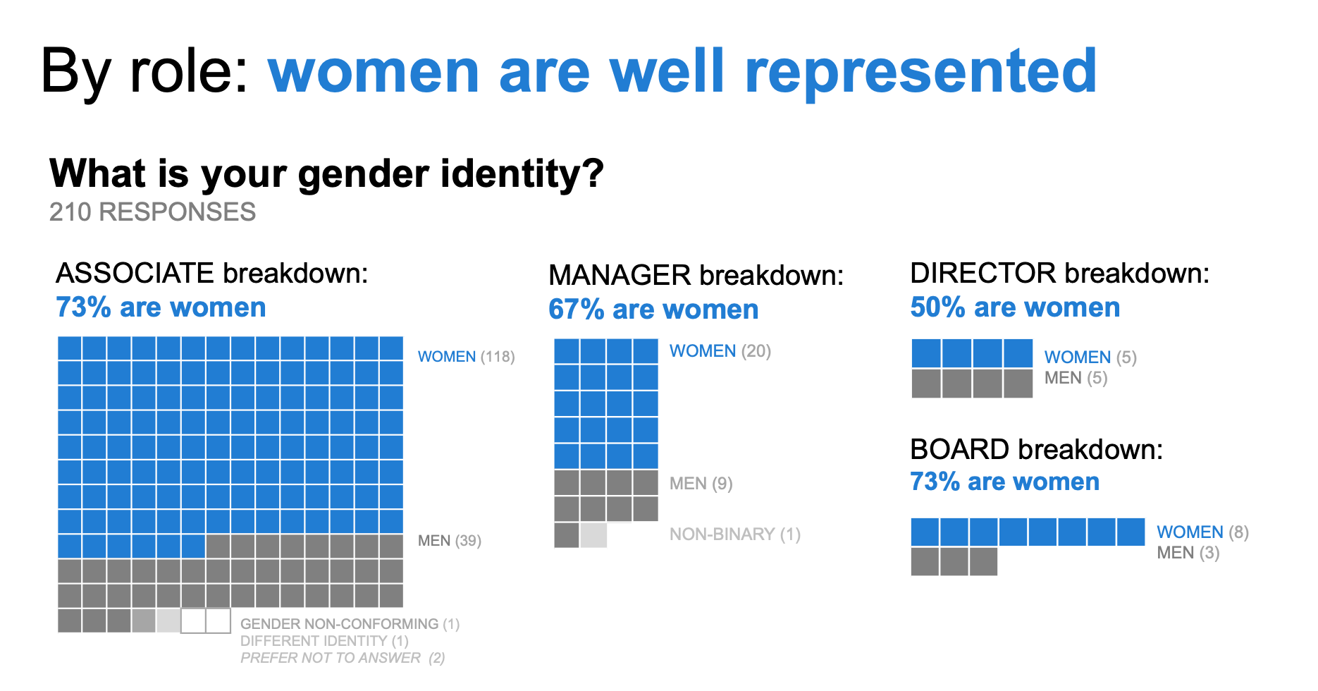
When working with survey data, a square area graph can be an effective choice to visualize the magnitude of responses within a population. If interested, you can download the Excel file for a behind-the-scenes peek at how I created these visuals.
A square area chart is just one example of a unit graph. Check out these additional resources on this type of visual:
Another use case: visualize a hiring funnel
Previous SWDchallenge: square area graph
Current SWDchallenge: create and share a unit chart
Monthly event (open to premium subscribers): a unit chart for two different audiences
Video: Jon Schwabish’s One Chart At a Time video series: Unit, Isotype and Waffle Charts
Article: Robert Kosara’s post (w/ video) on unit charts and what makes them special