communicating data to international audiences
An exciting part of working at SWD is partnering with people and organizations outside of our US-home base to talk about data visualization, storytelling, presentation, and other related topics. Through these experiences, I’ve learned firsthand that sometimes, due to diverse backgrounds and experiences, my audiences and I interpret graphs and slides differently. Being aware of these differences can help us communicate more effectively for our intended audience.
Before I share some considerations for presenting data internationally, I want to acknowledge that I am not an expert on different cultures and audiences. In this post, I simply share some of my experiences with the hope that others will provide additional commentary for increased learning. If you have related thoughts, please share in the comments.
Let’s consider six observations of regional differences I’ve encountered while communicating data.
Numbers are punctuated differently
How does this news make you feel?

After reading the above text and without any context, I’m excited; more than one thousand individuals subscribed in a single month! That’s how I interpret this news because I was born and raised in the United States, where commas separate thousands and points separate integers from decimals.
Someone else, perhaps from Eritrea or Indonesia, could interpret the statement differently and probably wonders why growth is so flat. Parts of the world use decimal commas rather than decimal points, so “1,500” is the same as one-and-a-half.
Decimal points and decimal commas are not the only differences when it comes to numerical punctuation. Spacing and apostrophes are also used to separate thousands, along with different currency symbols and formatting preferences. We should be aware of how we format numbers with international audiences, so we don’t unintentionally confuse anyone.
Date formats aren’t universal
Glancing at my planner, I can see that I started drafting this article on 03/01/22—March 1, 2022. If my colleague Simon looked at that date, he’d probably think I was ambitious for penning a post only two days after returning from the New Year holiday (January 3rd). Or maybe he’d wonder why it took two months to publish this article! Simon is from the UK, where it’s routine to write the day first, next the month, and then the year (DD/MM/YY). This is the case for many places globally; but not the U.S., where the month typically comes first (MM/DD/YY).
This can be super confusing—especially when numeric dates are shown in a chart like the one below.

The dates here might be showing days and months, or months and years…but at a glance, how can we be sure which? The above example comes from a previous blog post titled the accidental misdirect. The article suggests using monthly abbreviations (Jan-22) rather than numeric formatting for dates to avoid confusion altogether. This isn’t a perfect solution if you and your audience speak different languages, but it may be a safer option.
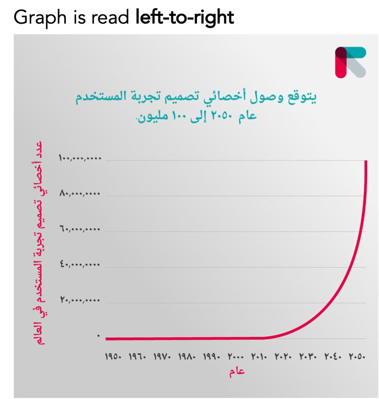
Natural directionality of text varies
Let’s consider the following slide from a previous SWD makeover.

Notice the slide orientation from left-to-right (LTR). The graph title, labels, and slide title are all left-justified. The above makeover was created by and for a western audience, who primarily consumes information from left-to-right and top-to-bottom.
This raises the question: in a society where information is consumed differently, say right-to-left (RTL) or bi-directionally, wouldn’t a graph be formatted differently? Should the x-axis extend to the left instead of the right for greater values?
I’m not aware of a clear answer for graphs, but it seems formatting charts from the left and right sides are both possible, as described in Nick Doiron’s Medium article: Charts when you read right to left.
Let’s look at a couple of examples of graphs from Nick’s collection where the labels and numbers are written in Arabic and Hebrew. These two languages are considered to be bi-directional, as they are written and read from right-to-left but select portions of text, like numbers, are written and consumed from left-to-right. (See Nick’s article for more examples.)
Notice how time flows from left to right in the above visual. Also, the vertical axis is formatted on the left-side even though information is generally consumed RTL when writing and reading in Arabic.
Here’s a line graph from a Hebrew Wikipedia article.

Notice how in this second example, the graph is consumed right-to-left as the vertical axis is on the right side and x-axis increases starting on the left and moving right.
Both formatting styles are possible, although Nick mentions that LTR seems to be more common—even within RTL or bi-directional languages. Given the ambiguity, I’d suggest doing some research on your specific audience and getting feedback to ensure whichever format you use will be intuitive for your audience to follow.
Color carries different meanings in different places
Color is truly in the eye of the beholder, as not everyone sees color the same. In a literal sense, about 5% of the population has some form of color vision deficiency. To learn more, check out some of our color and accessibility-themed articles.
But going beyond accessibility considerations, color carries different meanings for different people. For example, I can remember receiving a few PowerPoint examples from a past client located in Hong Kong. There were line charts with bright red annotations. From my western perspective, I assumed the callouts were negative because red was used. In eastern cultures, though, the color red has a positive connotation and was intentionally used to convey positive performance. This shows how important it is to be mindful of your audience’s color perceptions.
David McCandless created an infographic that shows different color associations across different cultures—a great resource to consult when designing your visualizations.

In addition to regional differences, color associations are also influenced by corporate culture. If you work for a company with strong branding or are passionate about a specific sports team, then you may find that the primary brand colors take on an entirely new meaning.
A common language can have unique spellings and pronunciations
Even though the above visualization is called ‘Colours in Cultures’, I have been spelling the word color without the letter U throughout this article. This is a prime example of how even when two different people speak the same parent language, there are spelling and pronunciation differences that may not be as familiar.
Last year, I led a virtual workshop for a group in Australia and New Zealand. At the end of the session, an attendee joked that while they enjoyed the workshop, they found my continuous spelling errors distracting. Fair point! Imagine sitting through a half-day workshop, where frequent words like ‘data visualization’ and ‘color’ were spelled differently (alternative spelling: ‘data visualisation’ and ‘colour’).
Local references might be lost on global audiences
It’s natural to seek out compelling and relatable examples that will illustrate key points in your presentation. Think critically, however, about whether the references you think will make your communication more accessible will actually resonate with the intended audience. If not, you may need to provide more context, adjust your analogy, or skip it altogether.
For example, I can recall a workshop where I described the challenges with displaying data in a chloropleth map (the area of a region doesn’t always align with the value of the data). In my explanation, I used an analogy from Scott Berinato’s Good Charts: the Montana-Manhattan problem.

This is a powerful explanation…for a U.S.-based audience. My oversight was sharing this exact reference to an organization located in South America. Using such a localized analogy didn’t have the impact I intended. In hindsight, I should have modified the area and population comparison to something more familiar—perhaps using the city of Caracas, Venezuela, and the country of Uruguay.
I’ve listed a handful of considerations to be mindful of when communicating internationally. Now, I’m not suggesting that we entirely rework our communications for global audiences. After all, many of the differences can be clarified through additional context.
Taking the 1,500 new subscribers statement from above, this was part of a more extensive communication about excess growth, so even for someone accustomed to decimal commas they may expect a large number.
The above bar chart with numeric dates along the horizontal x-axis has a title that references monthly values. This provides a clue for how to process the numeric formats.
Lastly, the PowerPoint slides containing red highlights also had plenty of supporting text describing positive results.
When we can provide additional context through smart labeling, the inclusion of related content as frames of reference, and/or narration and annotations, these differences don’t necessarily guarantee a miscommunication.
Nonetheless, there is value in acknowledging that our perceptions and understandings aren’t universal. With heightened awareness, we can more thoughtfully bridge gaps in our explanations and visuals so that we don’t inadvertently mislead or confuse anyone.
What tips and learnings can you share from your experience presenting to international audiences?