give each point its own view
An expected staffing shortfall is worth bringing to leadership’s attention. But a forecast alone doesn’t tell leaders where the gap is coming from. When there’s more to explain, it’s tempting to squeeze every detail into one chart.
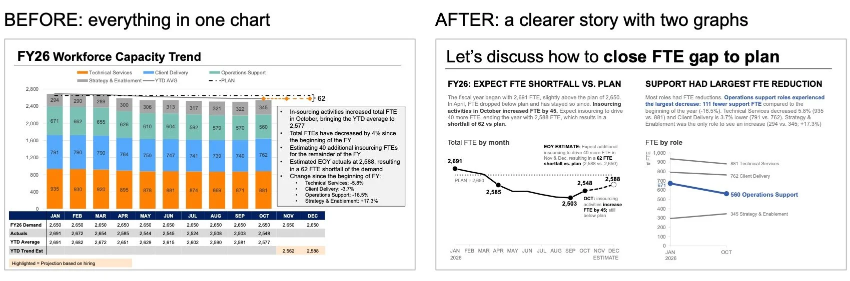
That was the challenge in an example from a recent custom client workshop. The team needed to show that full-time equivalent (FTE) staffing was expected to fall below plan, that a decline in operations support roles was an important part of the picture, and that leadership needed to discuss an approach to resolving the gap to plan.
The important information was there, but the story was buried in the complexity of the communication.
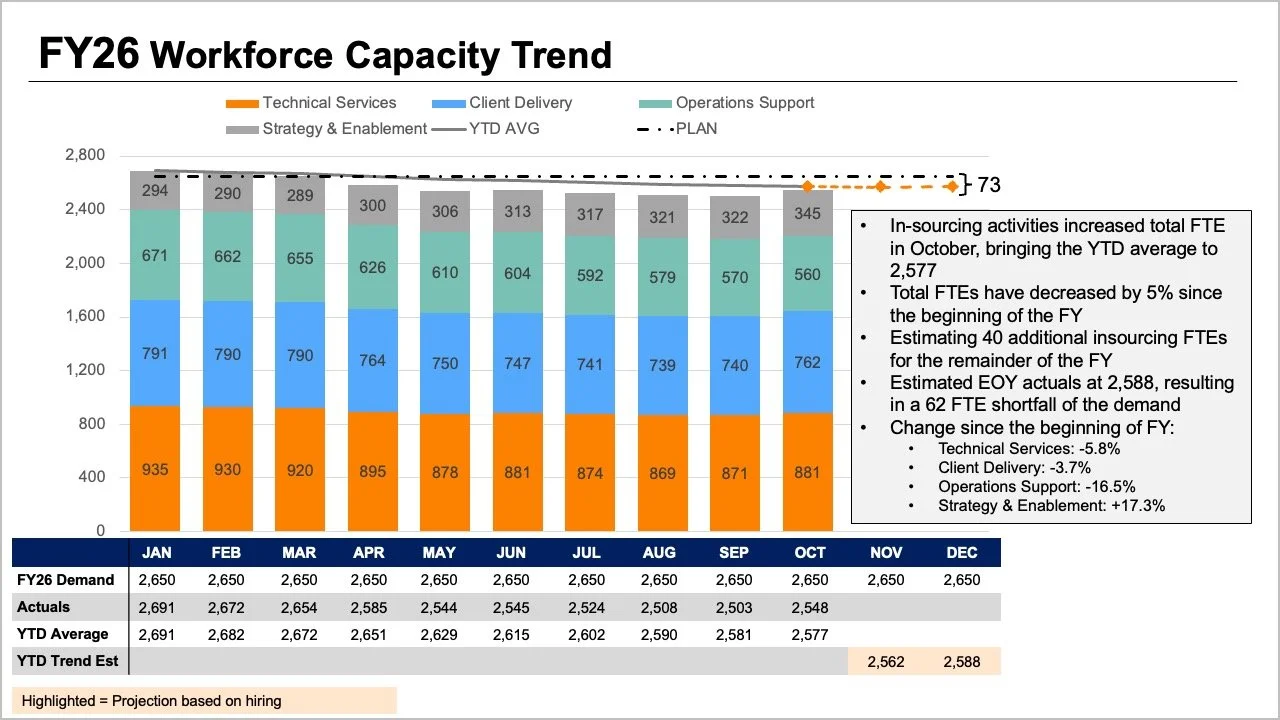
The original slide asks readers to follow several things at once. The tops of the stacked bars, the lines, and the data table all show overall FTE in different ways. The segments within the bars show the breakdown by role. Plan, actual, YTD average and projections add another layer to interpret.
Each element answers a reasonable question, but crammed together, they make it hard to answer any one question well. Taking a step back and considering what leadership would need for the conversation ahead helps guide how to show the information. Leaders need answers to two questions: How big a shortfall should we expect? And what do the latest staffing data tell us about where the change has occurred?
Rather than pack everything into one graph, we split it in two: one visual per question.
Use a line chart for the overall trend
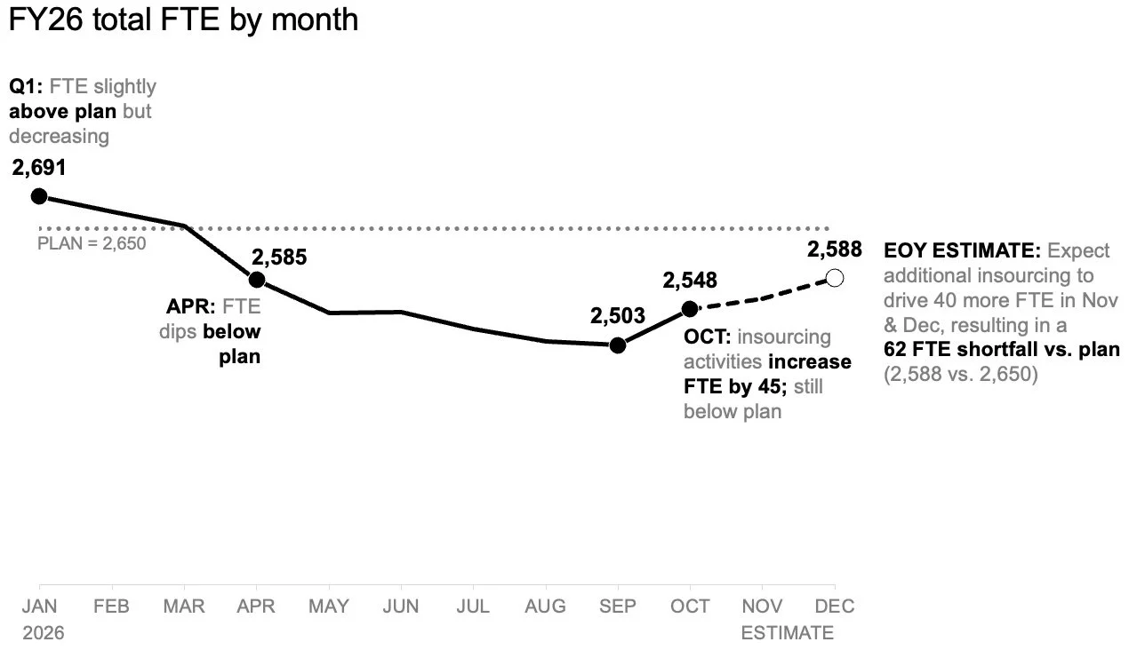
Let’s first tackle the anticipated shortfall. A standalone line chart makes it easier to see how staffing has tracked against the plan set at the start of the year and how the forecast compares with that plan going forward. This view also gives room to add annotations at the important points. Readers can focus on the expected gap to plan without first decoding the role mix or scanning the original table.
Add a second view for the role-level breakdown
The overall view establishes the expected difference to the target set at the beginning of the year. Next, we can look at the role-level changes in the actual data to help understand where the largest shifts have occurred.
Here, month-to-month variation matters less. Plotting only the start of the year and latest actual month with a slopegraph provides a quick sense of which roles changed most. Using color and words sparingly draws attention to the decline in operations support roles, helping the audience quickly see the largest difference.
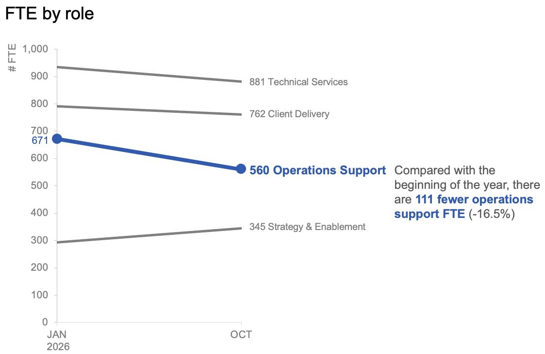
The two visuals work as a pair. The line chart answers, “What’s happening overall?” The slopegraph answers, “Which roles have changed most so far?”
Plan for how the story will be shared
For a summary that might be read or forwarded without a presenter, the two views can sit together on one page. A takeaway slide title states the expected shortfall, while supporting text points to the decline in the operations support roles and signals that leadership needs to discuss next steps. The charts provide the evidence without competing for the same space.
For a live presentation, we can use the same data differently. Rather than ask the audience to take in the whole summary at once while we speak to it, we can walk through the overall forecast first, then reveal the actual role-level changes piecewise, and finally turn the discussion to what needs to happen next. This sequence lets the audience absorb one point before moving to the next.
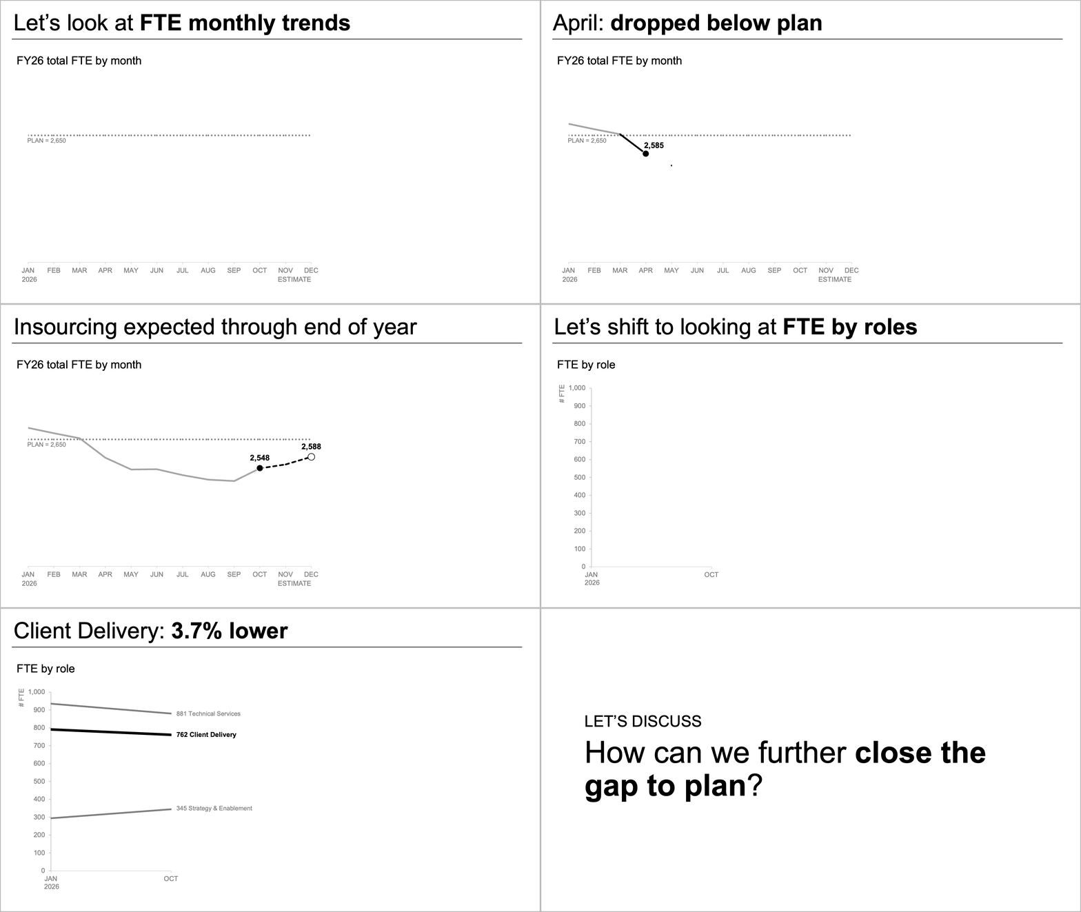
The data and message stay the same. What changes is how much the audience takes in at once.
Give each question its own view
When the full picture needs more detail, it's tempting to put everything into a single view. It can feel efficient. But more information doesn’t automatically create more understanding.
In this makeover, separating the overall FTE trend from the role-level changes made both insights easier to see. Together, these two charts tell a clear and focused story that leadership can act on.