SWD + AI: design effective graphs and slides
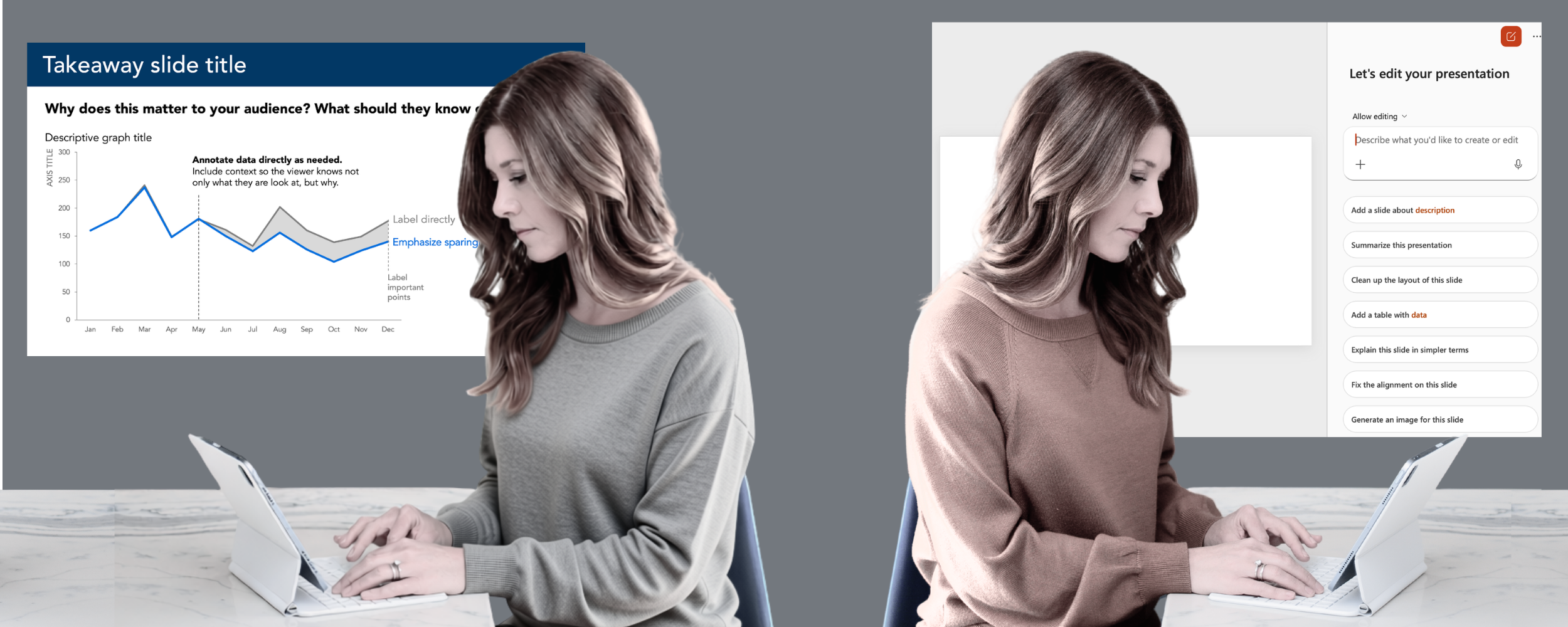
This post is part of the SWD + AI series—practical guidance for using AI as a thought partner across the various stages of your data storytelling work. If you’re just joining us, start with the first three installments: start with context, craft a story, and choose an appropriate visual. Explore all of our AI resources.
You’ve chosen your visuals. Now comes the work of actually designing them—and making sure they communicate clearly, direct your audience’s attention to what matters, and hold together as part of a cohesive presentation.
This is where many people spend the bulk of their time, and where the gap between “good enough” and genuinely effective communication is most visible. Whether it comes from a charting tool or AI, the first version of a graph is rarely ready to present. It needs to be decluttered, focused, and given the words that make it meaningful. A graph without a takeaway title makes your audience guess at the point. A slide crowded with data makes them work too hard to understand it. Getting this step right is what separates a presentation that informs to one that moves people to act.
It’s also a step where AI—given the right context and direction—can do a lot of the heavy lifting. Rather than building each slide from scratch, you can describe what you need, share your data, and let AI produce a first version to react to. It won’t be perfect, but it will be a starting point to work with—and getting there in minutes rather than hours changes what’s possible.
In this post, we’ll use AI integrated directly into PowerPoint—so the output is editable slides, not images. That’s an important distinction from the previous post: you’re not evaluating prototypes anymore, you’re building the real thing, and AI is helping you refine it in place.
Effective graph and slide design comes down to a few essential principles: removing what doesn’t belong, creating visual order through alignment, directing attention to what matters, and using words to make the message clear.
Declutter. Every element on a graph or slide contributes to cognitive load—the mental effort your audience spends processing what they see. Anything that doesn’t add informative value is clutter, and clutter makes your visuals feel more complicated than they are. The goal isn’t minimalism for its own sake; it’s reducing the extraneous so the essential stands out. In practice, this often means removing chart borders, gridlines, unnecessary tick marks, redundant labels, and default formatting that the tool added because it always does (not because it’s what serves your audience). When you take away what doesn’t belong, what remains gets stronger.
Align. When elements on a slide are misaligned—text starting at different points, graphs floating at inconsistent positions, titles not anchoring the content below them—the slide feels unintentional even if the viewer can’t articulate why. Consistent alignment creates a visual structure that your audience navigates without thinking about it. When design is thoughtful, it fades to the background; when it isn’t, your audience feels the burden.
Focus attention. A clean, well-aligned visual still leaves your audience to decide for themselves what matters—and they may not choose what you intended. The next step is to actively guide where they look. The most powerful tool for this is color used sparingly. When everything is the same color (or everything is a different color), nothing is emphasized. When one element is highlighted against a neutral field, the people look there immediately. Size, position, and contrast work similarly: make important things larger, place them where the eye lands first, and use visual weight to create hierarchy. The goal is to make the right thing obvious without having to say “look here.”
Use words wisely. Even the best designed graph needs words to make its point. Every graph needs a descriptive title that tells the audience what they’re looking at. Every slide needs a takeaway title—a sentence that answers the question “so what?” before the audience has to ask it. Axes should be titled. Key data points should be annotated where they add meaning. But more isn’t better; every word that isn’t earning its place is adding noise. The discipline here is the same as everywhere else in SWD: include what serves the audience, cut what doesn’t.
One more practical consideration: if your organization has a standard template or brand guidelines, start there. Colors, fonts, and layouts that align with your brand aren’t just aesthetic choices—they signal credibility and consistency to your audience. Before applying any of the principles above, make sure you’re working within your company’s visual identity. If you’re not sure what that looks like, check with your communications or design team.
These principles work together. Apply them with your audience in mind—what do they need to see, and what might get in their way? When design is working, it’s invisible: your audience isn’t thinking about the slide, they’re thinking about the message.
Working with AI: design effective graphs and slides
This is where having a shared foundation in SWD principles becomes especially useful. In earlier posts, we gave AI a few sentences of context before diving in. For this step, we recommend going further: share the SWD + AI primer with your tool before you begin. This free PDF download gives AI a grounding in SWD principles—including specific guidance on how to approach graph and slide design—and produces noticeably better results than prompting without it.
The workflow here is different from the previous posts in an important way that I mentioned earlier: rather than using AI as a standalone thought partner, we recommend using AI integrated directly into PowerPoint. This means the output is editable slides, not images. Tools like Copilot in PowerPoint and Claude or ChatGPT for PowerPoint all support this kind of integrated workflow.
You can come to this step with a draft slide you’ve already built and ask AI to help you refine it. Or you can describe what you want and let AI generate a first version to react to. Either way, AI can often get you 90% of the way there quickly—producing something clean, structured, and on-message that would have taken much longer to build from scratch. The remaining 10% is where your judgment comes in: the final tweaks to color, emphasis, wording, and alignment that make the difference between a good slide and a great one. Some of those refinements you’ll direct AI to make; others you’ll make directly yourself.
Before getting to the prompt and example, let’s review some potential pitfalls.
Things to watch out for:
AI may get decluttering wrong—it can add to many labels, callouts, and explanatory text, or strip away context your audience needs to understand the visual. Don’t equate clean with clear. Make sure every element earns its place, and retain the context necessary to understand what’s being shown.
AI may misuse color—it often suggests using multiple colors to distinguish categories, not understanding that strategic, sparing use of a single color is far more powerful for focusing attention. Watch for suggestions that add color complexity rather than reduce it.
AI will describe, not recommend—left unprompted, AI tends to produce neutral, balanced responses. Push it to tell you whether your takeaway title is doing its job and whether the message is clear.
AI-generated slides need your eye—especially when AI produces something that looks polished, apply your own SWD judgment before accepting it. Is it free from clutter? Is where to look clear? Are the words right? Does it tell the audience what to see and why that matters?
Be mindful of what you share—avoid including sensitive data or personally identifying information in your prompt.
Potential prompt: design effective graphs and slides
Before you begin, share the SWD + AI primer with your AI tool and ask it to use those principles when helping you design graphs and slides. Then proceed with the following.
Here is what I’m working on: [share your draft slide or graph, or describe what you want to create and provide the data]
My audience is: [briefly describe]
What this slide needs to communicate: [state your takeaway in a single sentence]
How it will be used: [for example, one slide in a live presentation, a standalone graph in a report]
Please help me create or refine this through the lens of clear, simple data communication.
With the primer shared and the prompt ready, let’s walk through an example.
In practice: design effective graphs and slides
If you’ve been following this series, you’ll recognize this scenario. I’m a People Analytics Manager at a mid-sized consulting firm, working on a presentation to recommend a change to our hybrid work policy. In previous posts, I identified my audience and formed a Big Idea (post 1), planned the story and developed a narrative arc (post 2), and chose the visuals I wanted to build (post 3). Now it’s time to design the slides.
For this step, I used Copilot in PowerPoint—which means the output is editable slides rather than images I’d need to rebuild from scratch. Before diving in, I shared the SWD + AI primer with Copilot using the suggested opening on the primer’s first page, giving it a grounding in SWD principles to work from.
After Copilot confirmed it would use the foundation learned from the primer, I followed with this prompt and a table of my summarized data:
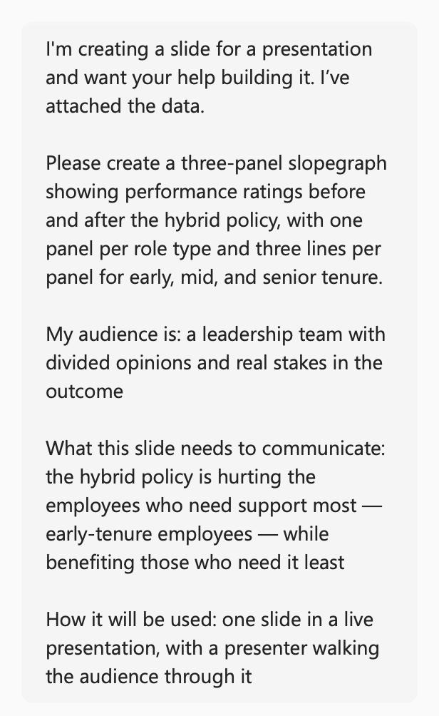
After doing a bit of “thinking,” Copilot asked me which visual direction should frame this high-stakes policy finding, outlining the options: Editorial Ivory and Red, Crisp White and Coral, Warm Paper and Ink, along with an option to enter my own specifics via text. I responded with my company’s standard font (Monserrat) and image of our color palette.
Here is the slide it created:
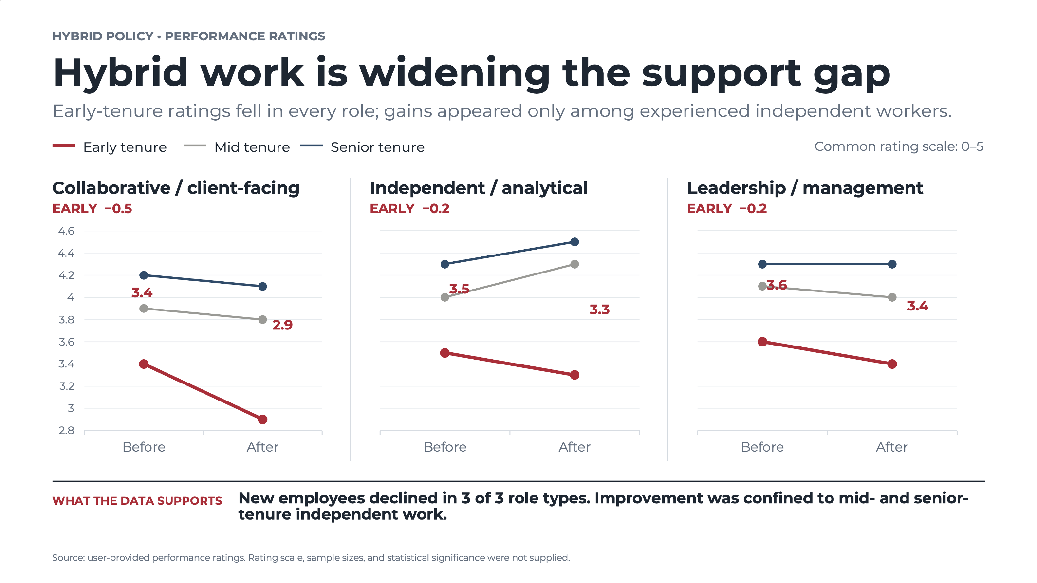
Copilot’s initial slide was a strong starting point: structured, on-brand, and closer to presentation-ready than anything I could have produced from scratch in the same time. But it wasn’t finished. The next step was to iterate, and I found it useful to divide that work into two categories: changes that require thinking and reconsideration, and changes that require craftsmanship and fine-grained execution. The first category is where I kept working with Copilot; the second is where I took over myself.
For changes where I wanted AI to reconsider the communication (not just move objects around), I kept the conversation going in the prompt window.
The most important issue was message hierarchy. The slide had three competing statements: a headline, a subtitle, and a takeaway at the bottom all making similar points. That’s too much repetition, and it dilutes the impact of each. I asked Copilot:
Review the title, subtitle, and takeaway at the bottom. They feel repetitive. Recommend a clearer hierarchy that communicates one primary takeaway, with supporting text only where it adds useful context.
This is a perfect AI task: there are multiple legitimate ways to solve it and I wanted its thinking, not just execution.
I also pushed on visual emphasis. The story is primarily about early-tenure employees, but the navy lines for leadership were fairly prominent, competing for attention. I asked:
The main story is the decline among early-tenure employees across all three role types. How would you strengthen focus on that pattern while keeping the other tenure groups available as context?
Finally, I asked it to pressure-test the headline itself. The graph shows performance ratings, not support directly—and “hybrid work is widening the support gap” is a stronger claim than the data strictly supports. I asked:
Review the headline against what the data actually supports. Is “support gap” too strong given that the data measures performance ratings? Suggest alternatives that preserve the intended message without overstating the evidence.
Here are Copilot’s responses:
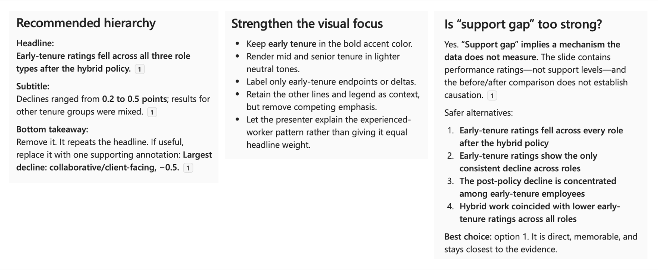
I confirmed the outlined changes and indicated I wanted the primary slide title to focus on the decline in early tenure performance after the hybrid work policy was introduced. After Copilot made the changes, the slide looked like this:
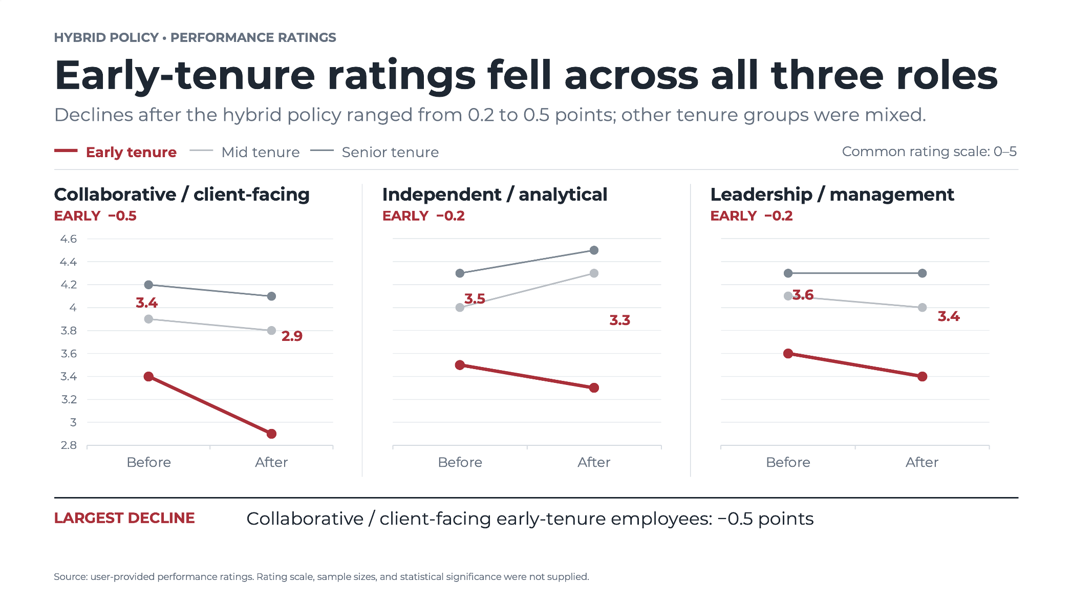
Once the conceptual decisions were made, I stopped prompting and took over myself. Detailed design work—exact font sizes, spacing, alignment, line weights, label positions, panel widths and margins—is faster to do directly than to describe to AI. The awkward label positioning on the red data points, for example, is exactly the kind of thing where I could spend five prompts trying to get Copilot to do something I can fix in a matter of seconds.
That said, I did turn back to Copilot for a few specific tasks where it genuinely saved time. Changing the y-axis scale across all three panels to run from 2.5 to 5.0—with consistent trailing zeros on whole numbers—was fast for Copilot to execute and would have meant a lot of clicking through graphs and menus for me. I also asked it to repeat the y-axis labels on the right of the panel group to facilitate comparisons, and to remove the x-axis tick marks. One thing to watch: when Copilot made this last change, it undid some of the changes I’d already made manually, so I had to ask it to restore those—and explicitly tell it not to touch what I’d done myself.
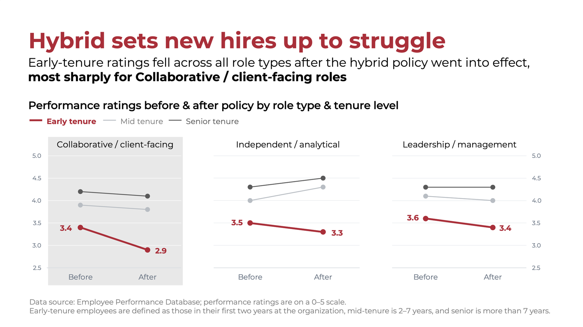
The work I kept for myself was largely about language. AI writes polished copy, but just because it’s polished doesn’t mean it’s right. The words it chose were reasonable starting points, but they weren’t exactly what I wanted to say. Reading every word critically and rewriting where needed is an important step that only you can do. Beyond the language, I removed the extraneous elements, adjusted label positioning and spacing, modified the size and weight of some text, colored the headline to tie visually to the relevant data, added light gray background shading to the Collaborative/client-facing panel, and changing the gridlines on that panel to white. (Yes, I usually remove gridlines, but in this case I wanted to keep them to make it clear that the same y-axis range applies across all three graphs, and so people can easily estimate the non-labeled data points.)
After about ten minutes of this work, here is my resulting slide:
This same approach can work for text-based and concept slides—those that carry your message through words, diagrams, or a simple visual rather than a graph. Share the primer, describe what the slide needs to communicate, and ask AI to create a first version. As with the data slide, expect to do the conceptual refinements in the prompt window and the fine-grained language and design work yourself. To reiterate: the language AI chooses will often be close but not quite right—read it critically and rewrite where needed.
If you find an example slide you want to emulate—a layout, a structure, a visual approach that works well—you can share this image with AI alongside your content brief and ask it to build something similar. This is particularly useful for data slides where the design logic is already solved and you just need to apply it to your own data (Alex explored this approach for a recent makeover). This is a powerful shortcut that can save significant time while keeping you in control of the final result.
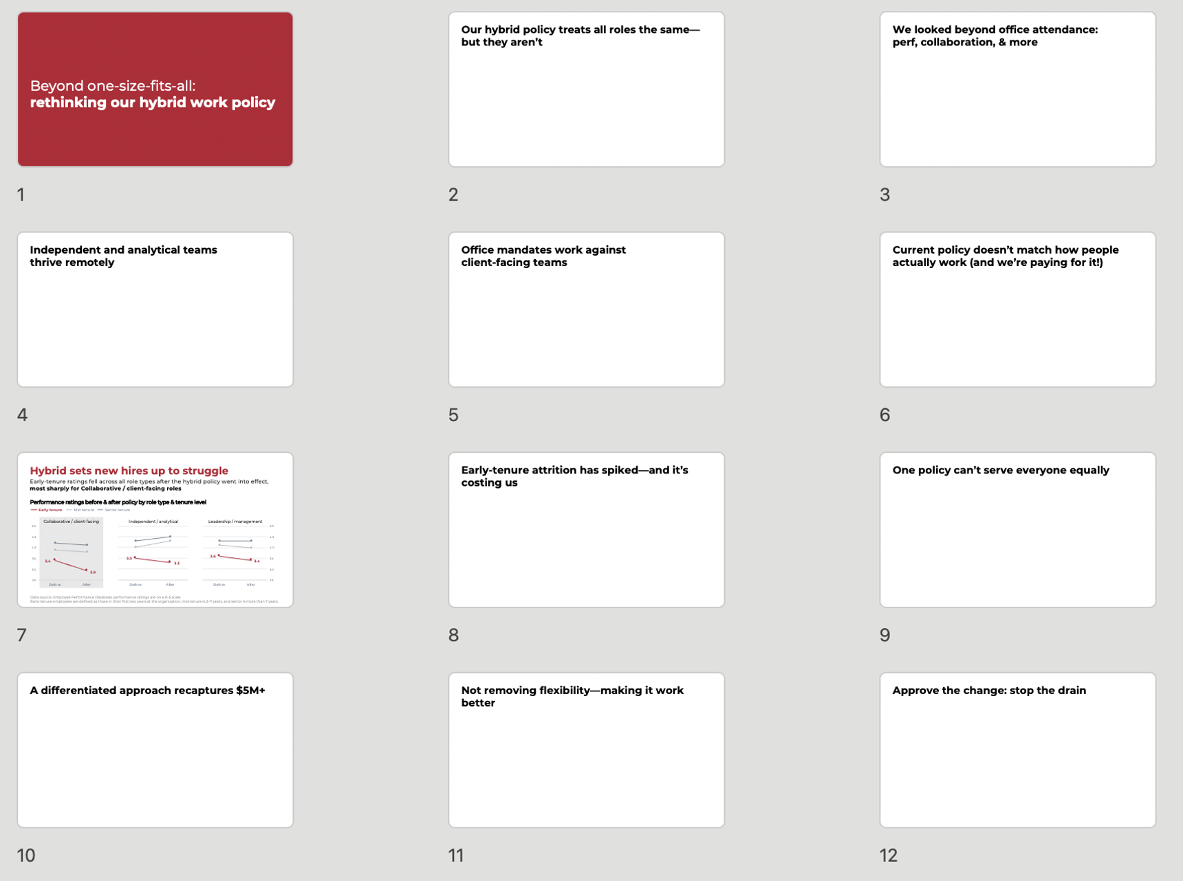
Before wrapping up, I wanted to try one more thing: asking Copilot to build out the rest of the deck from the takeaway titles we developed in the story planning post. Rather than designing each slide one at a time, I shared all eleven titles and asked Copilot to create a full draft deck. It wasn’t perfect, but it got me further faster—similar to what we saw with its initial drafts of the slides—and gave me something concrete to continue to refine.
Below is the slide sorter view: a title slide, followed by the eleven takeaway titles we crafted previously, each on its own slide and ready to be built out—including slide 7, which we designed in this post. In a matter of minutes, Copilot turned a list of titles into a structured deck. The story arc is visible, the narrative is in place, and the hard thinking is already done. From here, I can work through the remaining slides in the same way I did with slide 7: prompting Copilot with specific guidance to build a first version for each, iterating on the conceptual decisions in the prompt window, then taking over myself for the language and detailed refinements. What remains is the craft—which is the part I truly love—and I have a clear path to get from here to the completed deck.
Don’t forget: if you haven’t already, download our free SWD + AI Primer to help apply SWD principles when working with AI.