SWD + AI: choose an appropriate visual
This post is part of the SWD + AI series—practical guidance for using AI as a thought partner across the various stages of your data storytelling work. If you’re just joining us, start with the first two installments: start with context and craft a story. Explore all of our AI resources.
Now that we have the story planned, it’s time to start developing the content that will support our message and narrative. When data is part of that, a good first step is choosing a visual that aids in comprehension. The right graph makes your point immediately clear. The wrong one makes your audience spend their mental energy decoding the graph instead of understanding your message.
This is where people sometimes stumble. They use the first chart that comes to mind—or simply carry forward the one they used during exploratory analysis. But a graph that works for exploring data isn’t necessarily the best for communicating it. Your audience and takeaway should drive the choice. By this point, you’ve already done that work: you know your audience, you’ve planned your story, and you’ve written takeaway titles that tell you exactly what each graph needs to show. Let those sentences guide your design.
A handful of graph types meet most everyday needs—here are the ones we use most at SWD (from storytelling with data: before & after, Wiley 2025):
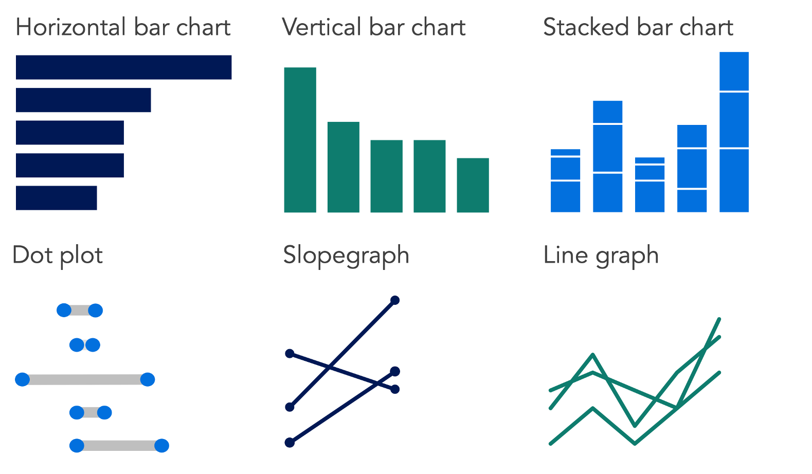
Bar charts compare across categories. Dot plots and slopegraphs emphasize change between two points. Line graphs show change over time. When in doubt, familiar works: your audience shouldn’t have to learn how to read a graph before they can understand your message. Use something less familiar only when it reveals an insight that would otherwise be difficult to see. (For more on when to use these and other common visuals, check out the SWD chart guide.)
Choosing an effective visual is rarely a straight line from first attempt to finished graph. You try one form, realize it emphasizes the wrong thing, try another, get closer. This iterative process—experimenting with different views of the same data to find the one that best serves your message—is one of the most valuable things AI can accelerate. The outputs are often rough and may take some back-and-forth to get right. Still, rather than spending time building a chart only to realize it doesn’t work, you can prototype options quickly, evaluate them against your takeaway, and commit to a direction before investing in the final build.
Working with AI: choose an appropriate visual
If you’re following this series in order, you already know what you want to show—your takeaway titles from the storyboarding step outline this. If you’re coming to this post independently, or you’re still in exploratory mode, AI can help you figure out what’s worth visualizing first. Share your data and ask it to surface patterns or trends worth highlighting. Once something interesting emerges, pause to articulate the takeaway before moving into prototyping. Either way, that articulation step is key—it’s what will turn a prototype into a purposeful visual.
From there, the workflow is straightforward: tell AI what you want to communicate, share your data, and ask it to suggest options. You don’t need to clean or aggregate the data first—that’s part of what AI can handle. For each prototype, ask AI to explain the tradeoffs: what each option makes easy to see and what it obscures. You’re not looking for AI to make the decision; you’re using it to quickly surface options you can evaluate with your own judgment and knowledge of your audience and goals.
Once you’ve chosen a direction, build the chart in your tool of choice—either yourself or with the help of AI features within your tool. We’ll explore the latter in more detail in the next post in this series. Either way, it’s important that you remain responsible for the accuracy of what’s shown.
Before getting to the prompt and example, let’s review some potential pitfalls.
Things to watch out for:
AI optimizes for the data, not the message—without clear direction, AI may try to visualize everything you give it or suggest a chart that represents the data accurately but doesn’t communicate your point. Lead with your takeaway, and be explicit about which data matters to the story.
AI may suggest unfamiliar chart types—it may recommend something technically interesting but unfamiliar to a general business audience. Push back if it suggests something your audience is unlikely to recognize immediately.
AI-generated prototypes aren’t finished work—use them to evaluate direction and spark ideas, then build the final chart yourself. When you build it from your own data, you also control the accuracy of what’s shown.
Be mindful of what you share—avoid including sensitive data or personally identifying information in your prompt. If your raw data contains details you’d rather not share, aggregate into a summary table or anonymize it before passing it to AI.
A note on tools: chart rendering capability currently varies significantly across toolsand account tiers. For the planning and thinking steps in this series, any tool can assist you. For visual prototyping, however, you’ll get better results with tools that can render actual chart images. Even then, it sometimes takes multiple prompts to get actual images in the output, rather than text-based approximations of the charts.
In my testing for this article, Copilot and the free version of ChatGPT struggled to render chart images for visual comparison, while the free versions of Gemini and Claude generally produced stronger results. These capabilities are evolving rapidly, so your experience may differ as the tools improve.
The paid tiers generally produced the strongest results overall, so if you have access to one, it’s worth using for this step. If not, the free version of Gemini is currently your best bet among the tools we tested. If you want to maximize your options, you could even copy and paste your prompt across multiple tools to generate a set of approaches to choose from or iterate upon.
Potential prompt: choose an appropriate visual
If you’re continuing in the same AI conversation from one of the previous steps (start with context, craft a story), your context is already established and you can jump straight to the prompt below. If you’re starting a new conversation, take a moment to briefly orient AI: describe your audience and note the key message you’re trying to communicate visually. A few sentences should suffice.
I’m working on a data visualization for a presentation and want to explore chart options. I’ll share the context and my data. Act as a thought partner to help me identify and prototype effective visual options.
My audience is: [briefly describe]
I want to show: [state your takeaway in a single sentence]
How it will be used: [describe the context—for example, a single slide in a live presentation, a standalone graph in a report or email—and the goal, such as informing, persuading, or prompting a specific action]
Here is my data: [paste your data, aggregated table, or describe the dataset]
Please generate 2–3 charts that could work well for this message and audience. Render the graphs so I can evaluate them visually. For each, briefly explain what it makes easy to see, and what it might obscure.
Before making suggestions, ask me any questions that would help you give better input.
Note: if the output looks code-like or uses text and symbols to approximate the charts rather than rendering them visually, follow up with: Can you render the graphs as actual images so I can compare them visually?
Let’s look at an example.
In practice: choose an appropriate visual
If you’ve been following this series, you’ll recognize the scenario. I’m a People Analytics Manager at a mid-sized consulting firm. My team has completed a thorough analysis of the company’s hybrid work policy—examining performance ratings, in-office attendance patterns, collaboration network data, and attrition trends. We have a recommendation: move from the current three-days-in-office, two-days-remote policy for all employees to a differentiated approach based on role and team type.
In the first two posts, I worked through the context and story planning stages. I identified my audience and what’s at stake, formed a Big Idea, built a storyboard, and developed a narrative arc with takeaway titles for each planned slide. Now it’s time to start creating the actual content—and for several of the slides, that means choosing and building effective graphs.
I’ll work through two of those graphs here, each supporting a different point in the story. For the first—showing how early-tenure attrition has increased since we implemented the hybrid policy—I used Gemini. As mentioned, this tool had the best output across the free tiers that I tested (the others were Copilot, ChatGPT, and Claude). For the second—showing how the policy is affecting different employee groups in opposite ways—I used ChatGPT Plus. I followed the same prompting approach across both. In practice, you would likely continue with the same tool; I’m varying which I partner with here to give you a general sense of the output and how different tools handle this task.
Graph 1: attrition rates by role type and tenure
I gave Gemini the general prompt shared earlier, with the following specifics:
My audience is: a leadership team with divided opinions and stakes in the outcome
I want to show: early-tenure attrition has spiked since we implemented the hybrid work policy
How it will be used: this will be a single graph that is part of a larger live presentation; the ultimate goal is to persuade the leadership team to move to a new differentiated policy
I shared a data table that summarized attrition rates pre- and post-hybrid policy by role type and tenure.
Gemini asked a few clarifying questions before proceeding—useful for orienting the tool, though by this point in the process I already had clear answers to all of them. It posed questions about the proposed differentiated policy (whether I’d be advocating flexibility based primarily on tenure, role type, or both), where the expected pushback would come from, and whether the leadership team prefers traditional graphs or if something less familiar would be acceptable.
After answering the questions, Gemini gave me three options: a slopegraph, grouped bar chart, and dumbbell graph. It explained that it chose gray to signify the Before Policy baseline and the Mid and Senior tenure segments where no dramatic change occurred, and red to highlight the Early tenure attrition post-policy, where the change was most dramatic.
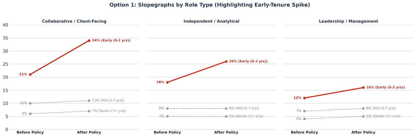
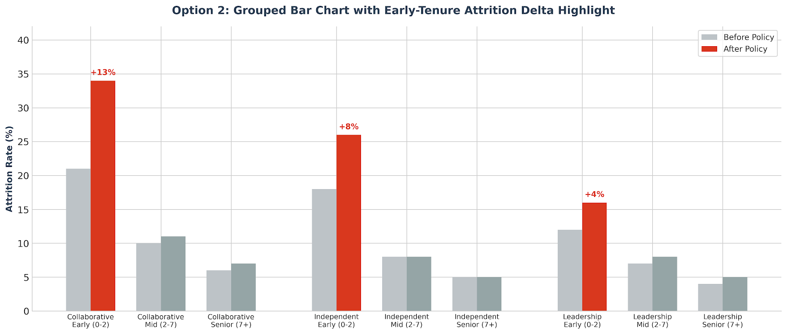
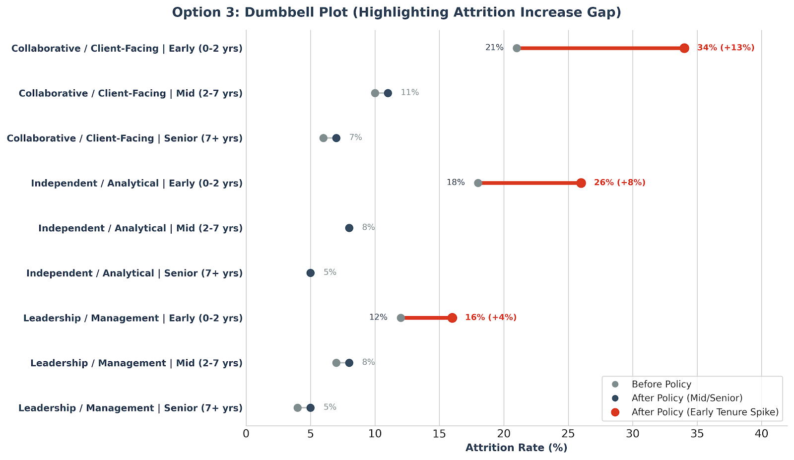
These were accompanied by a table that explained for each why it’s powerful (what it makes easy to see) and what it may obscure (trade-offs). For example, for the slopegraph it stated, “It shows that all early-tenure groups were impacted, but highlights that the Collaborative group had the most extreme shift. The ‘story’ is instantly visible.” For trade-offs, it shared that the grouped bar chart “design can become very visually heavy and busy with 18 bars,” and that “if the audience is not familiar with dumbbell plots, they might need a moment to understand that the dots represent ‘Before/After’ points.”
Gemini recommended the slopegraph for this situation. It also shared the following to help think through how each might work in a live setting:
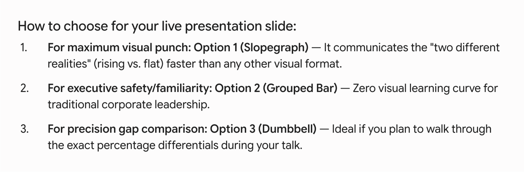
Gemini gave me some decent options here. I prefer the first two; the dumbbell, though interesting, feels unnecessarily complicated, and would take a lot of explaining before we could focus on what the data is showing. I agree with Gemini, that the slopegraph in particular makes the change between before and after the policy easiest to see (both where things have been stable in the higher tenured groups and where it clearly has not for the early tenure employees). The familiarity point about the grouped bar chart is worth keeping in mind.
If I needed a quick and dirty view for my own use, either of these would give me a useful starting point. Given the high stakes in my situation, I’ll want to recreate and customize the design for my audience. As I think ahead to the live presentation, I can imagine starting with overall attrition by tenure in a familiar grouped bar chart. From there, I could transition to a slopegraph, using the movement from one form to the other to make sure my audience knows how to read the slightly less familiar visual. Once that structure is established, I can move to the panel of three slopegraphs showing the breakdown by role type. I’ll recreate the visuals for this so I can have full control over the design details. I’ll use AI to help with it in the next post.
In the meantime, let’s look at some options for another important visual in my presentation.
Graph 2: performance ratings by role type and tenure
Next, I worked with ChatGPT Plus. I gave it the general prompt with the following specifics:
My audience is: a leadership team with divided opinions and stakes in the outcome
I want to show: the hybrid policy is hurting the employees who need support most
How it will be used: this will be a single graph that is part of a larger live presentation; the ultimate goal is to persuade the leadership team to move to a new differentiated policy
I shared a data table that summarized performance ratings before and after the hybrid policy by role type and tenure.
ChatGPT’s questions were more analytically focused than Gemini’s—asking about sample sizes, confidence intervals, and cohort definitions. It also asked how much to editorialize in the graphic itself (not yet: I’ll do that in a later step). I answered the questions and asked it to proceed.
Here are the options ChatGPT suggested and the tradeoffs for each:
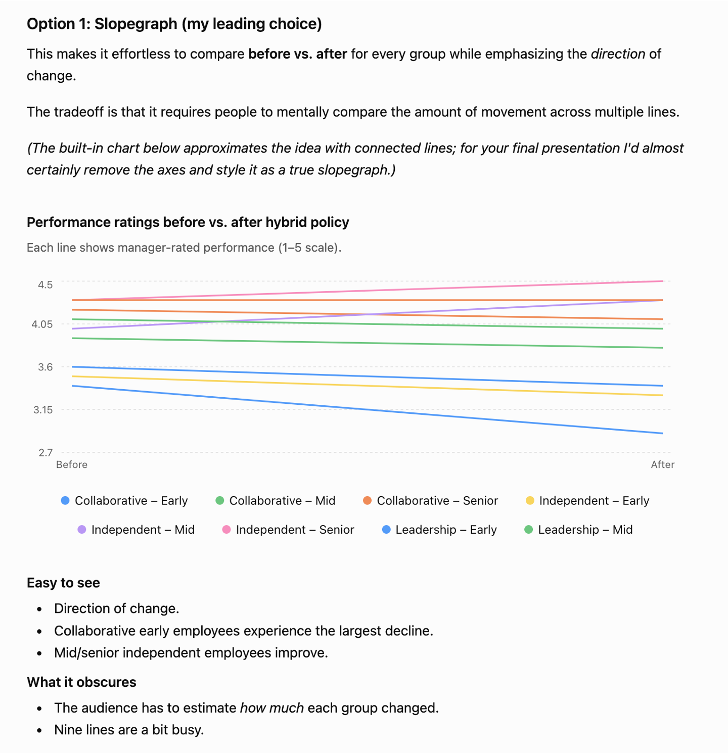
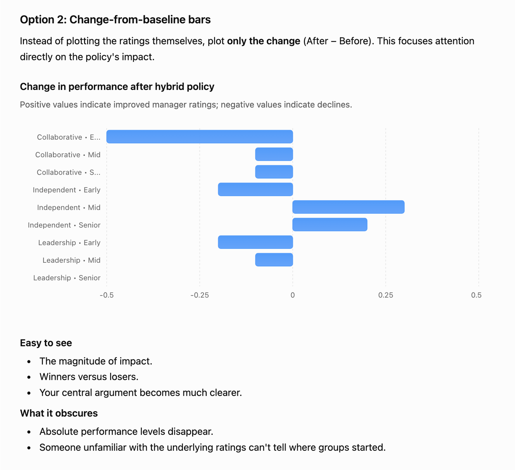
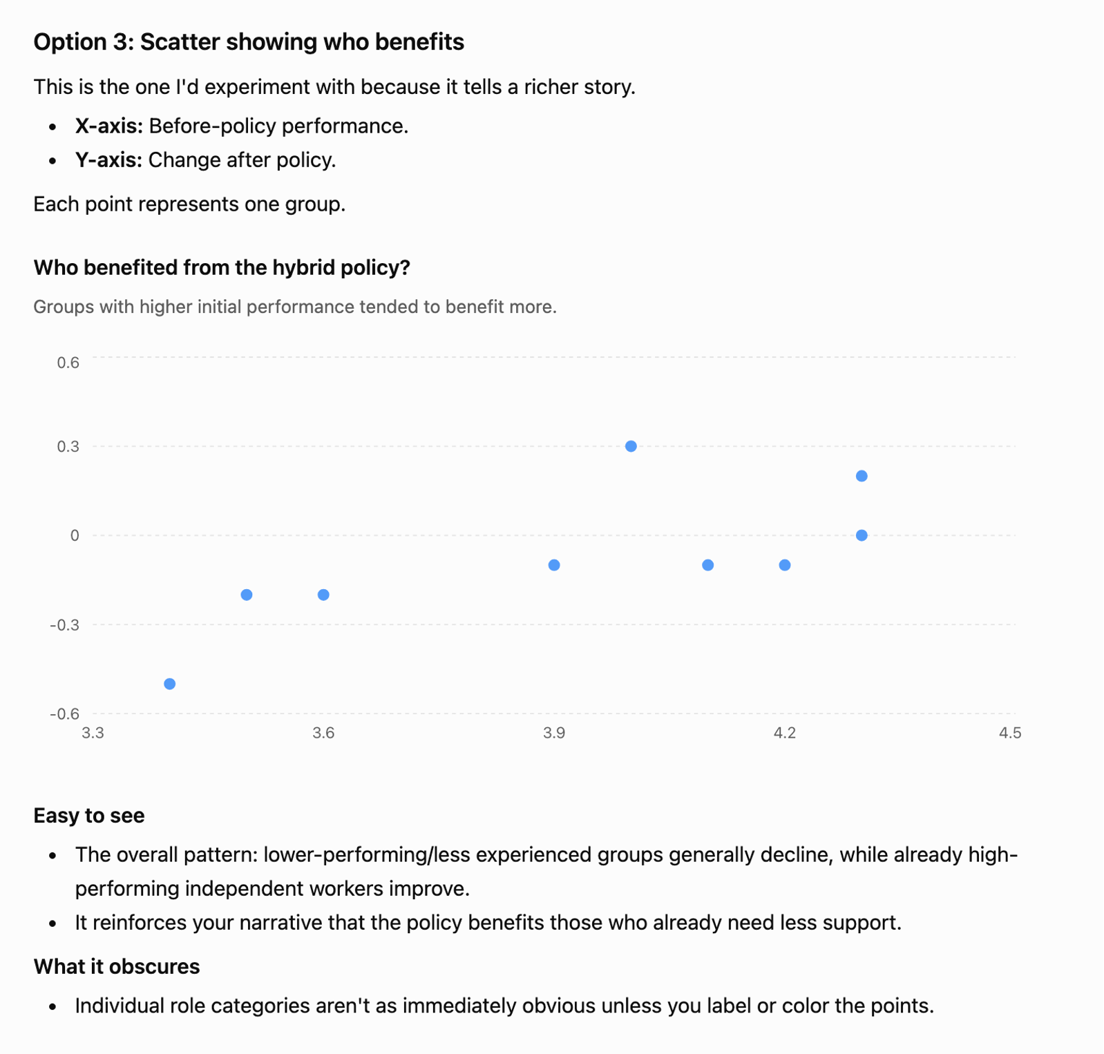
ChatGPT also offered “One additional idea I’d seriously prototype—a 2x3 small-multiple slopegraph.” It originally shared a prototype that was a little messy (see below). Note the narrative it outlines to accompany it—I found this a useful reminder of how the graph fits into the broader story, even if the visual itself needed work.
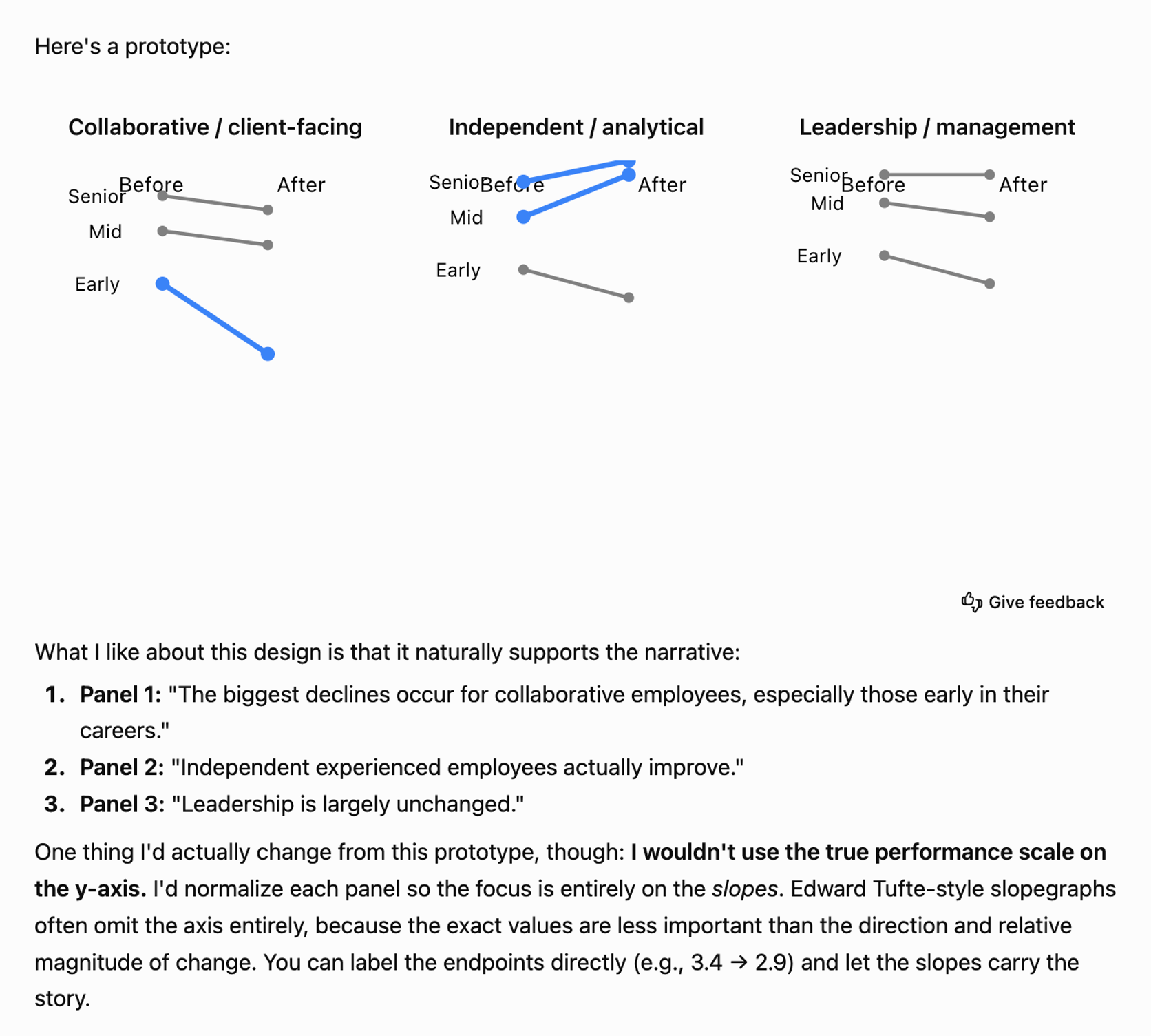
When I asked it to clean up the image, it confirmed I was okay with a mockup rather than a data-perfect chart, then shared the following:
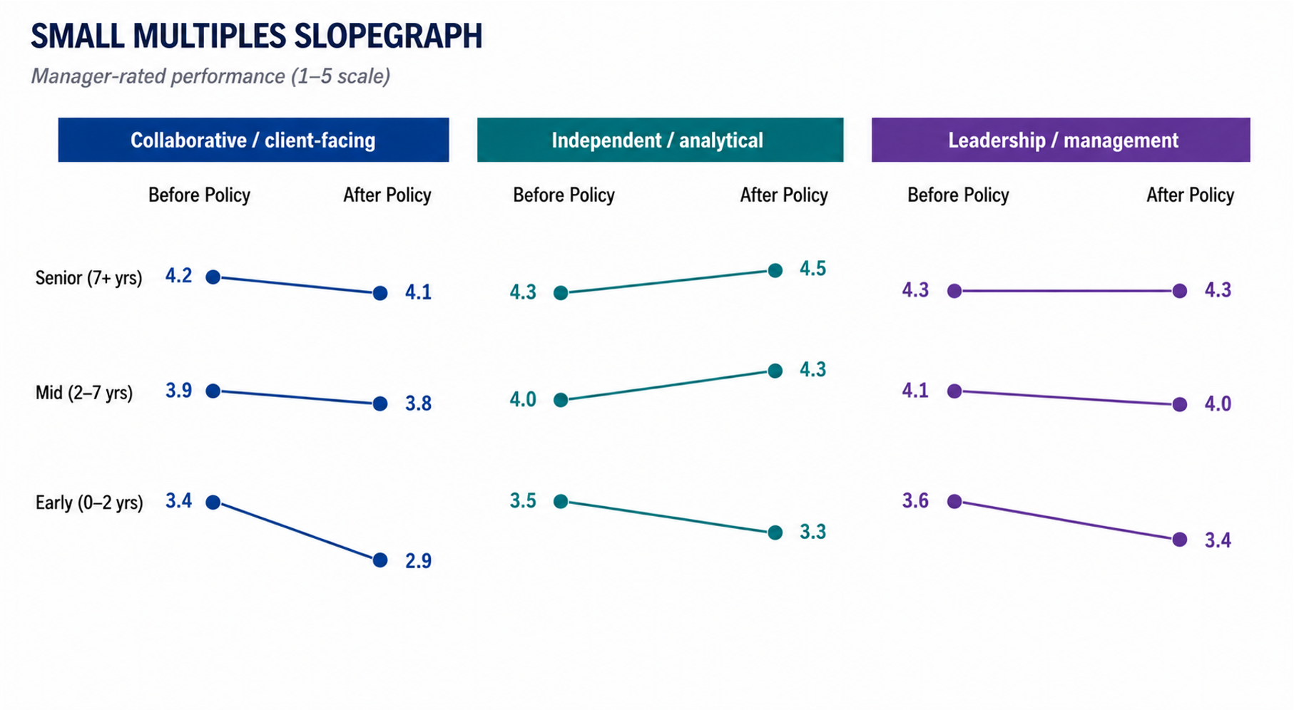
Like it did for attrition, the slopegraph makes the areas of change stand out among the mostly flat lines. Looking back at ChatGPT’s initial suggestions, I had thought the diverging bar chart showing change from baseline would be workable—but this small-multiple slopegraph is clearer. We get the absolute numbers in addition to the change, whereas the diverging bars only showed the latter. Using the same graph type as the attrition chart has another advantage: by this point, my audience will already know how to read it, reducing the cognitive load for interpreting this data.
More broadly, this exercise reinforced a few things I’ve learned about working with AI. AI prototyping for visual choice is still imperfect. Getting usable chart images sometimes takes more back-and-forth than you’d like. This should improve with time. Even today, though, it’s often faster than sketching by hand or iterating directly in a graphing tool, and it surfaces concepts you might not have considered—particularly if you’re still building your repertoire of visual approaches. A few things worth trying: ask for more options if you want a broader set to evaluate, share a rough sketch with your tool if you have a specific idea in mind, or bounce between tools to see how different ones handle the same data.
The visuals I’ve chosen here are starting points, not finished graphs. In the next post—designing effective graphs and slides—I’ll return to some of these and work through how AI can help refine them: cleaning up clutter, focusing attention, and making them presentation-ready.
In the meantime, if you want to go deeper on using AI for data storytelling, watch the recording of our recent live event, where Simon and I share additional tips and examples.