apply color thoughtfully in your graphs
One of our top tips for explanatory communications is to use color sparingly and purposefully to help your audience understand your data and message. Color should be an explicit choice, not something your software applies by default, whether that's a graphing tool or an AI assistant generating your first draft. These tools can build a chart in seconds. They might even add highlighting on their own. But they don't know which data matters most to your audience. That call is still yours. Used thoughtfully, color is often one of the quickest ways to improve a graph.
If you struggle with how to do this in Excel (or with charts embedded in Microsoft Word or PowerPoint), this post will walk you through the steps.
Let’s consider an Excel graph, which shows year-over-year (YoY) change in sales for cat food brands from a pet food manufacturer. This example comes from exercise 4.2 of storytelling with data: Let’s Practice! You can download the data to follow along.
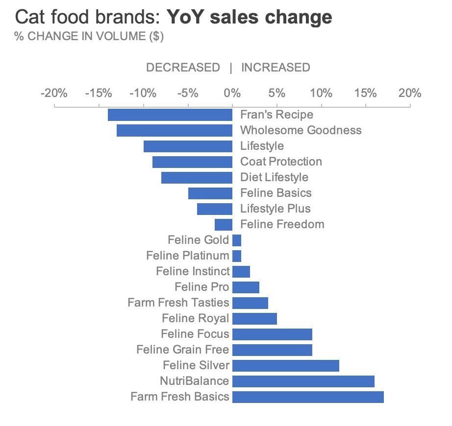
Start in greyscale
A good way to start is with shades of grey and then use color only where you want your audience to focus. A greyscale chart gives you a neutral foundation and serves as a reminder that more work needs to be done before it's presented, making it easier to be deliberate about where color belongs.
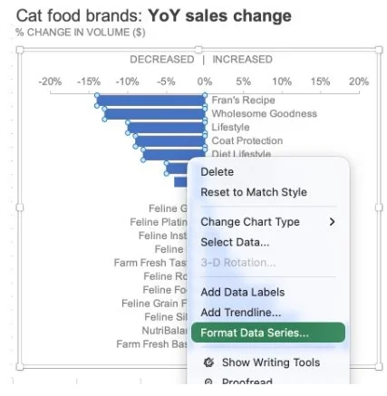
Begin by removing Excel’s default colors and replacing them with a shade of grey. Right-click on the chart and choose Format Data Series.
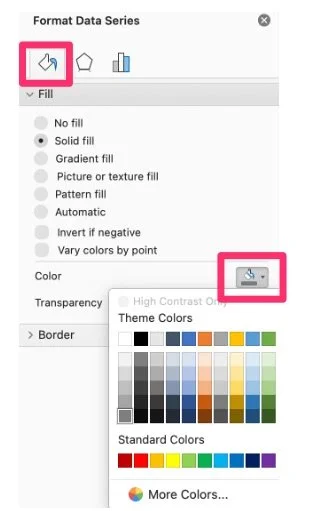
In the Format pane on the right, go to Fill & Line (the first tab with a paint bucket icon) and set the fill to a neutral grey.
If your graph had multiple series, you’d repeat as needed for the other bars until the full chart is in grey.
Tip: once you’ve created a clean greyscale version, save it as a reusable template so you don’t have to repeat those steps.
Highlight what matters
Let’s assume we want to call attention to the brands that declined year over year. To focus on these brands, we could choose to only color those bars. For accessibility purposes, we’ll avoid red and instead choose orange, a hue that reinforces the negative sentiment.
To color only the declining bars in Excel, click once on the bar you want to color. Then, click again to select just that specific bar (this avoids coloring all the bars at once). Right-click and choose Format Data Point. In the Format pane, go to Fill & Line (paint bucket icon). Under Fill, choose Solid fill and select the desired color.
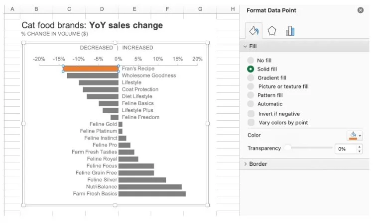
Repeat for each declining brand, leaving the increasing brands in grey. Or, as a shortcut, you can simply click on the next bar and use Cmd+Y on Mac or Ctrl+Y on Windows to repeat formatting.
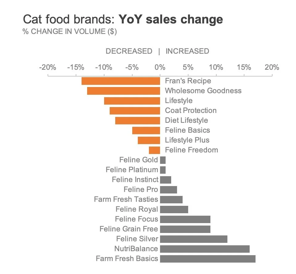
Coloring just the negative values tells your audience exactly where to look. Now imagine that within the declining brands, we want to specifically highlight the two brands that decreased the most: Fran’s Recipe and Wholesome Goodness. We could make those orange and everything else grey, but that would lose the signal for brands with lower sales this year versus last year. Instead, let’s vary the color's intensity to draw extra attention to the two biggest drops.
There are at least three ways to do this:
Color the two bars a darker orange and the others a lighter orange.
Change the transparency for the bars you want to deemphasize.
Overlay a transparent white shape on the other bars to create a stronger visual emphasis on the two bars at the top.
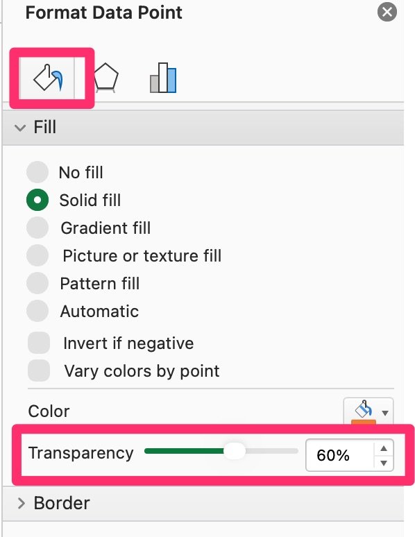
To manually vary the color in Excel—the first option—follow the same steps above but select a lighter or paler orange for the declining brands that are not Fran’s Recipe and Wholesome Goodness. Alternatively, you could keep the same color hue and adjust the transparency within the Fill menu (second option).
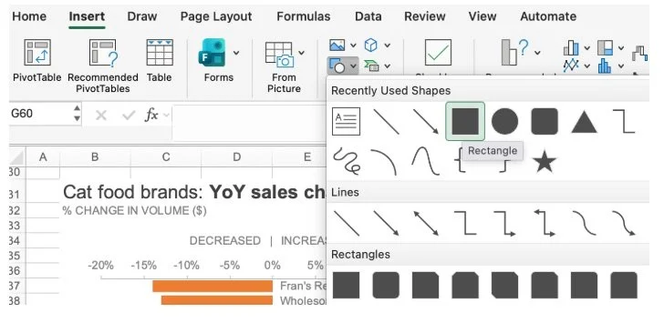
For the transparent shape, or the third option, insert a rectangle object (this shape works well for bar charts) over the other decreasing brands.
Then format the rectangle with a white fill, no outline, and the desired transparency.
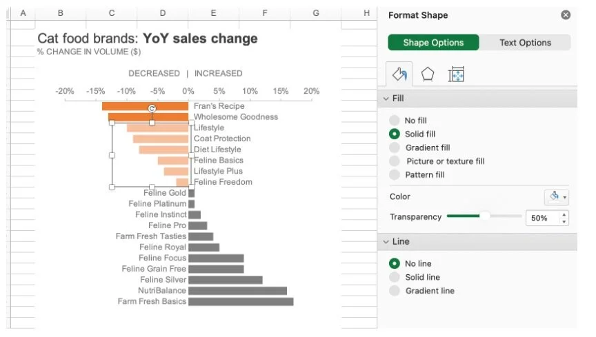
By varying the color intensity, we can highlight all the declining brands while bringing greater focus to the largest negative changes.
Include words for clarity
Imagine we need to share this graph for an audience to consume independently. If we are not able to walk through the information with them, we can pair the designed chart with explanatory text to make the point clear. A text annotation next to the data, with key words bolded and colored the same orange, visually ties the words to the data, making the takeaway quick to see and understand.
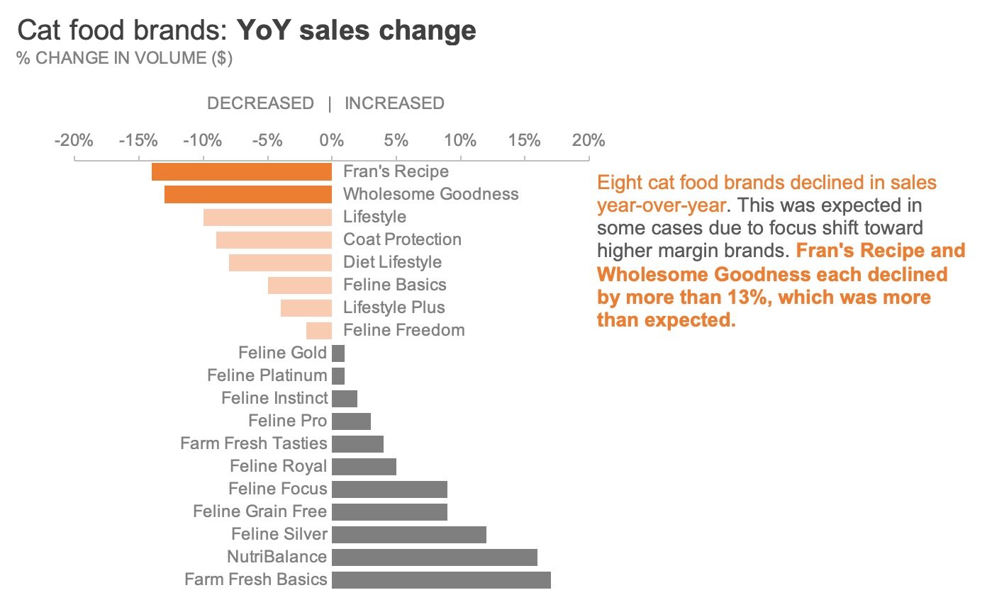
Color should support your message, not distract from the data. The best charts use a restrained palette, purposeful highlighting, and clear words to guide the audience to the intended takeaway.
For more Excel how-to’s, check out our tutorial library. And if you want to see these same concepts applied to a line chart, look at our related post on emphasizing a data point.