pre-reads and presentations are not the same
“Can you send me your slides before the meeting?”
This is a totally reasonable request if it happens often in your organization and you’ve planned for it. However, it might trigger mild panic if you were only planning to present the material live. A slide designed to support a spoken presentation is fundamentally different from one created for independent reading. Yet we don’t always make this distinction, which can lead to trouble.
In a recent team training, a client shared a slide intended to do three distinct jobs:
Serve as a pre-read for finance leadership before the meeting,
Support their live presentation, and
Work as a leave-behind reference after the meeting.
While it can feel efficient to design your communication to meet multiple needs like this, it can easily backfire. When you try to make a single slide work for different situations, you’re forced into compromises that mean it doesn’t fully satisfy any of them. The result? Communications that are too dense to present live, yet too sparse to stand on their own. When we know the scenario we are designing for, we can tailor the materials specifically to that setting.
Let’s look at the client’s original slide (anonymized for confidentiality), which tried to satisfy all three needs at once. Then we’ll explore ways to improve it.
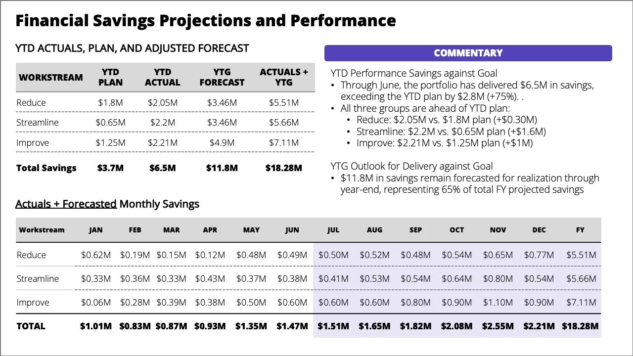
As a standalone slide, the commentary provides helpful context, but the core message isn't clear. The reader has to work to identify what matters and why. A strong pre-read should help leaders arrive informed and ready to discuss, rather than leaving them scanning through tables before the meeting.
In a live setting, this slide creates immediate friction. The busy tables and bulleted text force people to split their attention between reading the screen and listening to the presenter. Even if the audience read it in advance, they'll spend time hunting for details as you speak rather than engaging with the message. A live delivery is more effective when attention is deliberately guided by revealing one idea at a time instead of showing everything at once.
Start with the purpose
Being specific about the situation helps to improve design. Ask what the slide needs to do, who will use it, and in what setting. Once those are determined, it becomes much easier to shape the story and choose the right format.
The overall message the client wanted to communicate in the original slide was that, although the year-to-date performance is ahead of plan, a lot of work remained to achieve the forecast. The main action was to reiterate the priorities to ensure the team remained focused on the three workstreams and to quickly escalate any blockers to achieving the projected savings.
Articulating the goal helps determine what stays, what goes, and how to structure the narrative for each situation.
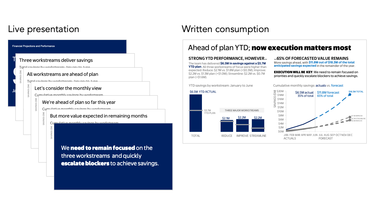
Let’s consider the live delivery first. When presenting in person, you don't need to cram every detail onto a single view because you control the pacing. Instead of showing everything at once, break the content into a sequence where each slide supports a specific point.
Here is how we could progress through the same information for a live audience:
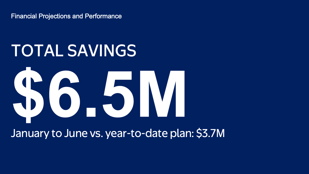
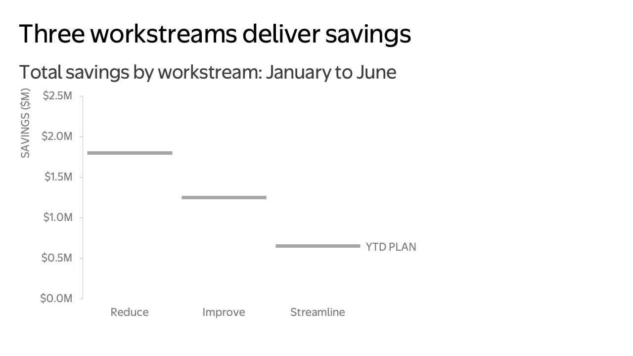
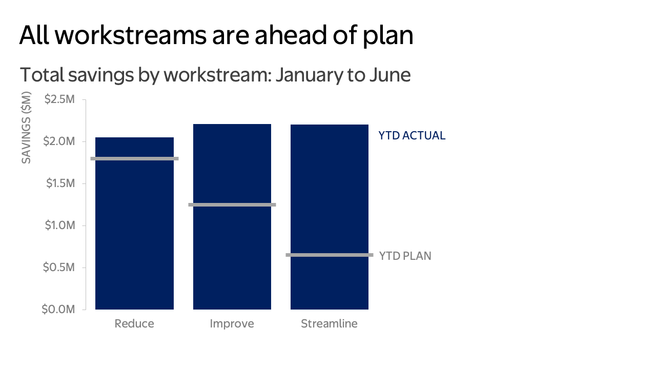
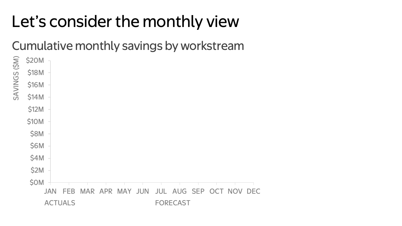
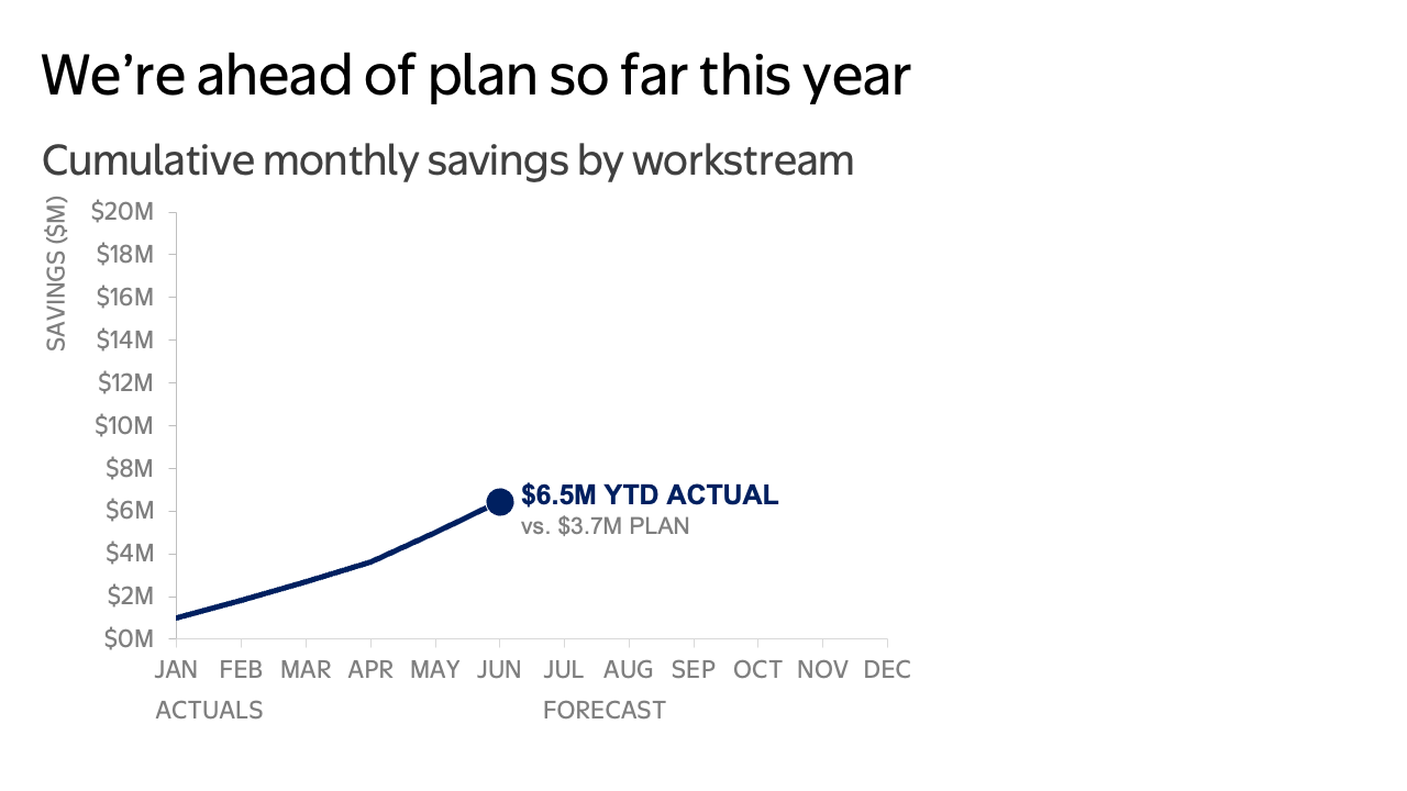
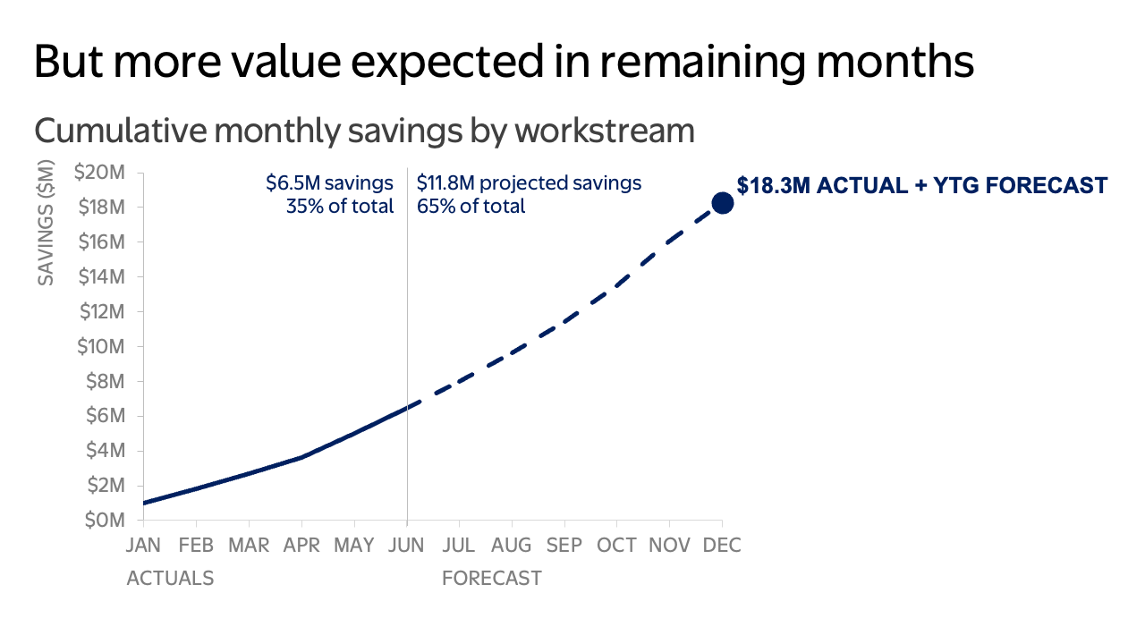
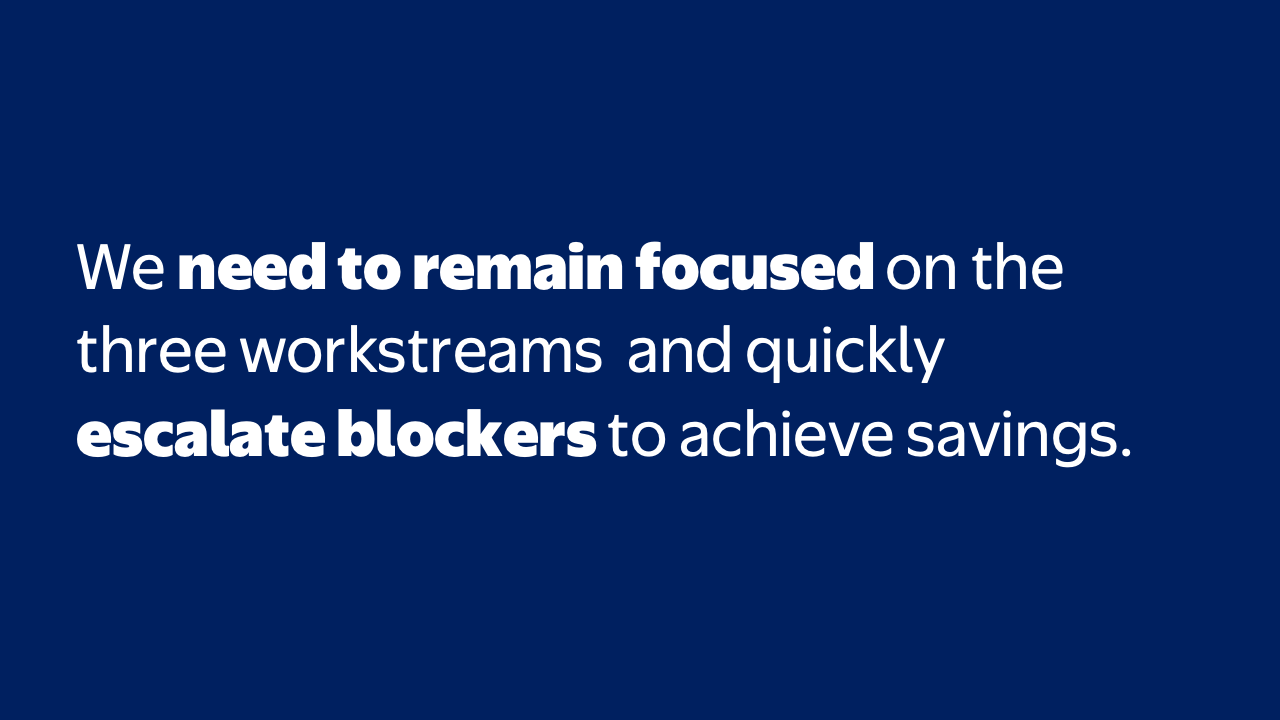
Because the story unfolds in a controlled manner, the presenter can guide the room through the information instead of hoping people find the right detail at the right moment. Takeaway titles frame the key message for each slide so the audience never has to guess. Supporting visuals reinforce the narrative rather than competing with it.
If leadership has already reviewed the pre-read, a live meeting shouldn't rehash every data point—it should focus on implications and decisions. But what about the materials that will be sent around before or after the meeting?
For a document meant to be read independently, incorporate the necessary depth without overwhelming the reader. Rather than leaving the data in dense tables, organize the content into a clear summary designed for solo reading.
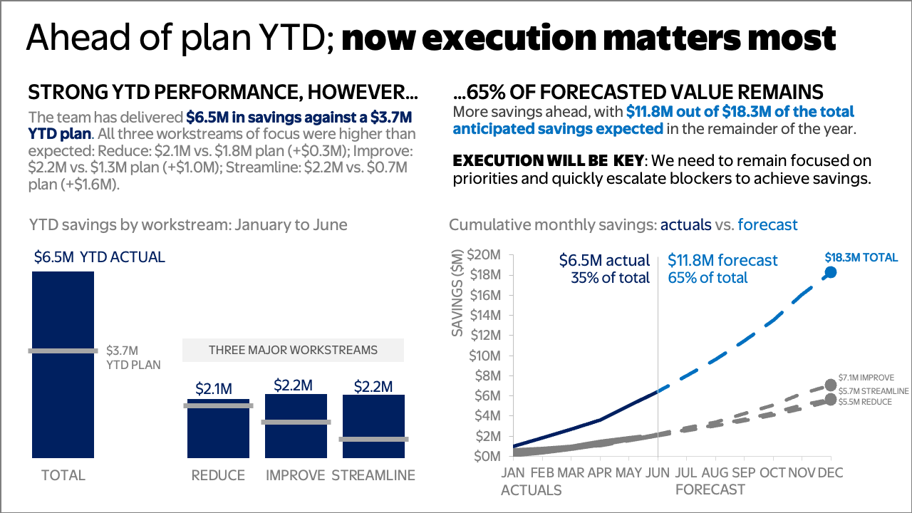
Single-slide communications often contain a lot of information, which can make it difficult to digest. By moving to a structured two-panel layout, the document establishes clear visual hierarchy. Bold takeaway headers immediately signal where to look first, while complete sentences directly beneath that provide the necessary detail and context for independent reading. Color applied intentionally and sparingly ties the text to the data it describes.
The original table views can then move to an appendix as a reference for anyone who needs the precise values for each workstream.
Match materials to the situation
To recap, circulated slides and presentation decks are related, but they are not the same thing. When one communication is asked to do multiple jobs, the result is almost always compromise.
The next time you build a communication, pause and consider the medium:
For live presentations: Keep slides sparse so the audience focuses on you and your spoken narrative.
For written consumption: Build structured, detailed documents that provide complete context for independent reading.
Designing intentionally for the scenario at hand ensures your audience gets the right level of detail—and your message lands.
For more examples of visual transformations, check out the before-and-afters in our makeover gallery.