simplifying a Gantt chart
Gantt charts are a popular choice for illustrating the start and duration of events, which is common practice in project management. While useful for representing timelines, these charts can quickly become busy and difficult to interpret, especially when dealing with complex workflows.
Let’s consider an example.
Inspired by NASA Schedule Management Handbook
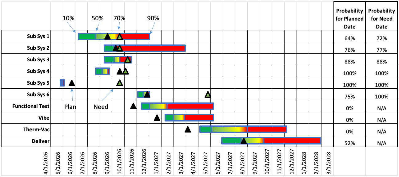
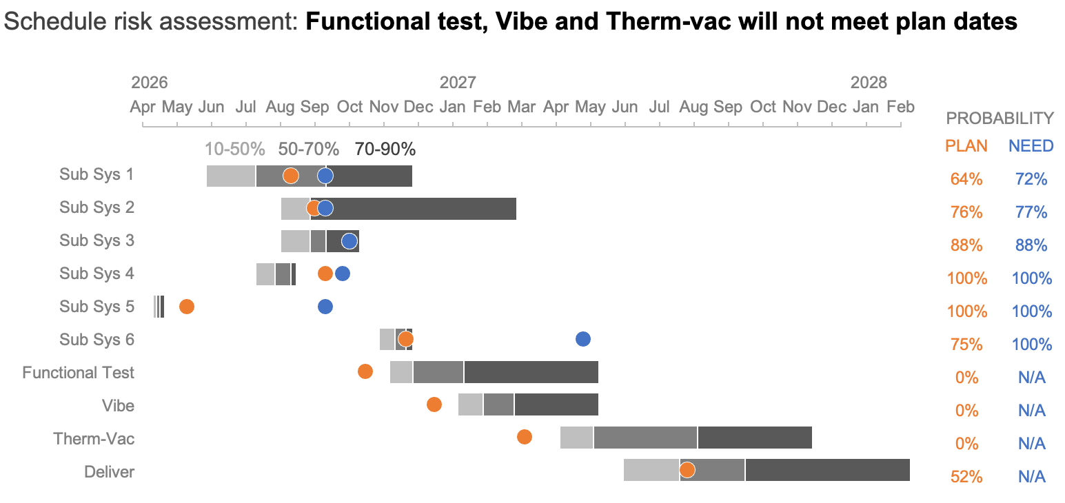
This is a project schedule with risk assessments showing the probability distributions for each activity of interest. The colors of the bar represent the likelihood of completion. For instance, the green portions towards the left show optimistic timing (10–50%), while the red portions indicate later, more likely completion dates (70–90%).
The black triangles represent the planned date, or the scheduled target, of each activity listed on the left, while green triangles show the need date, the required date to meet an on-time delivery. A table at the right lists the probability of meeting each date, adding a lot of information, but also visual complexity.
Simplifying involved views like this allows the audience to spend less effort decoding the structure and more time engaging with the insight it conveys. Imagine we want to use this chart to show where the project team should focus its efforts to meet the desired delivery date. Specifically, the Functional Test, Vibe, and Therm-Vac workstreams are showing no chance of on-time completion and will require corrective action to meet current deadlines. Some thoughtful design changes could help improve the effectiveness of this message.
Reduce clutter
The original view has many lines contributing to the cluttered look. Removing the gridlines is a quick and easy way to begin to bring the pertinent information to the foreground.
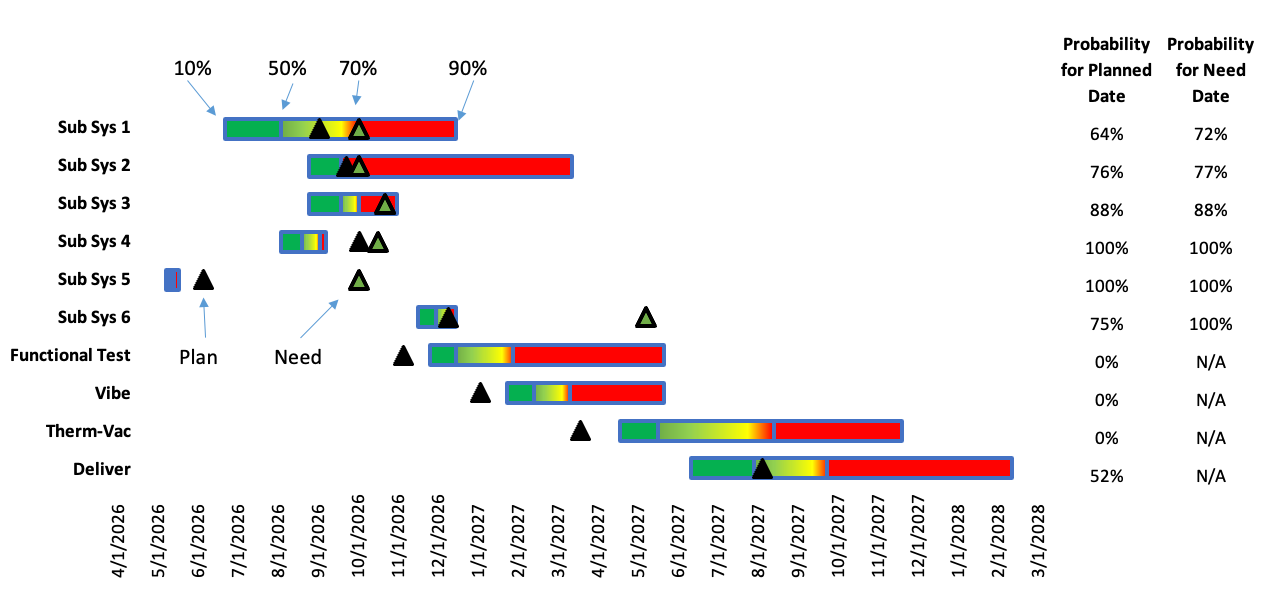
With fewer borders, greater contrast is created between the background and the data, allowing the horizontal bars and milestone dates to stand out more.
Another way to make it easier for our audience to consume this information is to be thoughtful about the order and alignment of the data and labels. Currently, the dates are at the bottom, which means they will likely be the last thing that is seen. Since dates are such an integral part of a project timeline, we should move them to a more prominent place at the top of the chart.
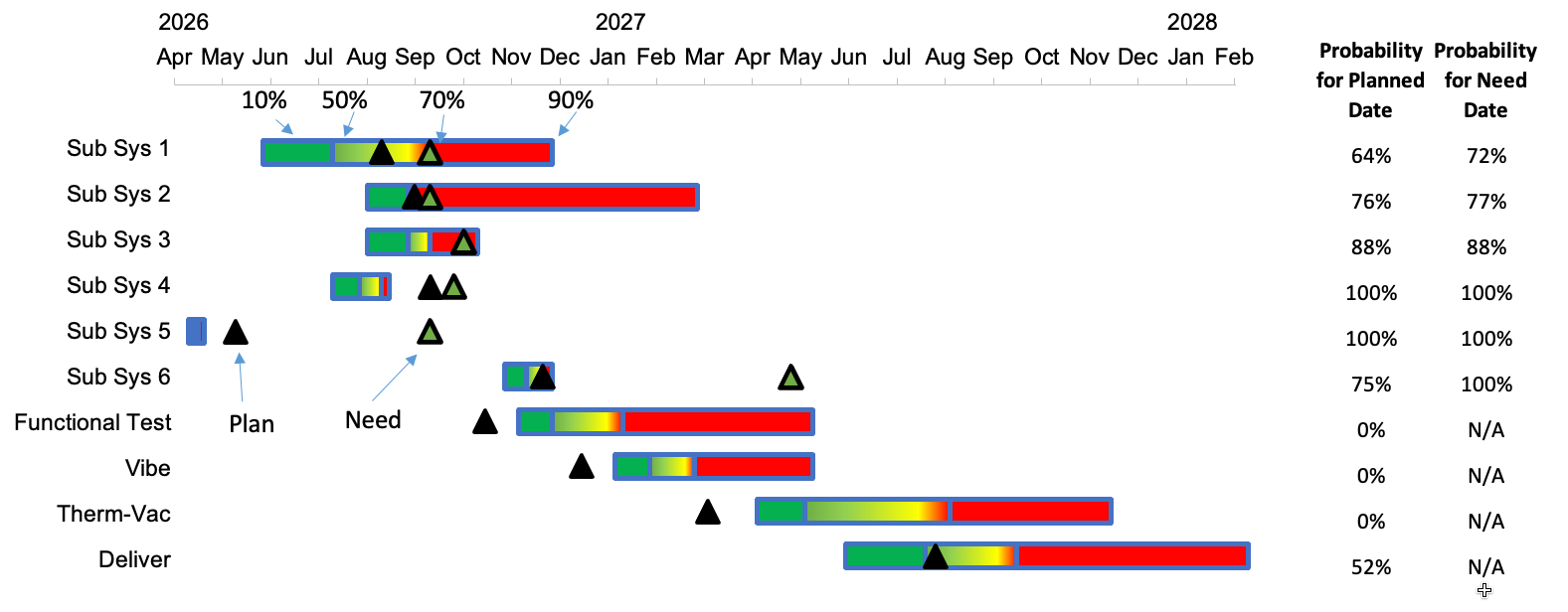
By moving the dates higher up, we can make sure they are seen first. Additionally, by simplifying the date formats on the axis, it becomes possible to rotate the text horizontally, making it quicker and easier to read.
Our next step is to rethink the use of color in this chart. The current green, yellow, red gradient is a challenging combination to discern for people with color vision deficiency.
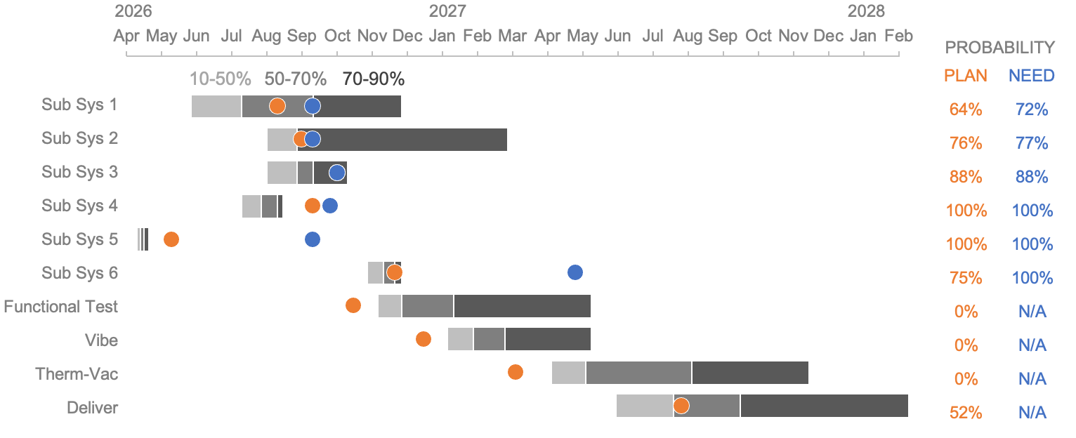
A color palette that uses shades of gray for bars eliminates the visual noise from multiple bright colors, allowing the viewer to focus on the timeline and task durations. For the milestones, more colorblind-friendly colors—blue and orange—make them stand out. Opting for circle markers is visually smoother and feels less alarming than the pointy triangles. Finally, applying the same color used for the circle icons to the probabilities listed in the table on the right helps to visually tie them together.
Now that the chart is less busy, we can turn our attention to guiding viewers toward the information that matters most. Ideally, we hope to draw our audience’s eyes to key elements or insights in the graph. We can apply some intentional focus techniques to emphasize these key takeaways for our audience.
Focus attention
As things stand, the Functional Test, Vibe, and Therm-Vac tasks have zero probability of being completed on time. A simple way to quickly get this point across is to add a takeaway in words at the top of the chart to tell our audience what we want them to know.
The added text indicates what we want our audience to see in the chart. We can also make additional adjustments to the chart itself to ensure that the words our audience reads are reinforced visually.
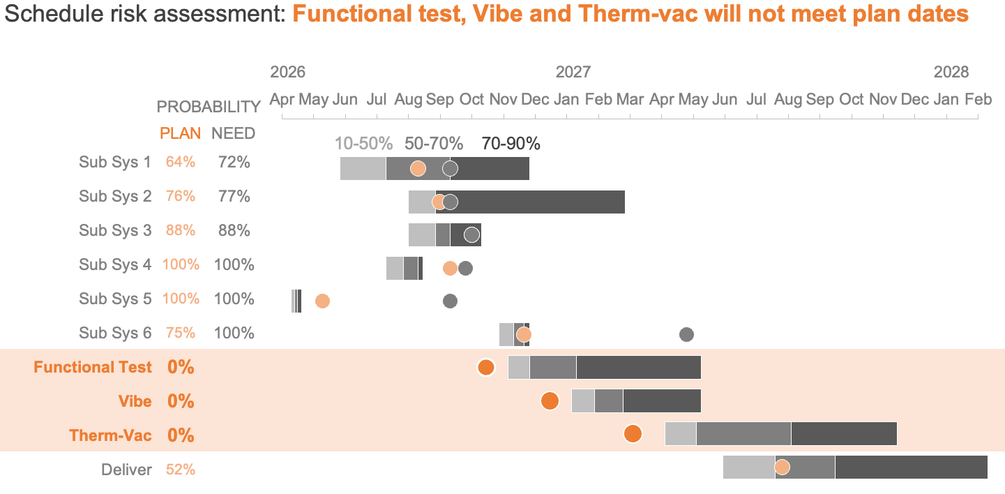
A light orange band spanning the three tasks named in the title draws attention to the workstreams at risk. Sparing color highlights just the plan dates (since these areas do not have need dates), while deeper intensity of color spotlights those projected to miss the scheduled target. Finally, placing the plan and need date probability columns on the left makes them quicker to find, and bolding task names and zero-percent probability values adds prominence.
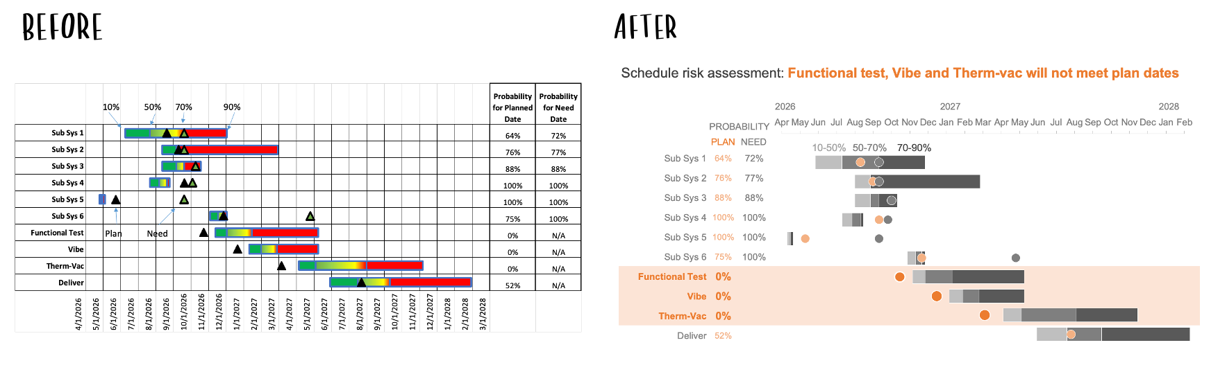
By applying decluttering and focusing techniques, we can bring clarity to a complex Gantt chart, leading to quicker decisions and a clearer understanding of schedule risks.
To see more examples of timeline visuals, check out our April 2026 Challenge.