and the winner is...
Thanks to those who submitted visuals in response to the recent data viz challenge (and thanks for your patience in waiting for this recap!). The goal was to turn a selection of the stats included in a recent Pew Research Center
article on how teens research into visual form. There were four entries, which I'll recap here, in addition to announcing the highly anticipated winner!
Submission 1: Joe Mako
Joe took the item "Research tools teachers say their students are most likely to use..." and created a Tableau visual, commenting "I like diverging stacked bar charts for plotting the results of Likert and other rating scales. They enable you to simply see the overall direction and the detail at the same time."
I really like this visual: it's well labeled and organized, with thoughtful attention to design. For example, very light grey shading helps your eye read across horizontally from the label to the data it describes without being obtrusive, sorting in increasing order of unfavorable/decreasing order of favorable provides a nice construct within which to interpret the data, and your attention is drawn clearly due to strength of color to the tails - not at all likely and very likely - the most interesting pieces of data. Subtly labeling the data bars allows for easy comparison across the different research tools (which would otherwise be difficult for the tails due to the lack of consistent baseline).
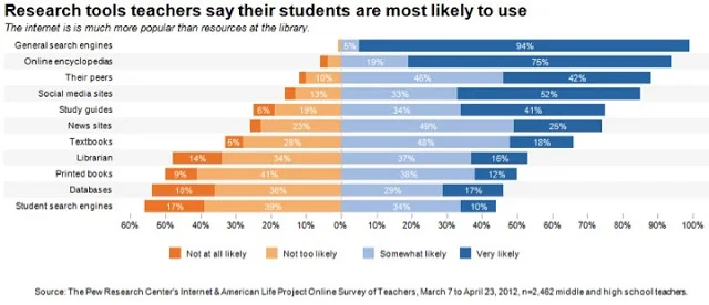
In terms of feedback, there are three (relatively minor) things I would potentially change in this visual:
- Swap the formatting on the title and the takeaway to emphasize the main takeaway, that the internet is much more popular than resources at the library.
- Move the legend to the top of the graph, so the audience encounters what the bars mean before they get to the bars themselves.
- Correct typo: I don't think I would have caught this, but reader Rupert Stechmann did - there's a typo in the takeaway at the top where 'is' is repeated twice. Attention to detail is critical, and perceived lack of it can call the entire analytical process used into question.
The direct link to Joe's image can be found here.
Submission 2: Sam Feldman
Sam created his data viz on how students use their cell phones in class:
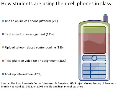
I give Sam high points for creativity - using color within the cell phone image to demonstrate the percentages. But it took me a little time looking at the visual to realize that's what's happening. In this case, I'd recommend a few modifications to make this visualization higher impact:
- Reverse the sort ordering so that you start with the biggest segment at the top, and work downward to the smaller segments. Then your takeaway could become: the majority of students use cell phones in class to look up information or take a photo/video for an assignment.
- Make the data in the cell phone stand out more: take away the sort of marbled shading within the different colors (it's distracting and doesn't add anything) and play with making the lines on the cell phone more subtle (try making them white or grey) - basically, I want the colored segments to stand out much more than the cell phone itself, but still preserve the ability to recognize it as a cell phone.
- Right justify the labels so each label is directly next to the portion of the cell phone it describes. Omit the boxes that tie the label to the given portion of the bar; instead make the label itself the same color as the bar it describes. There's plenty of space, so I'd consider making the labels larger as well.
Submission 3: Hrvoje Smolic
Hrvoje picked a pie chart visualization from the article and turned it into a slopegraph:

Hrvoje's blog post on this makeover can be found here. I agree that the relative increases and decreases are much clearer here than in the original pies. What I crave in this case are more words to make what we're looking at clear: let's state the main takeaway (what's interesting or noteworthy), add a graph title, a more descriptive y-axis label, and the data source. Now that we can see the data in a more straightforward fashion, let's think about what story we want to tell and draw our audience's attention to the relevant parts.
Submission 4: Jane Pong
Jane visualized how different groups of teachers perceive the impact that school policies have on their teaching. She converted a table included in the article into a more visual form:
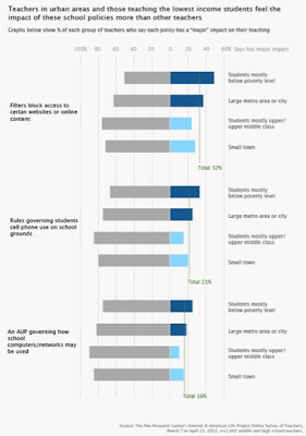
Jane's approach is similar to Joe's, plotting the Likert scale in horizontal bars anchored at zero. I think this is a good approach, but a little more labeling would help the audience to more quickly interpret what they're looking at here. It took me a bit of time to understand that the item text is what's shown at the left, and the breakdown at the right is income (mostly below poverty level vs. mostly middle/upper class) and size of area (large metro vs. small town). I'm not sure what the different colors represent, so we should make that clear.
This visual shows a lot of different comparisons - this is one of those cases where clearly identifying a single story or two that we want to focus on could be helpful for determining what data to show (perhaps we don't need all of this) and making it easier for our audience to consume.
...and the winner is...
While each entry has it's merits, the winner of this data viz challenge in my opinion is Joe's diverging stacked bar chart. It clearly tells a story, both through words and through the accompanying visual, which is utopia for me when it comes to storytelling with data. Joe, I'll be reaching out with the promised offer to pen a guest blog post.
A great big thanks to everyone who submitted entries. I really appreciate the time you took and the work you shared!