secondary y-axis
The question of the secondary y-axis comes up every time I teach a data visualization course. As you've probably deduced by now, my general bias is for ease of interpretation. The challenge with adding a second y-axis is that it's not always clear which data series belongs to which axis. That said, I think there are ways to do this that get over this hurdle.
Earlier today, I was reading an article from the latest McKinsey quarterly shared by a colleague (thanks Andrew, if you're reading this!). The topic: big data. Of particular interest to me, given that I work in an analytical field, was the forecast shortage of analytical talent to make use of the growing world of data, something McKinsey raised in the article as a competitive advantage. In addition to interesting content, there were a number of graphs included in the article - some good, some not so good. It was one of these less than stellar views that acted as the impetus to this post: the following.
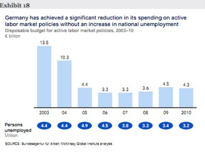
I think this visual is mostly pretty good. The takeaway is described clearly and the graph reinforces it visually.
But it could be a little better.
My one gripe, as you can perhaps anticipate, is with the blue circles showing Persons Unemployed across the bottom. Because the blue of the circles is darker than the bars, your eyes are drawn there by a visual cue that says "pay attention to this, it's the most important", whereas I'm not sure that's the case. Based on the takeaway at the top, the decrease in spending and lack of increase in unemployment seem to be of roughly equal importance. So let's make them look that way in the visual. Also with the numbers embedded in the circles, you have to read them and think about what they mean more than you would need to if this were shown visually.
My thought when I looked at this was that both of these issues could be solved by use of a secondary y-axis. Here's my makeover:
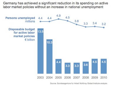
As mentioned, the main challenge with a secondary y-axis is making it clear which series belongs to which axis. One way around this is to not show the second y-axis, but rather label the series directly. In this case, I actually didn't show either axis.
What's your view on the secondary y-axis? Should it be embraced? Verboten? Leave a comment with your thoughts.