
a Google example: preattentive attributes
The topic of my short preso at the visual.ly meet up last week in Mountain View was preattentive attributes. I started by discussing exactly what preattentive attributes are (those aspects of a visual that our iconic memory picks up, like color, size, orientation, and placement on page) and how they can be used strategically in data visualization (for more on this, check out my last blog post). Next, I talked through a Google before-and-after example applying the lesson, which I'll now share with you here.
First, a little background: In 2010, my colleague Neal Patel undertook research on managers at Google. He set out to understand two primary things: 1) the impact that managers have on work-life and 2) what makes a good manager. To read more about this study and the findings, check out the New York Times article from earlier this year.
When Neal's research was complete and it was time to begin to socialize the study and findings, he and I locked ourselves in a room filled with whiteboards and began to brainstorm. One of the visualization challenges was the first part of the study: as one might expect, managers have varying degrees of influence over the different aspects of work-life, ranging from aspects that they are able to influence heavily to aspects that they influence little or not at all. Our aim was to show this in a way that was easy to understand.
One of the early iterations looked like the following (note that I've generalized the visuals significantly to be able to show them here).
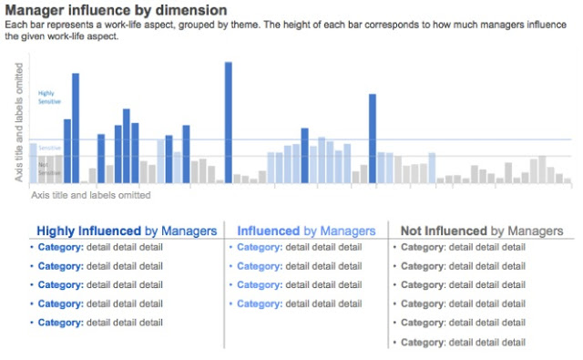
Findings

Given that I've generalized most of the labeling, I'll walk you quickly through what you're looking at. At the top of the page, there are three categories: those work-life aspects that are 1) highly influenced by managers, 2) somewhat influenced by managers, and 3) not influenced by managers. The categories within these are the different work-life themes, for example feeling supported in career development or having the ability to innovate, and then each has more detail on what aspects of the given theme are influenced at the given level by managers.
Next, comes the graph. The y-axis is a quantitative measure of manager influence. The x-axis shows the different aspects of work-life, grouped by color into same thematic categories as referenced in the table above the graph. The height of the bars indicates what influence category each work-life aspect falls into (matching the table above it): highly influenced by managers, somewhat influenced, or not influenced.
This is a nice looking visual. But we can use preattentive attributes more effectively to make the point come across more quickly and enable the audience to more easily take in the information.
In fact, it is exactly those two things from my perspective that preattentive attributes can facilitate in a really powerful way when employed effectively: 1) to draw the audience's eye to the most important part of the visual and 2) to provide a visual hierarchy of information that will help make it clear to the audience how they should interact with the information that is being provided. You can think of preattentive attributes as your tools to help your audience get into your (the designer's) head.
Let's inspect the above visual with these two things in mind. One of the first questions I ask myself when I'm looking at a visual is where is my eye drawn? You can do this easily with your own visuals: look away for a moment, then back at the visual and take note of where your eye first focuses (it's generally the preattentive attributes that dictate this). When I do this with the above visual, my eye first sees the title, "Findings," and then is pulled to the color in the graph at the bottom. The color differentiates the various work-life themes, which is probably not the most important thing on the page, and yet the strong draw of the color gives a signal that it should be.
Now, let's look at the visual from a hierarchy-of-information standpoint. Besides the title and the color in the graph, the font is all of similar size and weight. What this means is that the audience must read through everything in order to be able to conclude for themselves what is important and where they should devote their attention. To be frank, most audiences won't take the time to do this. It's also not really fair of us to ask them to, when a few minor changes will make it clear.
The following mock-up is similar to where we ended up with the visual after our brainstorming session. Note that very little change has been made to the content: we already had the right information, it was just a matter of playing with the preattentive attributes to make it more accessible to our audience.
Some work-life aspects are more influenced by managers
The only content changes were to the titles. One of my rules is to never waste the title line for a descriptor like "findings". Titles are typically at the top of the page, which means they are the first thing people encounter and they are often big and bold (and perhaps even blue!), which makes them even more attention grabbing. Use them to communicate the most important thing about the visual. Maybe it's the main finding. Or perhaps the call to action that the data informs. It's prime reas estate, so make it count.
Let's take a look at how preattentive attributes are working for us in this updated visual. First, from the where-is-your-eye-drawn standpoint: for me, it goes like this:
- I can't help but read the main title because of its placement at the top of the page and because it's big and bold and blue.
- Next, my eye catches the graph title (font is bigger than that which is around it, also the bold is a signal that it's important) and scans it so I know what I'm looking at.
- Within the graph, my eyes are drawn to the dark blue bars, which are those work-life aspects that are most heavily influenced by managers, arguably the most important thing on the page, since these are the areas that can be most impacted by change.
- As my eyes continue to move down the page, they are drawn to the dark blue in the table (color coordinating with the same influence category as in the graph so there is a visual tie connecting them that doesn't require reading).
From a visual-hierarchy standpoint, what I've outlined above is highlighted clearly as the highest priority information on the page. Everything else is secondary. It's there to add clarity and additional information, but note how much more scan-able the second version of the visual is compared to the first.
The lesson is this: use preattentive attributes like color, size, and placement on page with intention. Specifically, use them to 1) highlight the most important part(s) of the visual and 2) create a visual hierarchy of information. Your audience will appreciate that you are providing visual cues to help them interact with your data visualization and will be more generous in giving their time to it than a visual that feels like work to consume.