
drawing attention with data labels
I am a firm believer that data is inherently interesting. When you find the right story to tell with the data, that is. Graphing applications, unfortunately, don't know our data or what stories to tell with it. So, while it's easy to put your data into a chart and feel like you're done, this is a disservice to both your mission and your data.
The lessons in this post are two-fold. We're going to focus on an anonymized example from a recent workshop I conducted and discuss teasing the story out of the data and producing a visual that better tells this story, using data labels to help draw our audience's attention to where we want it.
Here is the visual we'll begin with:
Ticket Volume Over Time
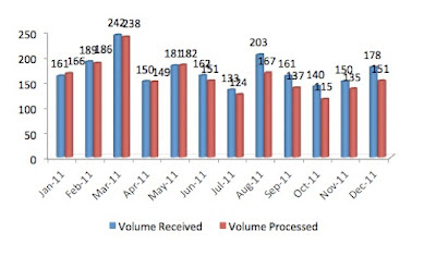
I'm going to implore you to resist the urge to scroll immediately downward and instead concentrate on the visual above for a moment. What story could we tell with this data?
It takes some time staring at the data in its current format, but if we take the time to do so, one thing to note is that the volume processed vs. received are close to one another during the first part of the year, but we start to see separation as we continue through the latter part of the year, with volume processed lagging the volume of tickets received. That's the beginning of a story.
When plotting multiple series over time, bars tend to quickly get visually overwhelming. Lines can often show trends over time in an easier to consume fashion, so let's start by seeing what this same data looks like in a line graph:
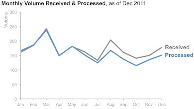
Note that in addition to changing the chart type, I've done a couple other things to make the visual above easier to interact with. The series are labeled directly, eliminating the work of going back and forth between a legend and the data to understand what I'm looking at. I also pushed the axis lines and labels to the background by making them small and grey, so they are there for reference, but don't compete visually for attention with my data.
In the above, I eliminated the data labels altogether. But bear with me a moment while I add them back:

Labeling every data point creates a cluttered visual, one of the issues with the original graph. But I think we can use them here in a way that will add value. The data labels act like added marks (a preattentive attribute) that draw our attention. The problem with labeling every point in this case, though, is that our attention isn't drawn anywhere except to the lines that were already drawing it in the first place. But take a look at what happens as we play with which points we label:

In this case, we're drawn more to the right side of the graph because of the additional visual pull of the data labels. But this still looks a little cluttered to me, so I'm going to remove a couple more labels:
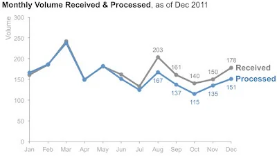
Bingo. I'm drawn to the part of the graph where the lines really start to diverge: forcing my audience fo focus visually on the part of the graphic that really tells the story. Now that I've got a visual that can be used to tell the story I want to tell, it's time to put the words down on this page to actually tell that story. This is when we need to take the context we know about the situation that the audience needs to know and figure out how to make our story compelling.
I don't actually know the context here, but I can use the data to start to make observations that will lead to questions that would help me figure it out. When I look at the data, I find it interesting that the incoming ticket volume was higher at some points earlier in the year, and yet we were able to keep up with it then, whereas in the latter part of the year we are falling short. This suggests that something changed. Perhaps there was attrition from the team that processes the tickets. Or perhaps a process or systems change took place that meant the sort of tickets coming in during the latter part of the year were more difficult and took longer to resolve than earlier in the year. Whatever the context is, we need to explain it.
The final visual could look something like this:

Note that this isn't the only story we could have focused on to make a compelling argument for the conclusion: we need more resources. We could have instead focused on the growing ticket backlog over time, for example. One reason that I didn't do that here was lack of data: since I only had the data in the chart starting in January, I didn't have any indication of whether a backlog existed prior that would be important to consider.
In almost every case, there are multiple different stories you could tell or ways to tell the story (or show it visually) that will get the message across. But the compelling stories don't suddenly materialize when we plot our data for the first time. Rather, it takes spending time on this piece to ensure you aren't just showing data for the sake of showing data, but rather that it's for a specific purpose, with a fleshed out story that your visual reinforces. That's storytelling with data.
If you're interested in the Excel file for the above progression, click here.