
strategies for avoiding the spaghetti graph
It seems that I have a distaste for any chart type that has food in its title. My hatred of pie charts
is well documented. Donuts are even worse. Here's another to add to the list: the spaghetti graph. Haven't seen one before? Oh, but surely, you have. They look something like this:
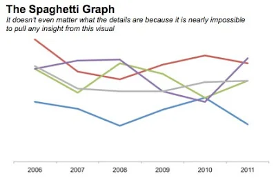
They are referred to as the spaghetti graph (by me, at least) because they look like someone took a handful of uncooked spaghetti noodles and threw them on the ground. And they are about as informative as such an action would be...
...which is to say
not at all.
There are a few strategies for taking the would-be-spaghetti graph and creating more visual sense of the data. Two such strategies that I've employed (there are certainly more) are 1) separating the lines spatially and 2) using preattentive attributes to emphasize one line at a time, while still leaving the others there for comparison. A third strategy could be a combination of these first two. I'll discuss these three approaches and show you some examples in the following. Caveat: the second and third approach I'll cover do have some redundancy of information, but it's not clear to me that's necessarily a bad thing (though if this bothers you a great deal, you may want to stop reading here).
Let's look at an example of each of these approaches.
Separating spatially
We can pull the lines apart vertically and give each its own graph (but mash the graphs together so they still appear to be a single visual):

It's important in the above example that my y-axis minimum and maximum are the same for each graph so that the reader can compare the relative position of each line/point within the given area.
Note that this approach assumes that being able to see the trend for a given category is more important than comparing it to the other categories - you can still do this latter comparison, but it isn't as easy visually because of the way the lines have been separated.
Emphasizing one line at a time
Another approach would be to have multiple graphs, where you plot all of the data on each but highlight a single trend at a time. Here's an example (note that this and the following example graph different data than above):

In this case, you can see each trend on it's own, but also have the others there in the background for reference. Here, I've emphasized the 2012 figures by including a marker and the data label and organized the charts from highest to lowest 2012 budget.
Combined approach
A third approach could be a combination of the above two:

Personally, this is my favorite for this particular data (I originally tried approach 1 here, but it was really hard to compare any given trend to the others, which wasn't ideal in this case).
In any event, if you find yourself facing a spaghetti graph, don't stop there. Think about what information you want to most convey, what story you want to tell, and what changes to the visual could help you accomplish that effectively. Perhaps the above examples will give you some ideas. If you're interested in the Excel file with the examples above, you can download it here.
Do you have other strategies for avoiding the spaghetti graph? Feedback on the above? Leave a comment with your thoughts!
8/25/14 update: check out this Washington Post article for a nice example of emphasizing one line at a time (via @jschwabish).