plotting a value within a range
I often refer to my method of creating graphs as "brute force Excel," meaning that you can make almost anything work in Excel, but it sometimes means getting a little creative. The method described in this post can be considered a prime example of brute force Excel.
This example was taken from a recent workshop, where I've anonymized the details. The goal was to understand the cost of various high cost items in a given region relative to some comparison regions. The hypothesis was that the region of interest (Region 1, in the example below) had higher cost items than the other regions. The original visual was a table that looked something like this:

The table in this case might be helpful for the exploratory analysis, but it isn't well-suited for explanatory analysis, because there is simply too much to try to take in to form a conclusion. So I knew going in that I wanted to make the data more visual. The question was: how?
While I was considering this, I sketched out an idea:

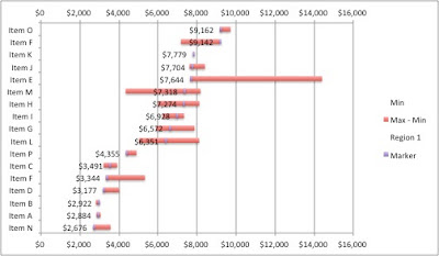
Rather than show the individual values for each of the regions, my idea was to plot the range of prices across the various regions, from the minimum value to the maximum value (irrespective of which region has the min or max price, since it didn't seem like that was critical for what we are trying to show here) and then show the specific value for Region 1, the region of interest, within that range.
The next challenge was how to create this visual in Excel. I'll take you through how I did this. The brute force in this case is a couple of stacked bar charts, with some of the series made to be invisible. Here's the step-by-step:
STEP 1: Plot the minimum price and range (the difference between the maximum value and the minimum value across the various regions) as a stacked bar chart on the primary axis.

STEP 2: Make the blue series (Min) invisible by formatting it so there is no fill color, no line, and no shadow (I will never understand why Excel adds a shadow in the first place!).

STEP 3: Plot the Region 1 price and Marker (for this, I just put a value of 100 across all of the items - just big enough for it to show up on the graph - this will be what we'll use to show where Region 1 falls within the range) on the secondary axis. At this step, you must set the secondary axis maximum to $16,000 (overwriting the default of $10,000) so that it lines up with the primary x-axis.

STEP 4: Add data labels to the green series (Region 1) and format them so they are placed at "inside end" of the bar. Then make the green series invisible (no fill, no line, no shadow).
STEP 5: Format, format, format! The base visual looks like what we want. Now it's about playing with the details of the visual so that the information is as straightforward to consume as possible.
In this step, I think about getting rid of clutter, using color strategically to draw my audience's eye to where I want them to pay attention, and adding titles, footnotes, etc. to describe and explain my visual. A couple of notes on changes I made in this step:
The item names and horizontal borders are in the cells directly (vs. part of the graph); I find it easier to format the visual this way, you just have to be sure that you've sized the graph so it lines up to the labels.
I reversed the order of the y-axis so the items range from min to max (vs. max to min as shown in the above steps) to leverage how our eyes tend to take in information (from left to right).

The above visual still takes a little processing to figure out what's going on. But I find the data much faster to process here than it was in the original table. Now, we can see relatively quickly that the price in Region 1 is mostly on the lower end of the ranges when compared to other regions (with a couple exceptions).
The final step would be to put the story around this visual: what it shows, why that's interesting, and what action should be taken (hard to do with the generalized example, but there was an interesting story here in the original version).
The Excel workbook with the progression outlined above can be downloaded here. Alternatively, if you enjoy consuming content via video check out our highlight a value in a range tutorial in which we walk through how to create this view using a different chart type: the dot plot.