color considerations with a dark background
I was working on some data visualization makeovers a few weeks ago and found myself facing a challenge I hadn't previously encountered: the need to leverage a dark background.
When it comes to slides that communicate data, I don't typically recommend anything other than a white background. Anything else makes me think of Tufte's conversation on data-ink ratio. His basic idea is that you should work to maximize this figure (more data and less ink, vs. the opposite). In The Visual Display of Quantitative Information, he says, "Every bit of ink on a graphic requires a reason. And nearly always that reason should be that the ink presents new information." If we think about a colored or dark slide background from the perspective of the data-ink ratio, that's a whole lot of ink for no data at all.
Nancy Duarte more directly discusses dark backgrounds in Slide:ology, listing the following considerations:
- Dark background: formal, doesn't influence ambient lighting, doesn't work well for handouts, fewer opportunities for shadows (Cole's input: I don't think this is a bad thing!), for large venues, objects can glow.
- White background: informal, has a bright feeling, illuminates the room, works well for handouts, for smaller venues, no opportunity for dramatic lighting or spotlights on the elements (Cole's input: as in the "fewer opportunities for shadows," I think the lack of opportunity for "dramatic lighting", though phrased as a negative is actually probably a good thing).
Let's take a look at what a simple graph looks like on a white, blue, and black background:
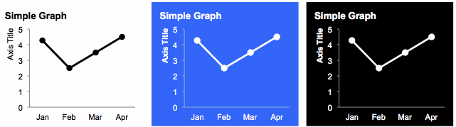
The blue and black backgrounds just feel heavier to me. They make my eyes almost pulsate a bit (that's probably the glow that Duarte referred to). That, plus Tufte's data-ink ratio and Duarte's considerations together seem to indicate that one should generally opt for a white background. That said, sometimes there are considerations outside of the ideal scenario for communicating with data that must be taken into account, such as your company's (or client's) brand and corresponding standard template. Such was the case in my specific situation.
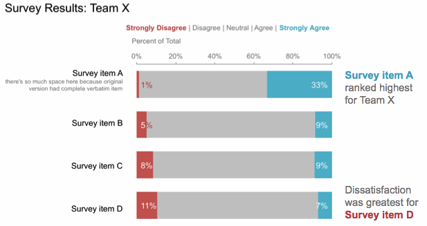
I didn't recognize this immediately. Rather, it was only after I had completed (I thought) my revamp of the original visual, that I realized it just didn't seem to fit with the look and feel of the work products I'd seen from the client group in general. Their template was sort of bold and in your face with a mottled, black background spiked with bright, heavily saturated colors. In comparison, my visual felt sort of...meek. Here's a genericized version of my initial makeover:
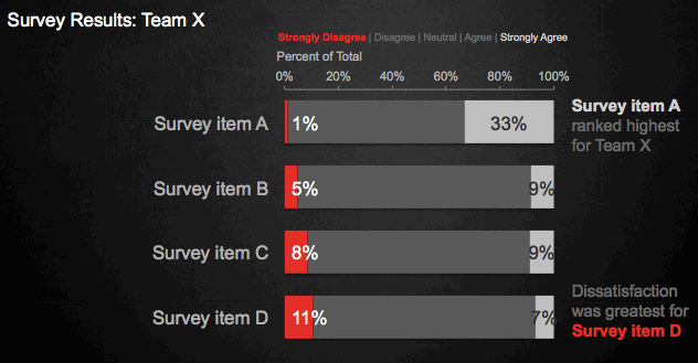
To solve for this, I remade my own makeover leveraging the same dark background I'd seen used in some of the other examples shared with me. I had to sort of flip around some of my normal thought process. With a white background, the further a color is from white, the more it will stand out (so grey stands out less, black stands out very much). With a black background, the same is true, but black becomes the baseline (so grey stands out less, and white stands out very much). I also realized some colors that are typically verboten with a white background (for example yellow) are incredibly attention grabbing against black (I didn't use yellow in this particular example, but did in some others).
The same goal of identifying and eliminating clutter (elements that aren't adding informative value) still hold. In fact, reducing clutter becomes even more important on a dark background, because you're already dealing with the high ink to data ratio that we previously touched upon. So less already looks like more than it would on a white background. But it can be done.
Here's what my "more in line with the client's brand" version of the visual looked like:
What do you think - are black or colored background out when it comes to communicating with data, or can it work? What other considerations should we make when working with non-white backgrounds? What other scenarios might lead us to want to choose a dark background? Leave a comment with your thoughts.