
how we position and what we compare
When visualizing data, one piece of advice I often give is to consider what you want your audience to be able to compare, and align those things to a common baseline and put them as close together as possible. This makes the comparison easy. If we step back and consider this more generally, the way we organize our data has implications on what our audience can more (or less) easily do with the data and what they are able to easily (or not so easily) compare.
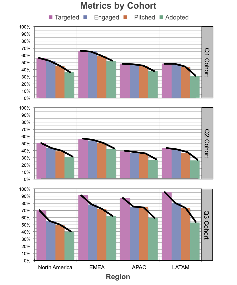
I was working with a client recently when this came into play. The task was to visualize funnel data for a number of cohorts. For each cohort, there were a number of funnel stages, or “gates,” where accounts could fall out: targeted, engaged, pitched, and adopted. Each of these stage represents some portion of those accounts that made it through the previous stage. In this case, the client wanted to compare all of this across a handful of cohorts and regions. Here is an anonymized version of the original graph:

There are some things I like about this visual. Everything is titled and labeled. So, while it takes a bit of time to orient and figure out what I’m looking at, the words are all there so that I can eventually figure this out, helping to make the data accessible. But when I step back and think about what I can easily do with the current arrangement of the data, there are a number of limitations. Let’s consider the relative levels of work it takes to make various comparisons within this set of graphs.
The easiest comparison for me to make is looking at a given region within a given cohort and focusing on the relative stages of the funnel. For example, if we start at the top left, I can easily compare for the Q1 Cohort in North America the purple vs. blue vs. orange vs. green bar. This is because they are both (1) aligned to a common baseline and (2) close in proximity (directly next to each other).
The next most straightforward comparison I can make is for a given stage in the funnel, I can compare across the various regions for a given cohort. So again, starting at the top left, I can compare within the Q1 Cohort the first purple bar (Targeted in North America) scanning right to the next purple bar (Targeted in EMEA), and so on. They are still aligned to a common baseline, but in this case they aren’t right next to each other (I’m inclined to take my index finger and trace along to help with this comparison). This is a little harder than the first comparison described above, but still possible.
The next comparison I can make—and this one is quite a bit more difficult—is a step in the funnel for a given region across cohorts. Again, starting at the top left, I can take that initial purple bar (Targeted in North America) and now scan downwards to compare to that same point for the Q2 cohort and the Q3 cohort. This is harder, because these bars are not aligned to a common baseline and they are also not next to each other. I can see that the bottom leftmost purple bar is bigger than the ones above it. But if I need to have a sense of how much bigger, that’s hard for me to wrap my head around. The numbers are there via the y-axis to make it possible, but it means I'm having to remember numbers and perhaps do a bit of math as I scan across the bars, which is simply more work.
And if we step back and think about it… comparisons across cohorts… this is actually potentially one of the most important comparisons that we’d like to be able to make! Visualizing and arranging our data differently could make this easier.
Perhaps it’s just me (and this really could be the case), but when I think of cohort analysis, it actually reminds me of my days in banking (a former life) and decay curves, and when I think of “curves,” it makes me think of lines, which makes me want to draw some lines over these bars… Actually, let’s try that. Here’s what it looks like if I draw lines over the bars in the first graph (Q1 cohort):

While I’m at it, I might as well draw lines across the other graphs, too:
And now that we have the lines, we don’t need the bars…

The bars would have likely been too much to put into a single graph. But now that I’ve replaced what was previously four bars with a single line—thus remaking my original 16 bars in each graph into 4 lines, or if we multiply that across the three graphs, I’ve turned 48 bars into 12 lines—those, I can potentially all put into a single graph. It would look like this:

While it’s nice to have everything in a single graph, those lines on their own don’t make much sense. Next, I’ll add the requisite details: axis labels and titles so we know what we’re looking at.
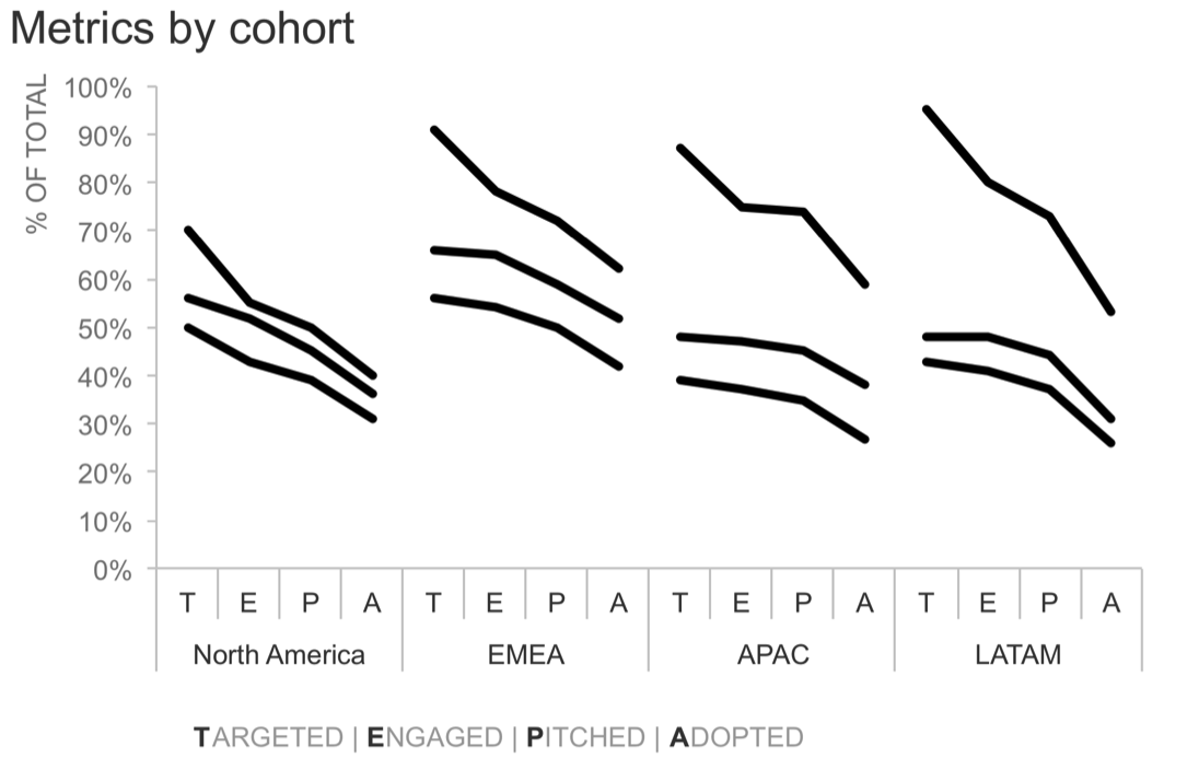
Note that I didn’t have space to write out “Targeted,” “Engaged,” “Pitched,” and “Adopted” for every single data point. Instead, I chose to use just the first letter of each of these along the x-axis, and then I have a legend of sorts below the region that lists out what each of these letters means. This may not be a perfect solution, but every decision when we visualize data involves tradeoffs, and I’ve decided I’m ok with the tradeoffs here.
You’ll perhaps notice here that I haven’t labeled the various cohorts yet. With this view, I could focus on one at a time (calling out either via text or my spoken narrative if talking through this live to make it clear what we are focusing on). For example, maybe first I want to set the stage and focus on the Q1 cohort and how it looked across the various funnel stages and regions:

I could then do the same for the Q2 cohort (lower across everywhere: Is this expected? What drove this? My voiceover could lend commentary to raise or answer these questions):

Then finally, I could do the same for the Q3 cohort (ah, now our metrics have recovered from their lows in the Q2 cohort and are now even higher than Q1, did we do something specific to achieve this? Looks like we targeted a higher proportion of the overall cohort, and it’s interesting to see how that impacted the downstream funnel stages):

Note with this view, I could also focus on a given region at a time. For example, it might be interesting to note that these metrics are lower across all cohorts in North America compared to the other regions:

Or the spread in APAC across cohorts might be noteworthy, as it’s the largest variance across cohorts compared to the other regions:

This piece-by-piece emphasis could work well in a live presentation. But in the case where this is for a report or presentation that will be sent out where we’d likely have a single version of the graph (vs. the multiple iterations that can work well in a live setting so you can focus your audience on what you’re talking about as you discuss the various details), I’d venture to guess that the most recent cohort (Q3) is perhaps the most relevant, so let’s bring our focus back to that:

Within the Q3 cohort, we may consider emphasizing one or a couple of data points. Data markers and labels are one way to draw attention and signal importance. If I put them everywhere, we’ll quickly end up with a cluttered mess. But if I’m strategic about which I show, I can help guide my audience towards specific comparisons within the data. For example, if the ultimate success metric is what proportion of accounts have adopted whatever it is we’re tracking (I’ve anonymized that detail away here), I might emphasize just those data points for the most recent cohort:

Given the spatial separation between regions, I don’t necessarily have to introduce color here. But if I want to include some text to lend additional context about what’s going on in each region and what’s driving it, I could introduce color into the graph and then use that same color schematic for my annotations, tying those together visually:

Let’s take a quick look at the before-and-after:

Any time you create a visual, take a step back and think about what you want to allow your audience to do with the data. What should they be able to most easily compare? The design choices you make—how you visualize and arrange the data—can make those comparisons easy or difficult. Aim to make it easy.
The Excel file with the above visuals can be downloaded here. I should perhaps mention a hack I used to achieve this overall layout: each cohort is a single line graph in Excel, where I’ve formatted it so there is no connecting line between the Adopted point for one region and the Targeted point in the following region. (It may be brute force, but it works!)