declutter this graph!
The importance of decluttering when communicating visually with data is something that I talk about regularly (you can watch a video from me on this topic, and I've also blogged about it many times—here's an early example). It's mostly common sense stuff when we stop and think about it: get rid of the visual elements in your graphs that are unnecessary. Doing so can have a profound impact. Yet too often, we don't take the time to do this.
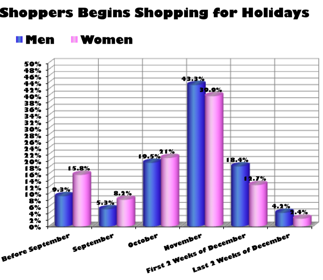
To illustrate the benefit, let's examine the following visual. I found it on viz.wtf, so we know it's a model for what not to do when visualizing data. There is a ton of clutter and other issues here. Consider for a moment: what clutter would you eliminate?
Scroll down to see the progression I went through. Each of these changes on its own is relatively minor, but sum them up and it's a pretty big difference between the original and the decluttered version. We can take it a step further by identifying the so what? and using words and color to make the point clear.


The graph still isn't perfect. It bothers me that the time intervals on the x-axis aren't consistent. You may see other things you'd approach differently as well. But check out the improvement we can make by identifying and eliminating clutter and making some other changes to reduce cognitive burden. Don't let unnecessary elements distract from your data or your message. If interested, you can download the Excel file.
What's your favorite type of clutter to remove? Leave a comment!