area graph to highlight a line
I don't use a lot of area graphs. But I found myself pausing on one that was submitted as part of the recent annotated line graph #SWDchallenge. It was created by Mike M. and the interesting thing to me was that the focus of this particular area graph wasn't on the area so much, but rather on the line that separated the areas.
This apparently stuck with me, because I found myself recommending a similar approach in a recent client makeover.
The original graph looked something like the following (data has been modified to protect confidentiality):
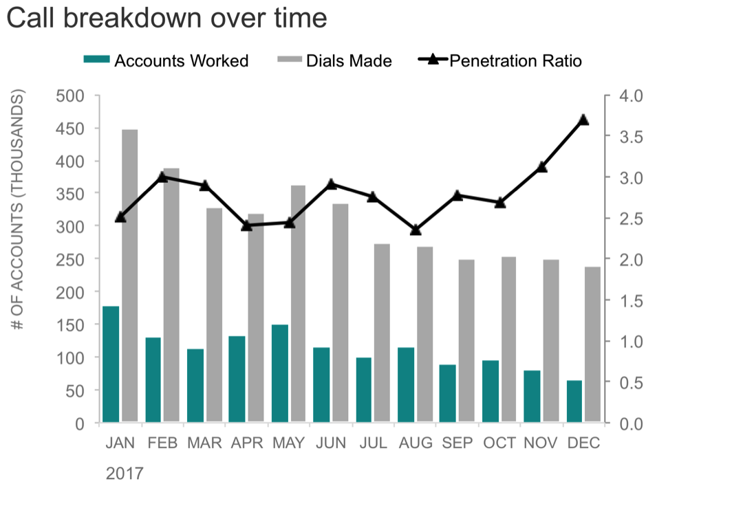
This is collections data from a bank. In case you aren't familiar with how collections work, typically an automated dialer makes calls to overdue accounts. The grey bars above represent total dials made. When someone answers the phone on the other end, the dialer connects them to a collections agent, who talks to the person who hasn't paid their bill and tries to get them to make a payment. The accounts where a person is reached (a collections agent talks to someone) are considered to be "worked," which is what the teal bars above represent. The penetration ratio, depicted by the black line, is...hmm. What is a penetration ratio exactly? This one threw me. I'm familiar with penetration rate, which would be the proportion of accounts that were worked out of the total dialed. So in other words, if penetration rate is 33%, we worked a third of the accounts. The ratio seems less straightforward. I think to describe it, it would be something like "if the penetration ratio is 3, it means we dialed 3x more accounts than we talked to." This seems unnecessarily complicated. Let's see if we can make some changes to how we show this data to make it more straightforward. Oh, and let's use that cool idea that I picked up from Mike M, too.
First, I'm going to remove the secondary y-axis on the right side of the graph and the data (Penetration Ratio) that goes with it. That gets us a simple two-series bar chart:

In the above, we see accounts worked (teal) and total dials made (grey). Dials made is the sum of accounts that were worked and those that weren't reached. So I'm going to change this data slightly—from dials made in grey to those not reached—and stack the bars on top of each other.

We can get the same information out of the view above as the previous one: we can see total dials made (overall height of bars) and within that, the portion that were worked and the portion that were not reached. Notice that because worked series is on the bottom of the stack, we can easily see how it has varied over time. Total dials made have decreased over time, so has the number of accounts we've worked. But are we working a lower proportion of total dials now than we have historically? It's hard to tell here. Let's shift to 100% view to answer that question:

With the 100% stacked bar, we lose the context that overall call volume (total dials made) has decreased over time. But that's ok, because we know it now, so we can state it in words: "Call volume decreased 47% over the course of the year." With the 100% view, we can see that the proportion of accounts that we are working has decreased recently. So in spite of reduced call volume, we are reaching a lower proportion of accounts. Interesting. Perhaps we can make that a little easier to see?
Let's remove the space between the bars and turn this into an area graph:

Bingo! With this view, we can see the proportion of accounts that were worked out of the total dialed. The white line separating the teal from the grey now represents the penetration rate. We can make this clear by adding some text and calling out the most recent data point:
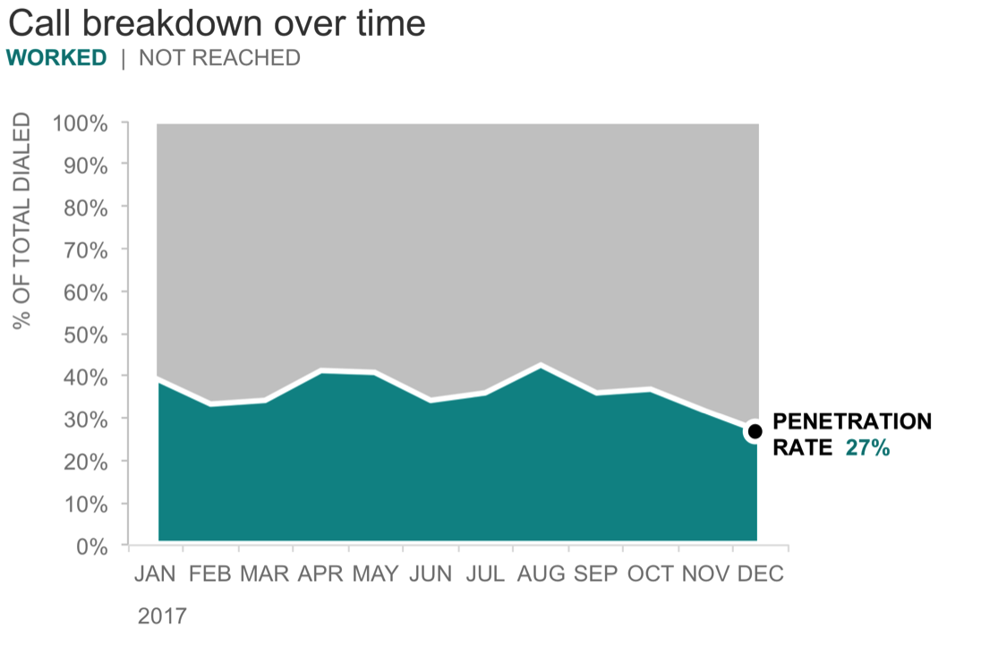
I might add a headline that says something like, "Despite decreasing call volume, penetration rate hit a 12-month low in December." And like that, we've used an area graph to highlight a line.
What do you think? Do you like this approach? What might you do differently? Where else could an approach like this work? Leave a comment with your thoughts!
You can download the Excel file with the above visuals.