#SWDchallenge: scatterplot!
Last month, we took a departure from the typical “try this graph” setup, when Elizabeth summoned you to remake a pair of pies. Nearly 100 people accepted the challenge and shared a ton of slopegraphs, bars, and a number of novel approaches to visualizing the data. I continue to enjoy looking through all of the creations shared and seeing many effective approaches and design elements to emulate (as well as some pitfalls to avoid). I hope you are learning through this challenge as well.
This month, we’re back to prescribing a specific graph type: the scatterplot. The scatterplot is actually one of the first graphs I remember encountering as a young child, when my elementary school teacher collected height and weight from each student and helped us plot it to see how the two measures were related. Scatterplots are used often in research settings to be able to see relationships like this (or the lack thereof).
I find we use fewer scatterplots in our redesigns of client data, perhaps because the use cases are less frequent in a business setting than those served by the more typical lines or bars. But scatterplots can be very useful in the right scenario: when you have two dimensions and something interesting is happening between them. Let’s look at a couple of examples.
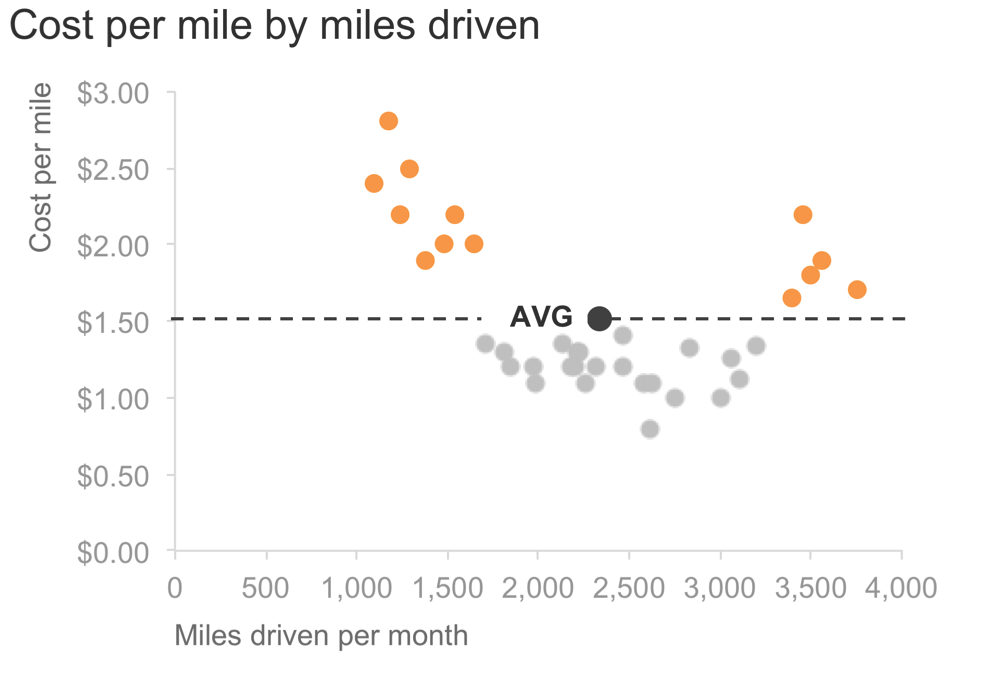
First, we’ll revisit one from storytelling with data. Take a simple scenario: imagine you manage a fleet of buses. One thing you might be interested in understanding is how cost per mile varies by miles driven. I could use a scatterplot to depict this.

I can take this a step further and highlight and label a point for the average. It might be interesting to note that when we drive a little or we drive a lot, cost tends to be higher than average. I could focus my audience’s attention on this:
Next, let’s look at a perhaps more relatable business example. At Google, we did a ton of research to understand what makes a good people manager and quantify it. After doing so, we instituted a regular “upward feedback survey,” where individuals would rate their managers across a number of dimensions we’d found were related to overall manager effectiveness. We also had a regular performance management process, where managers would assign performance scores for each of their direct reports. Wouldn’t it be cool to see how these two signals compare for the population of managers? On the one hand, we have the upward-looking measure: how employees rate their managers. On the other hand, we have the downward-looking measure: how the manager’s manager rates their overall performance.
It will be interesting to see both where these two measures agree (high across both would indicate the most effective managers, low across both would be those we need to get some help or manage out) as well as where the measures disagree (scoring high on one but low on the other). A scatterplot is the perfect tool to illustrate this (the scenario is real, but the data in this case is made up):

It can sometimes be useful to apply categorization—for example dividing the scatterplot into halves or quadrants and adding super-categories or labels—as was done above (see full post on this topic using the same example). As a related note, in both of the examples highlighted, the average was used to focus or categorize, but that’s purely coincidental and need not be the case—there could be a target or other reason you might choose to “draw the lines” in a different place, you just want it to be somehow meaningful in the context of what you are showing. In some cases, you may have values that dip into negative range and then the x- and y-axes will do this naturally for you. In other cases you may not need or want lines at all.
As mentioned, scatterplots tend to be less common in a business setting and because of this can feel intimidating to less familiar audiences. Thoughtful titling, labeling, and focusing can help with this.
There are a couple of twists on the scatterplot that I’ll mention. We welcome you to try either of these this month as well. Each adds a third dimension to the basic scatterplot.
twist: bubblegraph
The traditional scatterplot encodes data with consistently sized data markers (both examples shown here used small circles, but these could be any shape, or could vary in shape for multiple series of data).
With the bubblegraph, we instead graph varying sized circles (bubbles), encoding a third dimension of data with the area (often, something like relative market size). Our eyes aren’t great at measuring area, so specific comparisons are harder to make with a bubblegraph (but if a general “this one is smaller/bigger than that one” is ok, they can work). I don’t tend to use bubblegraphs because they have a lot going on and can be difficult to explain and interpret meaningfully. I have seen good use cases for decision or prioritization frameworks, where the axes are something like ease of implementation and cost and the size of circle represents some sort of sizing of the opportunity or gain. Or check out Hans Rosling’s work, for example this short video with the BBC, for some inspiring and entertaining examples of animated bubblecharts in action.
another twist: connected scatterplot
Connected scatterplots have lines drawn between the points, typically reflecting a third dimension of time. As with pretty much any graph, in the perfect use case, they can be awesome—stray far from that, though, and they get pretty confusing pretty quickly. Part of the challenge is that time isn’t shown linearly, the way it is if you plot it on the x-axis (where you’d read it from left to right and it is spaced in equal intervals). Rather, in a connected scatterplot, you read time from point to point. This sometimes means you’re reading upwards or leftwards to move forward in time and the time intervals are not necessarily evenly spaced. Arrows on the lines and clear labeling can help overcome these challenges. See Dan Zvinca’s guest post on the many roles of lines for some more general info on the connected scatterplot and an example, or Bill Rapp’s January #SWDchallenge submission for an effective example connected scatterplot.
the challenge
My challenge to you: find some data of interest that will lend itself well and create a scatterplot (bubblegraph and connected scatterplot twists welcome, too). DEADLINE: Monday, October 8th by midnight PST. Full submission details follow (be sure to email it to us, taking note of specifics below, for inclusion in recap post!). You're also welcome to share at any point on social media using #SWDchallenge.
SUBMISSION INSTRUCTIONS:
Make it. Identify your data and create your visual with the tool of your choice. If you need help finding data, check out this list of publicly available data sources. You're also welcome to use a real work example if you'd like, just please don't share anything confidential.
Share it. Email your entry to SWDchallenge@storytellingwithdata.com by the deadline. Attach your image as a .PNG. Put any commentary you’d like included in the follow up post in the body of the email (e.g. what tool you used, any notes on your methods or thought process you’d like to share); if there’s a social media profile or blog/site you’d like mentioned, please embed the links directly in your commentary (e.g. Blog | Twitter). If you’re going to write more than a paragraph or so, I encourage you to post it externally and provide a link or summary for inclusion. Feel free to also share on social media at any point using #SWDchallenge.
The fine print. We reserve the right to post and potentially reuse examples shared.
We look forward to seeing what you come up with! Stay tuned for the recap post in the second half of October, where we’ll share back with you all of the scatterplots created and shared as part of this challenge. Check out the #SWDchallenge page for past challenge details and recaps.