September #SWDchallenge recap: MAKEOVER edition
This month, we challenged you to remake a dual pie chart and a record number of you delivered—96 submissions to be exact!
With everyone starting from the same visual, it’s fascinating to see the diversity in your makeovers—from chart types to design choices to points of emphasis. This reinforces one underscoring theme of storytelling with data’s guiding principles: there is no single “right” answer and two people can approach the same dataviz challenge in completely different ways. We believe there’s room for diversity of thought and creativity in this space, as long as you use that creative license appropriately. Ultimately, we should always strive to design with the audience in mind—their needs trump all else!
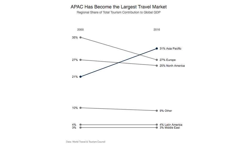
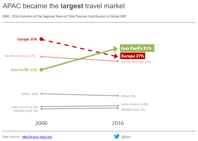
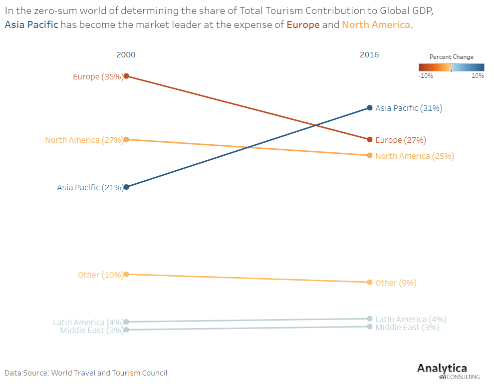
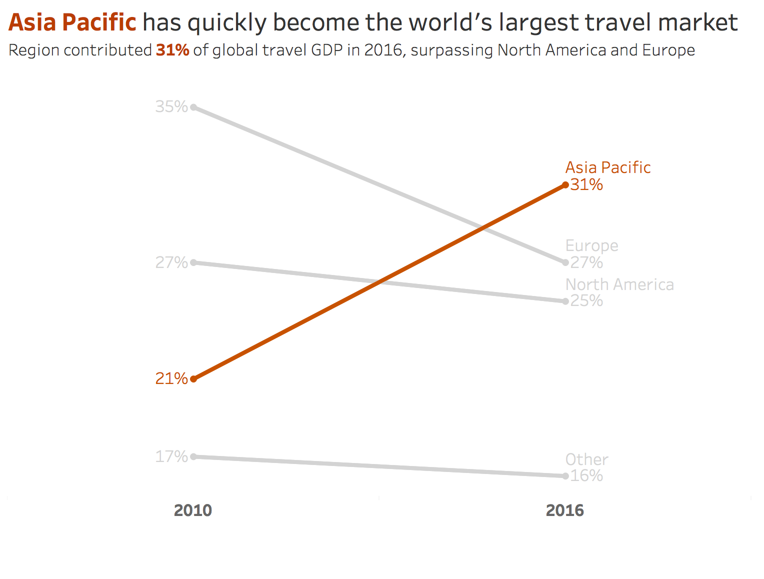
Nearly 50% of makeovers included slopegraphs. This can be an appropriate choice when you want the audience to focus on the change or difference between two data points. We’ve expressed our affinity for the intuitive nature of slopegraphs many times, including examples of employee feedback, market share and your own topics from the June challenge. Within the many slopegraphs, it’s neat to see the wide variety of design choices and points of emphasis. Many focused on the decreases (Dennis utilized a clean design with red to focus attention on Europe, Paul emphasized all decreases with red, Colin chose blue to focus attention on Europe), while others called out the relative increase in Asia Pacific (Clayton made good use of font size and color, Steve included a takeaway and call to action in his title, Joost’s decluttered visual allows for easy interpretation). Others emphasized both increase and decrease (Aleksandra’s, Joey’s and Kristina’s thoughtful choice of two different colors tied together with annotations).
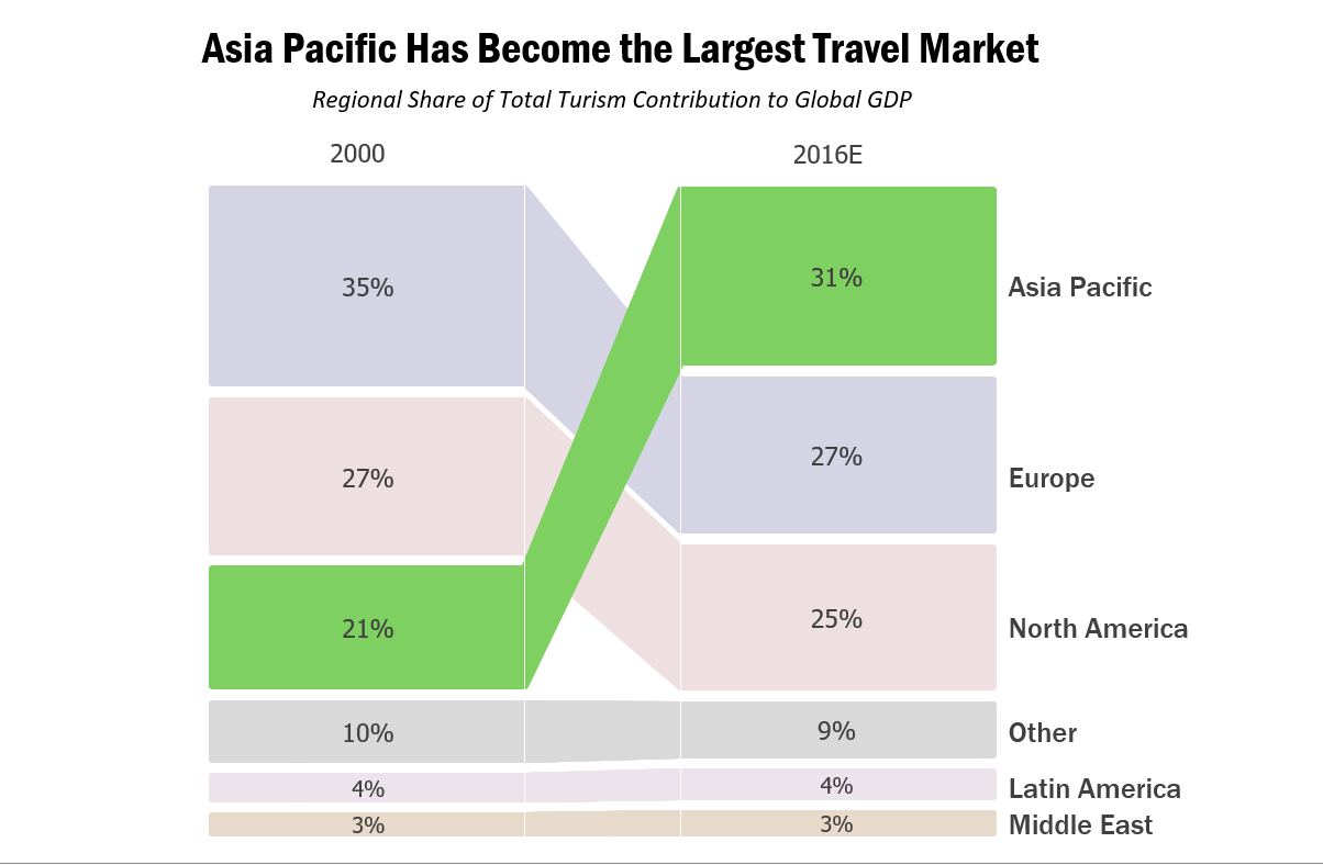
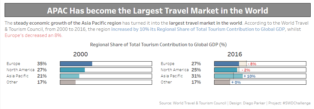
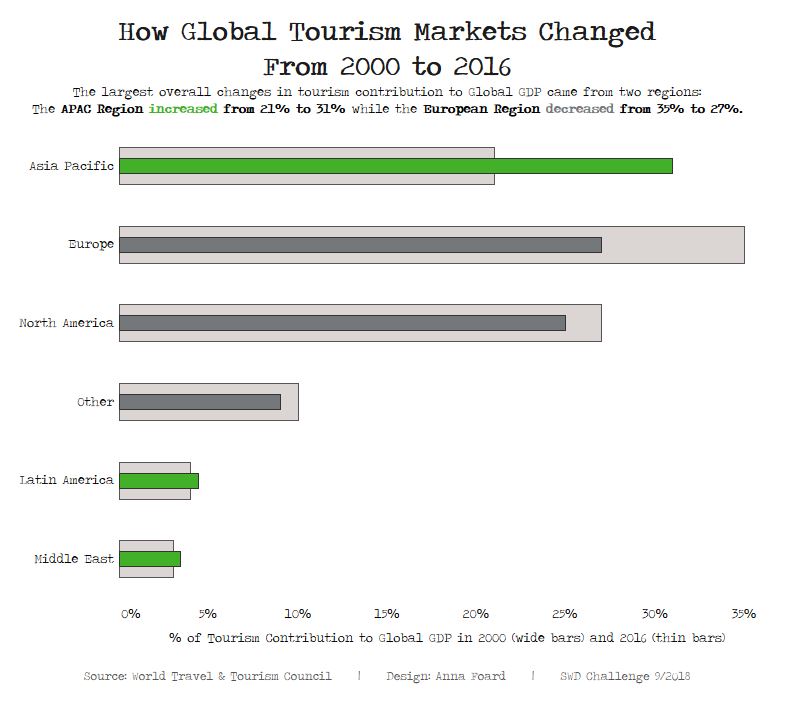
While slopegraphs have a visually intuitive benefit, one downside is that some audiences may be less familiar with how to interpret one, potentially a reason against using one. From that standpoint, check out how the other 50% of submissions ranged from dot plots, rocket charts, a waffle chart, a circular flow chart and many variations of bars (standard bars, diverging bars, bullet bars, and 100% stacked bars). Allan made a nice choice of diverging bars, calling attention to the latest data points with darker blue. Also don’t miss Kat’s submission, including a link to a video demonstrating how she’d progress through a story.
A number of readers pointed out that there’s some broader context missing in this data: the absolute numbers behind the percentages (which represent regional % of total tourism). In absence of this, directly comparing percentages in 2000 vs. 2016 could lead to false conclusions about travel increasing or decreasing on an absolute scale. Check out Dan Z’s submission where he articulates this caveat well. This is a good reminder to always consider what additional context your audience may need to draw a meaningful conclusion.
To everyone who submitted examples: THANK YOU for taking the time to create and share your work! The makeovers are posted below in reverse alphabetical order (to give some visibility to those at the end of the alphabet). If you tweeted or thought you submitted one but but don't see it here, email your submission (including your graph attached as .png) to SWDchallenge@storytellingwithdata.com and we'll work to include any late entries this week (just a reminder that tweeting on its own isn't enough—we unfortunately don't have time to scrape Twitter for entries, so emailing is the sure way to get your creations included).
The next monthly challenge will be announced on October 1 and will run through midnight PST on October 8th. Until then, check out the #SWDchallenge page for the archives of previous months' challenges and submissions.
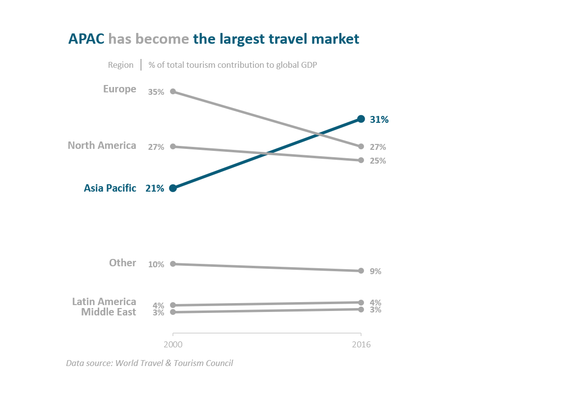
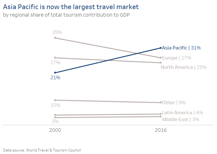
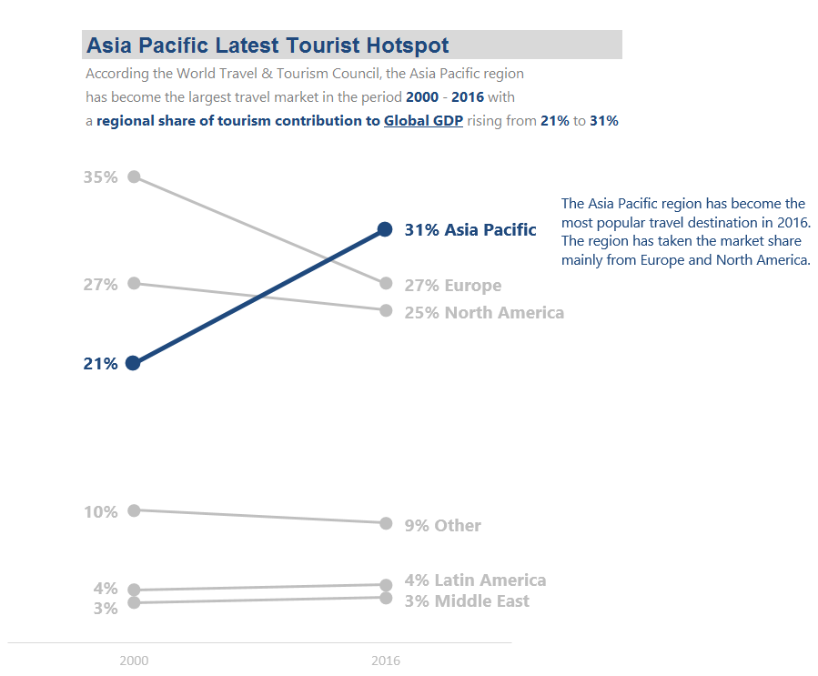
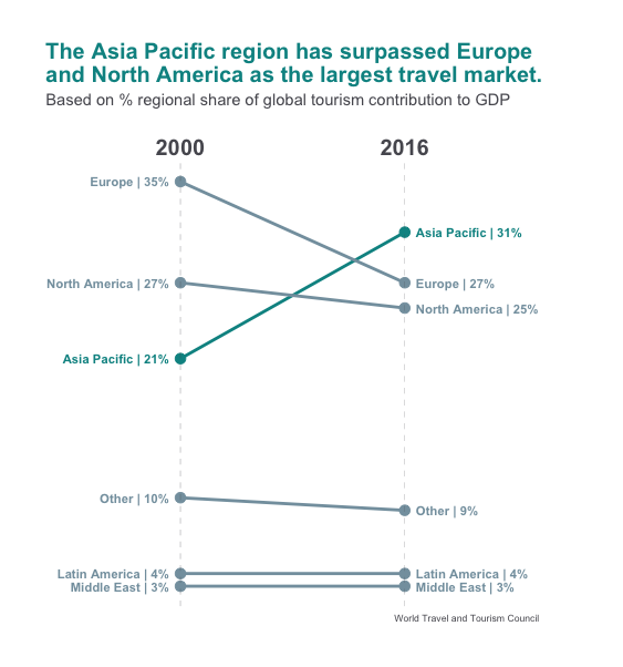
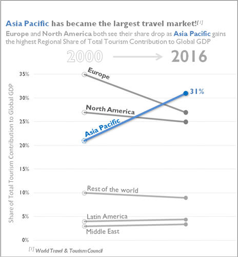
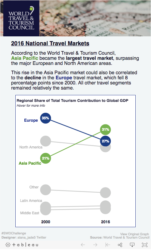
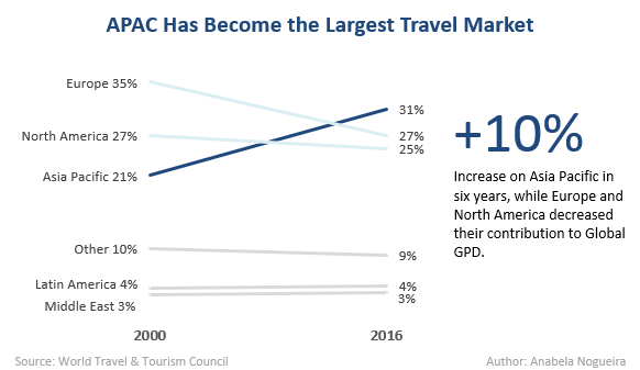
As a reminder, here’s where we started with the dual pie charts. Scroll down to see the many makeovers. We hope you enjoy perusing this month’s creations!

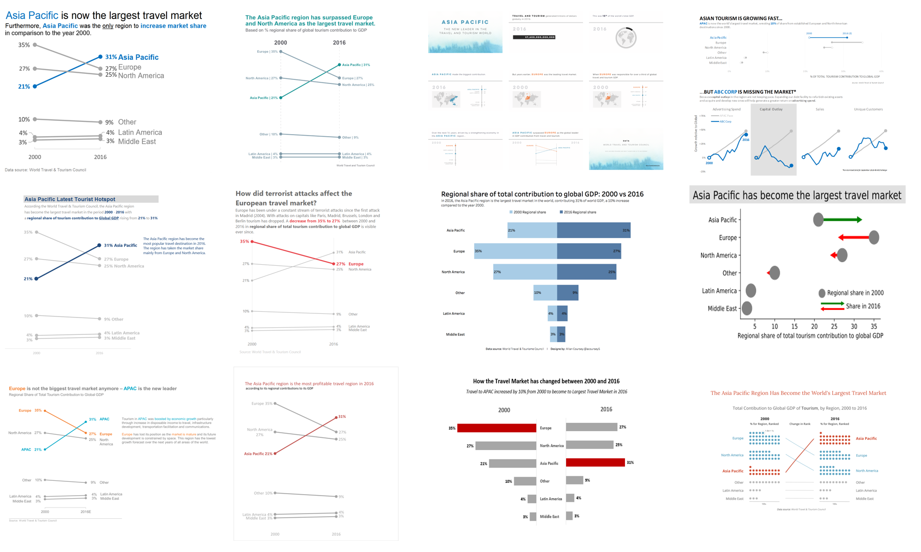
Zunaira
I chose a simple layout with minimum colour. I tried to use colour to highlight the message that I wanted the end user to see. Also added directionality in the chart to highlight increase and decrease in percentage value.
Zach
Here is a link to the Tableau Public post. My goal was to clearly show the growth and rankings of the regions over the given time frame. I did this by drawing arrows on a graph starting where the region ranked in 2000, ending where the region ranked in 2016, and ordered by 2016 rank. I also wanted to make the viz visually appealing, so I used regional colors to pop and emphasize the text, along with a simple plane background that I created in Powerpoint.

Vidya
The takeaway message in the original is that Asia Pacific is the largest travel market in 2016. The title of the chart makes this clear. In the chart though, Asia Pacific is lost in the sea of colours. I was torn between a slopegraph and a back-to-back bar chart for this makeover. The slopegraph shows the trend very clearly but it doesn't make it clear that Asia Pacific ate into Europe and North America's share. The part to whole relationship is lost in a slopegraph. In a back-to-back bar chart, the bar lengths make it evident who the largest contributors for each year are and the part to whole relationship is intact. But Asia Pacific's increase in travel market between the years does not stand out as clearly. It came down to the key message I wanted to communicate with this makeover. I decided the key message I wanted to highlight is Asia Pacific has the largest share of travel market in 2016. The growth in Asia Pacific travel market from 2000 to 2016 is my secondary message.
Blog

Valentina
In the first graph my eyes went to the most colorful slices of the pies, so I decided to highlight with colors the region that grew most between 2000 and 2006. I chose a different kind of graph to show the relationship between the two periods. It would be interesting to have more data about this process: for example, I'd like to know which parts of each continent are more visited. I've used Excel.

Tinju
Simple bar charts grouped per region, designed in Tableau.

Tim
I ended up just creating this by hand with one of our design tools. My first thought was to go with a slopegraph, but my concern was that the percentages didn't stand out enough, and, while the story seems to be about the change, I didn't think the relative sizes should be buried. I thus married a dot-based waffle chart to a panel bar arrangement to a slopegraph. The color strategy borrows from an piece I saw sometime back, and now can't find. NYT, I think. What am I still uncertain about? I couldn't figure out how to elegantly add actual numeric value labels to the dots. Some may miss them. I decided the relative number of dots was sufficient. I can also imagine some finding the dots more clutter than value (as opposed to just a bar, for example).

Thys
Created in PowerBI.

Susan
I got inspiration from @jimvansistine's entry. I thought his rocket lines worked well, so I riffed on that. I appreciate his inspiration for this. The viz was created in Tableau.

Steve
I wanted to keep the original message of the graph the same, while making it clearer to follow. So I changed to a slope chart to get make the change over time and ranking particularly clear. I used colour sparingly and made it consistent across the commentary and the visualization, and made sure that wording was consistent throughout (I found the original use of both APAC and Asia Pacific slightly confusing). I've written this up in more detail on my blog and have shared the visualization on twitter.

Stela
Since we are comparing multiple categories I think using a bar chart is a better option. Also we are comparing how these categories have changed between two time periods I decided to create a bi directional horizontal bar chart. I think this chart type shows the two important takeaways from this data: The increase in travel to APAC. The overall change in travel behavior: decreases in travel to Europe and North America.

Solange
I decided a slopegraph would show the change between the years better, and it would also make it easier to understand which regions changed the most and their ranking. I used colour to focus in Asia Pacific, but made sure to label the other regions as well. Then I considered a possible context for this data: an airline looking for new routes? Or an investor who needs to decide where to invest next? I realized that either way, there was not enough information to recommend an action, but there was an option to spark curiosity which is why I opted for a question as title. To recommend an action I would need to understand a bit more, not only the contribution of each region but also the absolute values. The contribution of some regions has decreased, but has the absolute value between those years increased? Has tourism in general increased as well?

Shahnaz
When I looked at the chart first, my eyes straight drawn on to the label that are outside the pie chart and the year. Then the header I found is misleading as APAC has become the largest Travel Market in 2016, not in 2000. When I look at the chart for 2000, my eyes drawn straight to Europe (i.e. probably due to the dark color). For 2016, my eyes drawn to Europe as well. Due to the light colour, APAC didn't standout for me as the largest Travel market. I would do the graph as bar or slope chart. In my makeover, I chose to do slope chart. Also, the data is in very high level. We can only say that APAC has become the largest travel market in 2016 but cannot say why? I wish I had the data in more detail level (e.g. which month people travel more, season, popular travel destination…). I have used Tableau.

Sashmir
When I was looking at the original image, my eyes were drawn to the two circles. After inspecting the shapes my eyes went back up to the title and took a while for me to register what APAC meant. Once I understood that it was about the Asian continent I inspected the shapes again and looked from left to right repeatedly to compare the values of the different continents. Given this experience, I found 2 issues with the image that was used. First is the title could be improved by using Asia instead of APAC since it is a more common term. Second is by comparing the 2 pie charts my eyes had to keep moving back and forth in order to compare the different slices. To address the first issue I used the word Asia and placed a small description after the title to convey a clear message. For the second issue, I used a horizontally stacked bar chart for easier comparison and in order to emphasize Asia I chose a strong red color and used a grayscale palette for the other continents.

Sarah
I wanted to build something that was easy to read and draw comparisons between the years. This is very difficult in the original pie chart version of the viz. With this in mind I decided to build a bar-in-bar chart which clearly shows the latest year versus the earlier year used for comparison. I ordered the bars by the latest value so APAC appears at the top since this is the focus of the story.
Interactive viz

Sara

Sanne & Michiel
Our first thought was a single slopegraph, but because we already saw so many online. So we decided to use a slopegraph-small-multiple combination. This allowed us to show the different layers in the story. The three continents with strong movement we placed on top, the continents with small change below. We used color and dark grey to create hierarchy between the top and bottom charts. Next we ranked the charts by size in 2016 and placed the “Other” as last. The visual is made in Excel. We wrote and aligned the title and subtitle in such a way that the colored text part is near the charts they belong to. Small numbers use a single decimal to show change. The year is written in two numbers instead of four. The main line in each chart crosses over the others.

Sandeep
Clearly, looking at the title, the author wants to convey that APAC has become largest travel market (in terms of share to global GDP). This means he is comparing regional share to all other markets as was in year 2000 and also highlighting the number 1 ranked regional share for the year 2006. Hence, my story would be to show how each regional share has changed compared to 2000. Then rank them according to the current year (2006) regional share to global GDP. This is built in Tableau Public. Link to dashboard here.
Twittter | LinkedIn

Rodrigo
Yes, it is a simple barchart as I feel it does a much better job to draw the 2000/2016 comparison than the original set of pies. To enhance the bars I've opted o add the region name, its measure and the growth percentage to allow users to also understand the change more quickly. For the use of color I wanted to make it clear that the focus is APAC region (as the takeaway title declares) and left the remaining regions muted in a light gray for context.

Roman
Had a few thoughts about rebuilding this chart, and before long, I realized I had quite a bit more than a paragraph! Here’s a link to a blog post I made on the topic.

Raymond
A little zany! Why not!

Pietro
I've made a really simple makeover based on the basic learnt on SWD! So 2 different pies for a comparison isn't a good choice and column and lines are better when your art showing data about time. I've used Power BI desktop and paint.
Linkedin

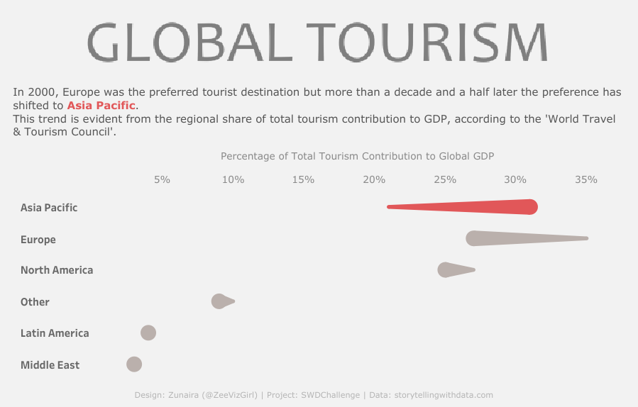
Paul
When I saw the original pie charts, my eyes immediately went to the largest slices. However it's difficult to compare changes in segment size between the two pie charts. Based on the original title, only the second pie chart is needed to see that APAC now has the largest travel market. In that case though, the first pie wouldn't be needed. Instead of just reducing the data to only 2016, I realized that showing the changes in segment size would be a more valuable use of this dataset. Since there are only two dates in the dataset (2000 and 2016) and my goal with this viz was to show change in travel share over time, my mind immediately went to a slopegraph. Especially after having created a slopegraph for June's #SWDChallenge, I knew it would be a great way to not only rank the segments for each of the two years, but to also show changes between the time periods. In my updated version, it's now easy to see that while APAC is the largest market, the market share for both North America and Europe decreased the most over the 16 year period.
Interactive viz
Patricia
For this makeover I used the lessons I learned from last month's challenge using dot plots. Along with slope graphs, dot plots are a great way to illustrate changes especially between two points of reference. I used Python's Plotly to create this graph, and I wrote a tutorial on how to make connected dot plots here.

Olga
I decided to make a simple slope graph, partially for the sake of exercise, since I have not done this type of chart in Tableau before. I also thought it would deliver the main message really well. I went with a simple colour-blind-friendly palette. I was interested in how big is the contribution of tourism to the global GDP and how many jobs it generates. I decided to add a couple of extra sentences of insight/description and a link to the World Travel & Tourism Council 2017 report.

Nishanth

Nick
A slope graph seems to be the best way to see change between the two years for each region so it's a pretty basic viz, nothing fancy.
Natalia
For this makeover, I decided that the most important idea was to highlight changes in top-3 players, here was the most drama happening. That's why I moved Latin America and Middle East data in the comments.
Twitter

Matt
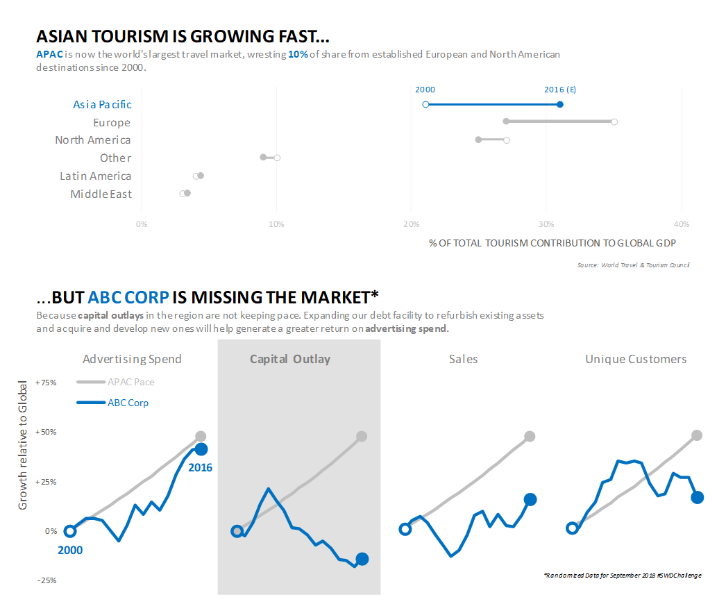
Tools: Microsoft Excel 365 (Android App, Desktop Program). This is my first challenge, so the process took a little longer than I was expecting. The title in the original graph gave me an idea on what data needed to be highlighted. From that point I knew I needed to make a point that the Asian Pacific Region was the “Bell of the Ball.” In my day to day, metrics are reported with Gauges, and although a gauge graph would be appropriate it would not show the full story.

Marian
For me the original visualization made it difficult to compare the percentages per region per year so felt a bar chart grouped by region would give the best visual. I got feedback to put a larger gap between the regions and I’m pretty pleased with how it turned out. Depending on when the original Viz was published you could also argue that the original title is a bit misleading. Since we are now in 2018 and are comparing numbers from 2000 and 2016 only, I thought it was more appropriate to state that in 2016 APAC was the biggest travel market rather than ‘Asia is the biggest travel market’.
Viz | Twitter | Tableau Tip: Adding space between grouped bar charts

Maria
After considering a bar chart (stacked horizontal or simple vertical) I have chosen a slopegraph. WIth a slopegraph I could easily show the visual change from 2000 to 2016 for each region via the slope of the respective line. I used color to emphasize visually the "Asia Pacific" results that made the main message of the initial graph. I also added the text boxes on the right side, using the respective colors to make a link with slopes. I decided to show 1 more digit on the data labels of Latin America & Middle East. As there is a minimal change from 2000 to 2016, these slopes are not horizontal, so I needed to explain this with more accurate numbers. I find that they do not attract attention due to the color that pushes them to the background. I used Microsoft Excel.

Maja
Mahfooj

Liyang
I just finished reading Cole’s storytelling with data and the idea to use a slope graph to makeover the original chart came to me right away. Additionally, the highlight and annotation to draw attention are also important takeaways from the book which I applied here.

Luigi

Lora
Made in Excel. Wanted my story to focus on the drastic changes that occurred over the four year period.

Lise
Made in Excel, with the help of a SWD blog post on bullet graphs. I wanted to show the change more clearly in general, and specifically the change in the Asia Pacific market. I decided on this graph type because I find it easy to read and because it shows the development reasonably clearly. The blue 'dots' (lines) makes it a little unclear because I've gone for quite chunky lines to match the bars, and it's impossible to know whether the 2000-figure is the top, bottom or middle of the line. However, given that my aim is to show the change from 2000 to 2006 rather than the exact difference, I find this acceptable. The bars are sorted largest -> smallest for the 2006 numbers. For precision, a slope graph would have been better.

Lily
My immediate thought when looking at the 'before' pie charts was "Europe has gotten smaller" because the dark navy blue caught my eye and that slice of the pie seemed most prominent. However, the title indicated that the Asia Pacific slice was really what the chart was intended to illustrate. So I redesigned it as a slope chart, with Asia Pacific in a bright red and the rest of the countries in shades of blue and green. This brings attention to that specific part of the story. I also re-titled it with "Asia Pacific" instead of "APAC" because not everyone knows that acronym and it isn't labeled that way in the chart itself. Time constraints prevented me from thinking about the broader context of the data, but I'm happy with this as a starting point.
Website

Laura S
Please accept the attached graph on behalf of the graduate students at Middlebury Institute for International Studies, who are using “Storytelling with Data” as a textbook this semester in the course Analytics and Thick Data. We love the blog and were excited for this opportunity to put our data visualization techniques to the test!

Laura M
I decided not to use any tool. For me is important starting drawing first my ideas and then use any tool if is needed. In this case I wanted to present my proposal only painted in order to demonstrate that tools are usually overrated, I mean we usually start the process opening a tool and creating a "new file" when the most important is starting drawing in order to tidy our ideas (most important KPI’s, data that we don't need,colors, sorting etc).

Larissa
This is my first time participating in the SWDchallenge. I used Tableau public and Power Point to make my graph.

Kristen
I love the simplicity of a slopegraph and it seemed the perfect option for this data. Created using Tableau.
Kristine
As I have understood, the "Before" graph would like to underscore that APAC has already become the largest travel market came 2016. In this sense, only the APAC marker (2016) was left colored, and a call out stating the key takeaway was placed and pointed to the marker.

Kristina
I believe the point of the original chart is to show how the share of each of the six regions has changed from 2000 and 2016. However, the pie chart is a format that makes that comparison quite difficult. One chart type that I came to know and love thanks to SWD is the slopegraph and I thought it was the perfect format for this data. We have two states - data for 2000 (before) and data for 2016 (after) and also the numbers are suitable to show the dynamics in the share of Europe and Asia Pacific - the two regions with the most significant change - positive or negative. This is the reason those two are in color - blue to mark the increase for Asia Pacific and orange to mark the decrease for Europe. However, one more reason to decide to focus on these two regions is because I'm from Europe and my story here is that I want to present a proposal to increase the Europe share by making North and Southeast Europe more attractive. The mentioned European Tourism Association is fictitious.

Kirill
Please see my very first attempt to participate in the data challenge. Created in Excel.

Kaushik
Made in Excel 2016: Given I have data for two time periods, which are quite apart, I choose to use a "Stacked Bar" chart to show trends:
1. Normalized bars - each bar has same length. No misrepresentation by having varying length bars for each region.
2. Stacked bar - shades of black and lighter black used, to show gradual change.The more the color in the bar, the larger the contribution. I avoided jarring colours as they only draw attention to themselves and not what need to be understood.
3. Data labels - Big data labels to improve readability. Red color used to draw user's attention to steepest decline in share.
4. Added Trends - Added trends to aid interpretation of the graph.

Kat
One word in particular stood out to me in this month’s challenge - “storytelling". I chose to focus my efforts on uncovering a story in the makeover graphs and then animate this using Adobe After Effects. You can see the final version and a look into the process here.

Julian
Slope graph was an obvious choice from my point of view. Done with python and matplotlib and published on my Twitter account.

Joost
Upon seeing the pie charts, my eyes were drawn to the title and then to the large share of Europe in the first pie. It took me a while to figure out what the main message was, which is the increase in the Asia Pacific region in 2016 compared to 2000. Obviously I thought that a pie chart was not the best chart type to visualize here. I kind of automatically started to link the shares of the first pie chart to the corresponding shares of the second pie charts, creating kind of like a slope graph in my mind. So I decided to go for the Slope Chart to make over this chart. Though I normally work with QlikView handling larger datasets, I created this with Excel.
I am wondering what the statistics were in the years between 2000 and 2016. Whether this was a trend, or just random fluctuation for every year. I am also wondering what the statistics are for 2018, as I am leaving tomorrow towards the APAC. I'll assume I will be visiting the most popular travel region.
John
A slope graph made a ton of sense to show changes in the global tourism market between 2000 and 2016. This visual allows us to easily see the rate and direction of change in global tourism market share across world regions. Our goal here is to highlight the dramatic increase in market share for Asia Pacific, so I chose to highlight the Asia Pacific slope in blue to make it stand out from the other regions (for which I used a muted grey). I used the same shade of blue in the text above the visual to help the reader connect references to Asia Pacific in the paragraph to the visualization.

Joey

Jim
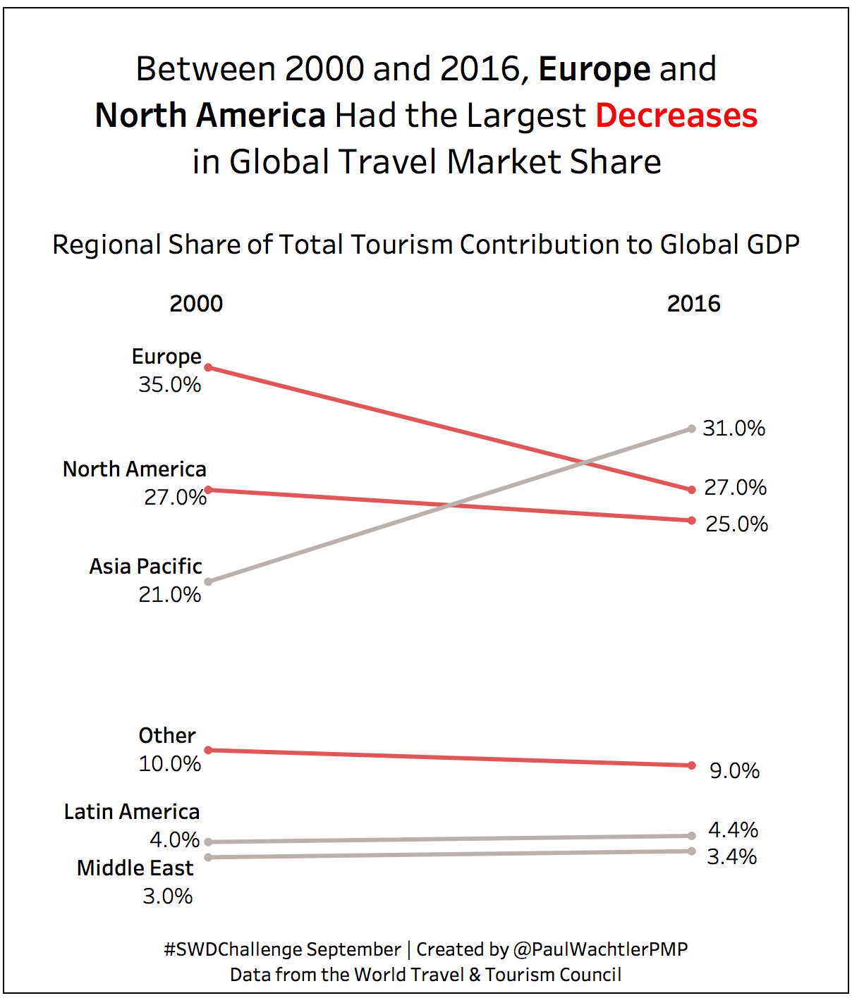
For this month's challenge I thought of a slope graph at first. After seeing so many of those, I tried to test out a variation by measuring the percentage point change from 2000 to 2016. I like how it highlights the growing and shrinking share, which was one of the main takeaways in the data. But I think it obscures the ranking of each region, so I called that out in the text labels. Created in Tableau.

Jeremy & Sarah
We thought we would try the rarely-popular doughnut chart – it will be interesting to see what people think. It’s not as accurate as a stacked bar chart, but the circle does lend itself to a more engaging layout: a bar chart would not have nearly as much room for adding commentary boxes. We stuck closely to the provided data – it would have been interesting to see absolute figures, and the changes in these year-on-year. With more time I would also have liked to explore the WT&TC’s figures and see what countries were included to make up each of the regions. As it is, while I think the map is a helpful guide, it’s also a best guess (and so any errors are mine!)

Jennifer
Created in Data Studio – tool tips available on hover.

Jennie
I used Excel's basic line graph function and decided a slope graph would show the changes clearly. Our corporate colours are pink and blue so decided to use those to highlight the 2 main changes, with the most interesting (to me) in bright pink to catch the eye.

Jenna
This is my first #SWDChallenge and my first time applying what I've learned about R / ggplot2 to plot on my own. I thought a simple slopegraph like this would be most effective to communicate the main point of the original chart - that Asia Pacific has become the largest travel market - surpassing Europe and N. America in the process.
LinkedIn
Jared
I ended up going with a slope chart - like everyone else it seems. Despite this, I can say I learned how to create a slope chart in Tableau. Something that I've never done before!

Jamie
My main goal was to highlight both the change in share over time, and the current relative shares. The growth in the Asia Pacific market was pretty significant, as was the drop for Europe, so I wanted to be able to highlight that. Slope graphs are still fresh in my mind, so I used that for the change factor. With more time I might consider a dot plot with directional connectors to show the change in position. The slope graph does allow for a comparison of the shares in each year, so the bar chart may be redundant, but I felt that it makes the comparison much more clear. The need for two charts in this arrangement may be, in itself, a good argument for going with the dot plot instead.

James
The key message for me was the fact that Asia Pacific has become the largest share of global tourism, secondary message being that Europe and North America have seen their share drop. I’ve used Excel and the quintessential storytelling with data colour palette of grey and blue to highlight the key message. For the year 2000 data points I’ve used a faded outline to try and convey a sense of movement between them and the solid data points used for the year 2016.
Jade
As we know, humans have a hard time judging the area segments of a pie chart, let alone comparing the areas across two pie charts. So my first thought was to change the visual to a type of graph that would better display trends and rankings over time; so I decided to go with a slope graph. With the more appropriate graph type and green color call-out, readers can now easily see that Asia Pacific moved from #3 to the #1 slot in 2016. I also thought it was noteworthy to point out that Europe’s travel market had experienced decline. It would be helpful here to have actual dollars of Global GDP to give a little more context as to why the changes in percentages were happening.
Interactive viz
Ilya
The classic slope graph seemed a natural choice to show both the rankings and the dynamics of regions’ market share for two moments in time: with only one line going upwards from the third place all the way to the top, highlighted in blue for more contrast, it reads in unison with the title. Made with Highcharts with styling and interactivity stripped to bare minimum.
Inta
I used PowerPoint to show the percentage increase or decrease, emphasized the increase & decrease in the data in a column chart and green color for increase, and grey for decrease. I showed only one number, % increase or decrease for each region.

Gordan

The FrankensTeam
The most important message of the original visualization is how the shares changed, and - as we can read from the title - Asia Pacific region become the leader of the market. Pie charts are good choice to represent parts of a whole but cannot drive your focus on the change in shares and in rank. So our choice is stacked column chart with sorted data where we show the change in position with "flow". Our visualization was created using Excel 2016. It is not a built-in chart, we did some magic with scatter lines. You can find more of our work in our chart gallery.
About us
Franck
This chart is my contribution to the september 2018 #SWDChallenge. I wanted the chart to focus on rank shifts so I designed it this way:
* colours focus attention on rank shifts; any other information (such as percentages) gives the reader a deeper understanding, but uses less eye-catching colours (i.e. grays) in order to not disturb the main message
* two distinct colours differentiate rise and fall, respectively in green and red
* the chart is vertically oriented, so that shapes of the chords themselves indicate a rise or a fall
Also, even if my first idea was to use a basic flow chart, it was more appealing and fun to use a circular flow chart :-) Many thanks to Nadieh Bremer for sharing How to create a Flow diagram with a circular Twist.

Emily
The original slide focused on only half the story (the rise for Asia/Pacific) and not the corresponding drop in Europe. That, plus change over time, called for a slopegraph that de-emphasized the less interesting markets.

Dragos
The pie charts were a good representation of what the title lead to, it was just that it took a little time to notice the areas that grew and the ones that decreased. I used two clustered bar charts to show the two years in parallel and the differences between the two dates. Some data about the changes in presidency in these regions would have been nice, maybe this made the difference. I used Power BI.

Dorian
I am using Tableau to compare the travel market share using bar charts and reference lines.
Viz by Dorian Banutoiu (Canonicalized) • Tableau Public profile.

Dirk
I used MS Excel. I've also posted to Twitter.
Diego
I tried to keep it simple, just adding some colour to the important text and numbers.
Viz Tableau Public
Dianna
I’d use the data as a starting off point to explain why Asia Pacific is doing so much better with tourism compared to all the other areas we had data for. Listing Asia Pacific at the top in green with all other regions in either yellow (for no change) or red (for decreases) draws the user’s attention to a clear conclusion that Asia Pacific is performing best. Depending on my audience, I’d try to answer a few questions to create this data narrative. Things like what Asia Pacific might doing better than everyone else and other causes for the increase would be a good starting point. Likewise for the no change and decrease groups- are there things that they could be doing differently to increase tourism? What are the reasons for the decrease in tourism? I’m sure we could cater the data story to them to figure out a plan of action based on these questions. I’d also use the percent changes of actual tourism earnings rather than showing changes in the percent of GDP, that way we have something a little more concrete to show true changes in tourism, rather than just how tourism earnings and GDP relate.

Dennis
On Twitter I already saw some designs coming along all drawing the same conclusion. That's why I forced myself to make assumptions (as part of the exercise) and followed a different path. I am aware that the conclusion I am drawing from this data is not fully supported by the data. I would need more data, for example tourist data by year, to see where the decrease started and see if there is a correlation with the terrorist attacks. The absolute numbers on tourism contribution would also help to see if there is a real decrease or that other parts of the economy did increase over time. I decided to use a slope chart to show the decrease between the two available points. This tells us the top 1 position Europe had in 2000 on the one hand and the decrease ever since on the other. As this decrease (and the subject itself) are both negative the use of a red color seemed the most appropriate. To highlight Europe I also increased the font size, the line thickness and the shape size. This was all done using Microsoft Power BI, my main tool for data analytics.

David
The power of testing: I did a little audience testing and found my snappy titles were a bit too snappy. I originally said "Asia Pacific: Your Target Market” This misled my audience into thinking that 31% percent was somehow a target. My more wordy title separated the facts - "Asia Pacific: The largest travel market" - from the call to action "Your target market?"

Darryl
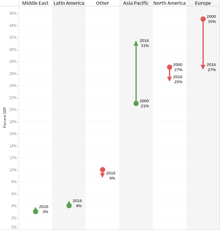
I thought it would be useful to see the numbers on a scale of a graph to easily compare the relative values of the 2000 and 2016 data for the different countries. I then used a modified dumbell type graph to clearly show how the different regions had moved of the period, adding colour so this stands out a little more.
Daniel
In this illustration, I want to highlight the 2016 figures, and also highlight the change since 2010 (inside the bar).
LinkedIn

Dan
It is nothing wrong in investigating the evolution of a market share. We do this very often and this implies percentages comparison. IMO, comparing the numerical attributes of the same entity (in our case region) that are estimated in very different contexts (periods of time) is like comparing different variables. The market share variation of the same item (calculated either by difference or by ratio) becomes less relevant and, in this particular case, it looks very different from the absolute values variation. One of the most often used solution to encode variation, the slopegraph, becomes in this case more like a parallel coordinates plot because the slopes of the lines are losing the “difference” encoding sense. Let’s have a look at Europe, for instance. Ratio calculation of the market shares between 2000 and 2016 shows a serious -23% decrease. But the absolute figures (not included, but you can get them here: choose Download Source Data in Excel format) show a +23% raise. Without the absolute figures in hand I know that I need to be more careful in designing graphs that can influence my audience conclusions. Neither -8% (difference) nor -23% (ratio) are calculations that properly describe Europe evolution in tourism. In the absence of absolute values, my design is trying to discourage precise visual decoding of differences between values that belong to the same region, but related to so different contexts (years) and emphasize other relevant observations. Those are: market share updated rankings (with Asia Pacific becoming first travelers's destination), a similar cumulative share now and then (83%) among top three players and a more balanced market share distribution between them in recent years (6% = 1st-3rd in 2016 vs 14% = 1st-3rd in 2000).

Crystal
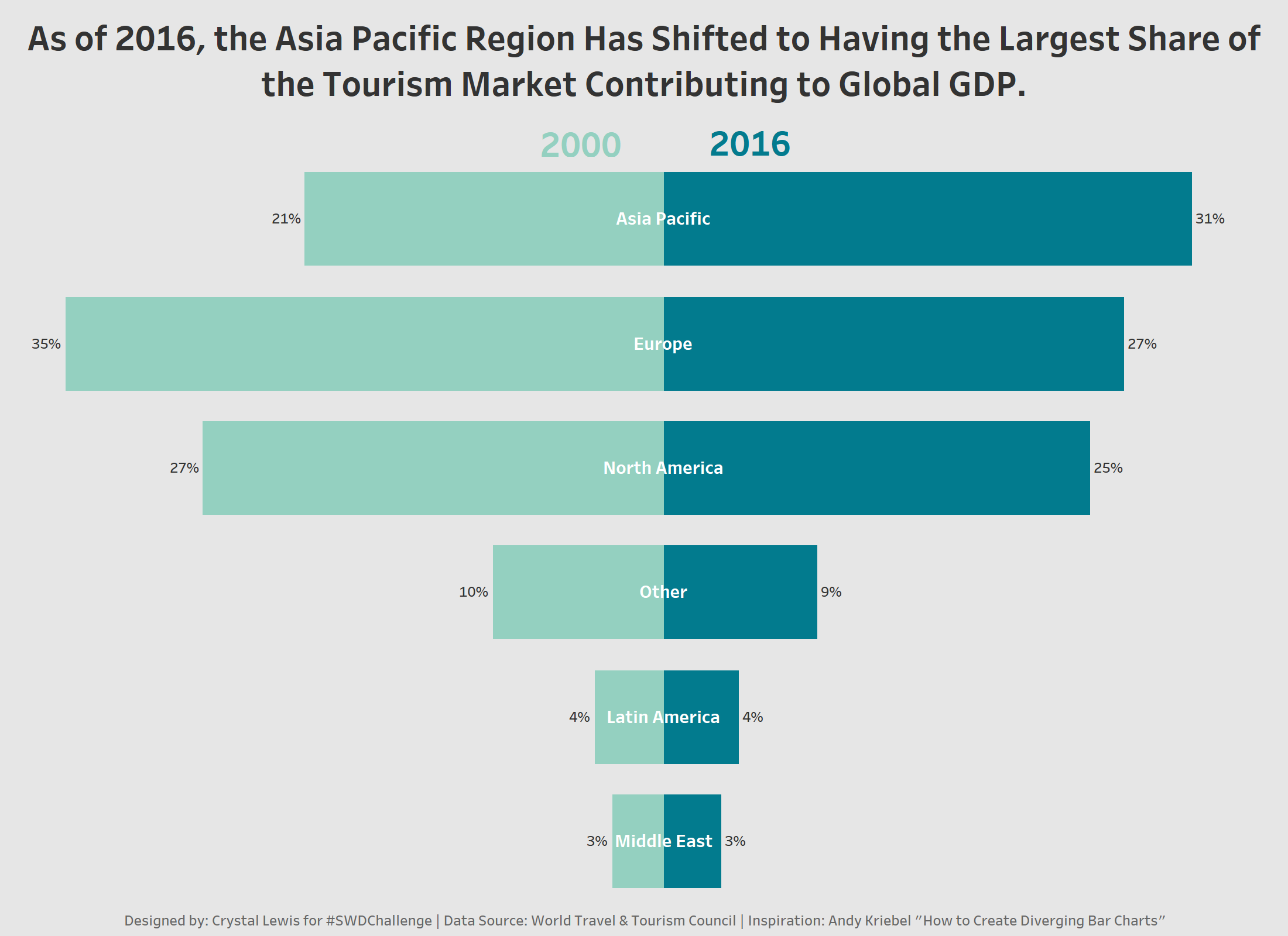
This month's #SWDChallenge makeover gave me the opportunity to try out a new butterfly/diverging bar chart. I think this makeover allows for easier comparisons over the original pie charts.
Interactive | Twitter
Colin
Data visualizations can tell an interesting narrative. However, sometimes the focus can be lost in the chart choice and design. The challenge came with some useful guidance on how to makeover a chart, which I decided to follow: choosing an appropriate chart type to show change over time such as a slope chart, use of pre-attentive attributes like colour and size to draw our audience's eyes to the decrease in the European travel market size, identifying clutter and removing elements which may be confusing or complicated, evaluating the wider context and adding a call to action for further research into this topic.
Interactive viz | Blog

Clayton
Since reading Cole's storytelling with data and the blog I have enjoyed discovering the slopegraph. A useful visual for comparison situations whilst also displaying rank. In my mind, perfect for this makeover. The visual also quickly highlights that no other region has experienced a gain in market share.
LinkedIn

Christophe
I used two main principles from the literature: 1) “Visualizing is categorizing (ordering)” from J. Bertin , and 2) “There must a common (horizontal or vertical) basis for visual comparison” from Cleveland and Mcgill (1984). So to help the reader compare market shares, whether they were increasing or decreasing, visual variables (here bars) should be somehow aligned. I’ve chosen horizontal staked bars with common references for starting or ending points. So bars are aligned either on the right or on the left . My trick was to slightly cheat with the way one usually do horizontal stacked bars, I changed the order of continents and inserted some blank space and align Europe (on the left) and North America (on the right) to highlight the increase of Asia-Pacific in the middle. The rest is classic (colors, values, text, highlight, etc..).

Burkhardt
In order to focus the graphic on the essential, I have sorted the data series and clearly marked them in color. With the headline I then pointed out the important points: a) Europe has clearly lost and b) Asia Pacific has clearly won. What I lacked for a better presentation are the absolute numbers. For example, it could be that the number of trips in 2016 has decreased significantly (probably not so....). Which tools did I use? I used simply MS PowerPoint with the addon "Thinkcell" to put the graphic cleanly into a suitable format. I completely invented the Call-To-Action. Here it depends surely on who looks at this diagram: the European tourism minister will certainly have other To Do´s, than the tourism industry in the Asia-Pacific region.

Brett
The first change I thought would help make the message more clear (for me anyway) was to change the two pie charts to a single slope graph. I think the pie charts were a little hard to follow, as I had to compare them for a bit to find out the difference. I chose a slope graph as I only had two dates to work with with to show the change, and I find a slope graph is both great at that type of comparison. Like a pie chart, a slope graph is also easily understood by most audiences. I don't know much about the audience this was intended for, but as a person outside of the travel industry it took me a few seconds to understand what APAC stood for. I'm assuming this makeover is for a general audience, so I changed APAC to Asian Pacific. I agree with the original design that the Asian Pacific market taking over first place from the European market was the most interesting message, so I highlighted those markets in the title and in the graph. If this was about exploring all of the regions, I might not have done that. The last key difference I added was giving context to how much money travel accounts for, so I did some additional research and I found that the Asian Pacific market had $326 billion in travel bookings in 2012. That is a big number, so I added it below the graph. I used the full number without the "billion" abbreviation to show how monstrously big that number is.

Brent
I chose a slope graph to show the change over time mainly because there are only two years of data to compare. Instead of using the arbitrary colors on the pie chart, I used a standard blue-orange diverging color palette, which worked well to grey out the regions that didn't experience change while highlighting the shifts in both Asia and Europe. I built the graph in Tableau and it is posted on Tableau Public.
Brad
I added some completely fictional data from a fictional company to generate some business-relevant takeaways.
Bosley
I used Tableau to create this slope chart which I believe is much easier to read than the original. I went back and forth on the color to highlight Asia pacific but landed on the dark red as I felt it was punchier than a blue version of the same chart.
Benjamin
First time of many for me participating! I thought this dataset is a prime target for a slope graph comparing two different years. I think the raw GDP values in a separate plot, probably not another slope graph, would be helpful in supplementing the percentages shown. Otherwise, this single plot makes it look as if Asia took the tourism from the European region. Perhaps it's my age group and what I'm exposed to on social media, it seems like traveling is becoming a much more common use of disposable income. So additional data in total tourism GDP difference between 2010 and 2016 could further illustrate how much bigger tourism to Asia is.

Annamarie
I used Tableau to illustrate the story.
Graphs are colored by increase (green) or decrease (light gray) in overall tourism contribution to GDP from 2000 to 2016. Wider bars represent 2000 figures while thin bars represent 2016 figures. "Travel" was on my mind when I chose the green with typewriter fonts.
Anna
I have created just simple one bar chart in Tableau. I have added color to Asia Pacific to catch the eye on this region.

Anabela
I decided to follow along the image idea to promote the growth of Asian Pacific. In order to do that, I decided to use a slope chart (I've never seen one), build with Excel, where the dark blue lets you focus on Asian Pacific.
Ana
For the September challenge, I wanted to find a way not only to represent the growth of APAC and the decline of Europe, but also that the market is still stable and dominated by same three regions. That was the reason for a bar chart selection instead of line chart. I also wanted to play with unusual colours to explore other possibilities. I prefer to keep the use of Excel and Powerpoint, as this is what most of the companies will use for their presentations.
Amy
I often present to audiences that are very analytical and prefer to have access to all the data to make sure they come to the same conclusions. For this type of audience, I developed a second visual that is a stacked bar chart. Again, I used size and color to draw the eye to the Asia Pacific region, but here I included all the data labels. I also think my analytical audiences would appreciate a sense of the magnitude of the data (although I didn't include additional information in my visuals). For example, in the slope chart, it looks like Europe is on the decline. However, it's not clear if the overall number is going down or just growing at a slower rate compared to the other regions.

Amit
I used Excel and relied on a line graph to demonstrate each region’s change over a 16 year period. The original graph was an OK start. I found the sub-text confusing and could not interpret what the percentage represented. I.e.: It reads like “Europe got 35% of GDP from Tourism, in 2000.” I assumed the percentage was a region’s market share against global tourism spend AND that total tourism spend remained flat. The real story for me was that APAC grew very strongly, while other regions remained flat or dropped. Europe had the largest drop. This is what I show. I used RED to contrast against blue shades to draw the reader’s attention. A sarcastic title at top adds humor. Whole dollar amounts would make the data and graph more useful.

Amber
For this makeover I used a line graph in Excel.

Allen
For this challenge I’ve recreated a set of charts, starting with pulling the source data into Tableau and playing with different visualizations to see what is interesting. The final display has a few different views to display my findings. I believe combining different views to build the story has worked here, while doing my best to stick with the theory of keeping it as simple as possible. More data would be interesting, I’d like to see a more granular view to see how countries in these markets are changing as well as seeing how the market itself is changing.

Allan
I decided to make a simple diverging bar chart for this challenge using Tableau.

Aleksandra
I wanted to focus on the change in the ranking (highlighting also drop of Europe) and some reasons behind it.

Click "like" if you've made it to the bottom—this helps us know that the time it takes to pull this together is worthwhile! Check out the #SWDchallenge page for more, including details on the next challenge. Thanks for reading!