visualizing change via slopegraph
Elizabeth Ricks recently joined the storytelling with data team after spending the past decade in various analytical roles in the healthcare, manufacturing, retail and payments processing industries. Most recently, she was Assistant Vice President of Analytics for Bank of America Merchant Services, where she strengthened her data storytelling skills by using the key lessons covered in the storytelling with data workshop. Elizabeth has a passion for helping her audience understand the "so-what?" when communicating with data. Join me in welcoming Elizabeth and her first blog post here! You can connect with her on LinkedIn or Twitter.
Communicating the “so what?” is fundamental to telling a story with data and I can’t overemphasize the importance of choosing an intuitive visual. Often our story is lost, simply because because we’ve chosen a graph that forces the audience to do more work than necessary. Today’s post illustrates this transformation with a real-world (de-identified!) example.
Imagine you’re a marketing analyst tasked with evaluating your product’s market share and communicating the growth opportunity to your senior marketing leadership team. You’ve gathered the data on the 14 states in which you operate and visualized your market share over the past decade in this bar chart:
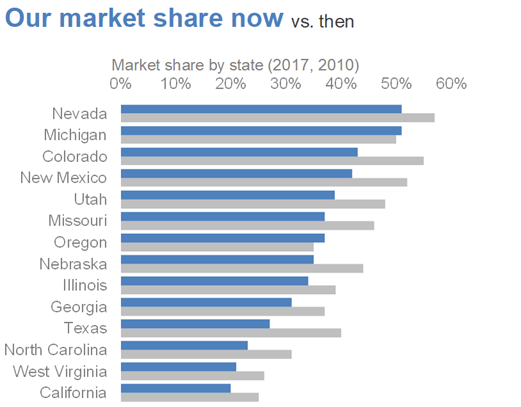
This graph is functionally adequate. It’s thoughtfully designed using pre-attentive attributes. The color blue cues us where to look first (that’s our market share now!), which allows our second series (our market share then) to fade to the back.
Additionally, horizontal bar charts have many visual advantages as outlined in storytelling with data:
Familiar and easy to read
Useful for long category names
Align well to how we typically process information: starting from top left and zig-zagging across the page so that we process the category names before interpreting the data
We see this final point demonstrated here, as a quick vertical scan makes it relatively easy to see that our product’s market share is down in every state, except Michigan and Oregon.
That’s fantastic if that’s the end of the story. However our task is twofold: we also need to communicate how our market share has changed over time and our recommendation for the opportunity. With the current design, how easily can you see which state(s) had the greatest decline in market share? Between Michigan and Oregon, which had the greatest improvement?

As the designer of this information, we are asking our time-crunched marketing executives to do a lot of work to scan the graph and make 14 different comparisons. Never make the audience do more work than necessary to understand a graph! Perhaps a different visual would make the task easier.
Enter the slopegraph.
The slopegraph is a visually intuitive way to see what’s changing in your data. For a deeper analysis of the beauty of slopegraphs, check out this post.
Let’s instead connect the data points with a line. Notice where your eyes go first now.

A few interesting things emerge. We can immediately see that some states have higher rates of change than others, both positive and negative. That’s the "so-what" what we want our audience to understand!
We can further improve by using color to focus our audience’s attention on specific takeaways. For example, we might use blue to highlight the positive story: we’ve improved in 2 states!

Or we could focus attention on Texas, the state with the greatest market share decline.

Finally, we’d add a call to action emphasizing how the audience should use this information. Remember, we always want our audience to do something!

In conclusion, if your “so-what?” is what’s changed over time, then the slopegraph can be an extremely effective visual. If interested, you can download the Excel file with the above graphs.
From a formatting standpoint, slopegraphs can take some time to set up. However, that’s time well invested if it means your audience clearly understands the story. Here’s a handy Excel template to get you started.