
#SWDchallenge: visualize variability
“You’re lucky, it’s been a mild winter,” people kept telling me. Until recently.
It has been cold here in Milwaukee—colder than I actually realized is possible. The “polar vortex” has meant temperatures in the negative 20s (Fahrenheit, that’s negative 30s for those of you on a Celsius scale; even colder when you factor in wind chill) this past week. And while I was lucky to have southward travel timed with the coldest days (though unlucky that the cold cancelled my plane home and was away longer than planned)—I have a new appreciation for just how hearty midwestern folk are (as well as those elsewhere living in fiercely cold climates) for braving this extreme weather.
These cold temperatures have me questioning things.
No, I’m not ready to pack my bags (yet), but I do want to get a better understanding of what “normal” winter cold is here, as well as just how extreme abnormal can get. Because when I talk with people who’ve lived here for a while, they’ll say that this is unusually cold, but then frequently follow that statement up with an anecdote about another time it was just as cold—or colder!
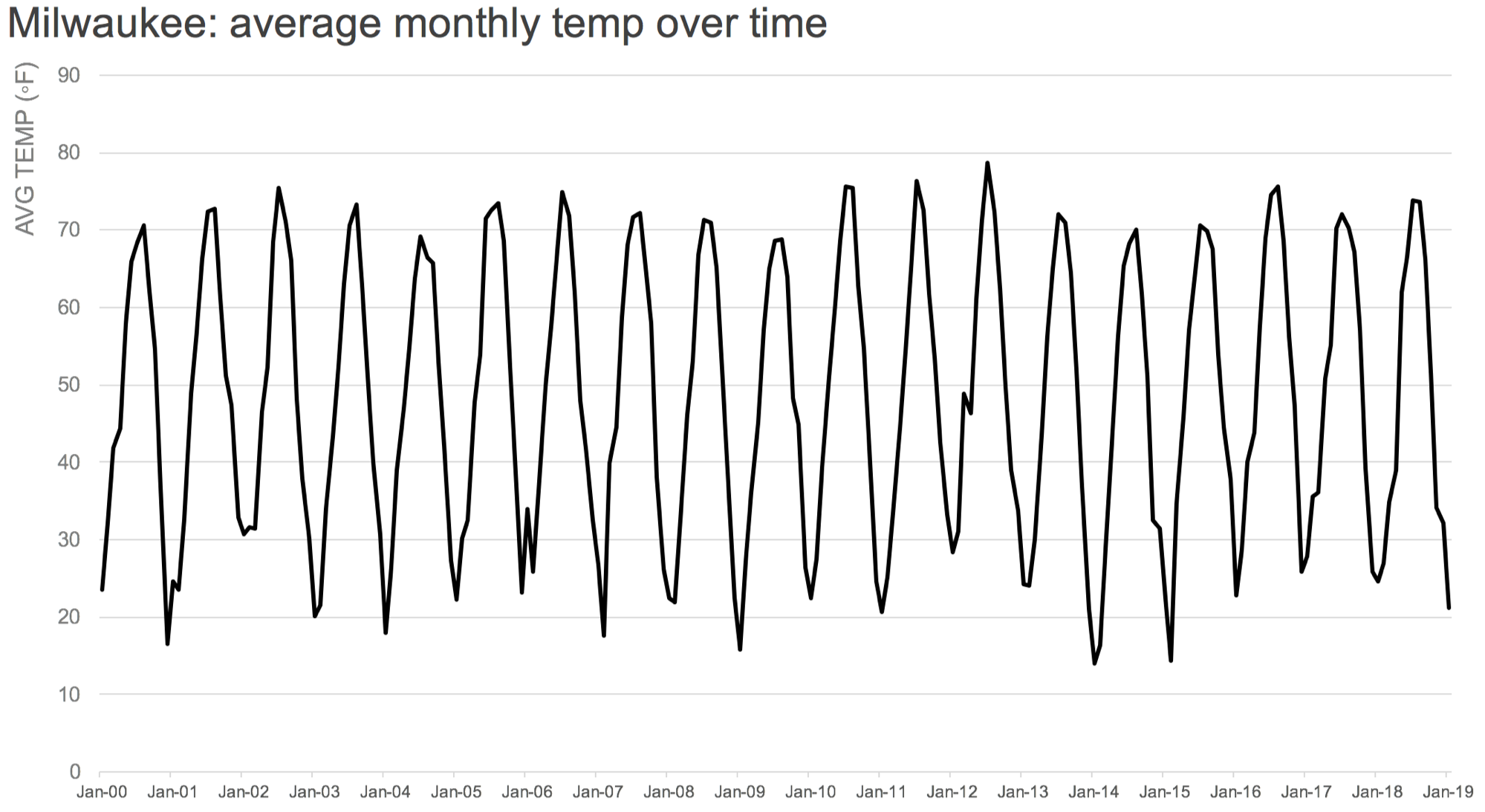
It’s time to me to turn to data to get a better understanding. I downloaded data from the NOAA’s National Weather Service Forecast Office—nothing fancy: monthly minimum, average, and maximum temperatures over time in Milwaukee. Then I started graphing it. I began by looking at the average:
DATA SOURCE: weather.gov/climate
We often summarize data with an average. For example, from the graph above, we can see that the average temperature in January 2019 in Milwaukee (final point on far right of graph) is 21 degrees Fahrenheit. That’s cold, but not so cold. And it certainly doesn’t tell the whole story. That’s because when we summarize data with an average, we lose the sense of variability, the variance. Does an average of 21 degrees mean I can expect temperatures generally in the low 20’s over the course of the month, or can it be -10 degrees one day and 50 degrees the next? (My limited observational evidence points towards the latter.) Just how cold can it get?
Any time you summarize data with an average, you should also spend time to understand the underlying data. This is especially important when comparing averages, because when you do this you miss the distributions that may overlap and not actually be as different (or as similar) as the average might lead you to believe. It can also sometimes be useful to show that variability in the data or the underlying distribution to your audience. That’s actually going to be the focus of this month’s challenge. But first, let’s look at a couple additional views of my Milwaukee weather data.
I can give a sense of the range over time by plotting the min and max values in addition to the average:

DATA SOURCE: weather.gov/climate
Now I can start to see just how cold it gets in the winter months: notice how much below the average temperature the minimum monthly temperature is! Whereas in the summer months, the extreme temps are in the upward direction (and the lows aren’t so much lower than average), the reverse appears to be the case in winter months, with minimum temps in some cases markedly lower than average.
Let’s look at another view, where I line all of the data up over a January to December period and plot a point for each year’s minimum temperature in the given month. That looks like this:
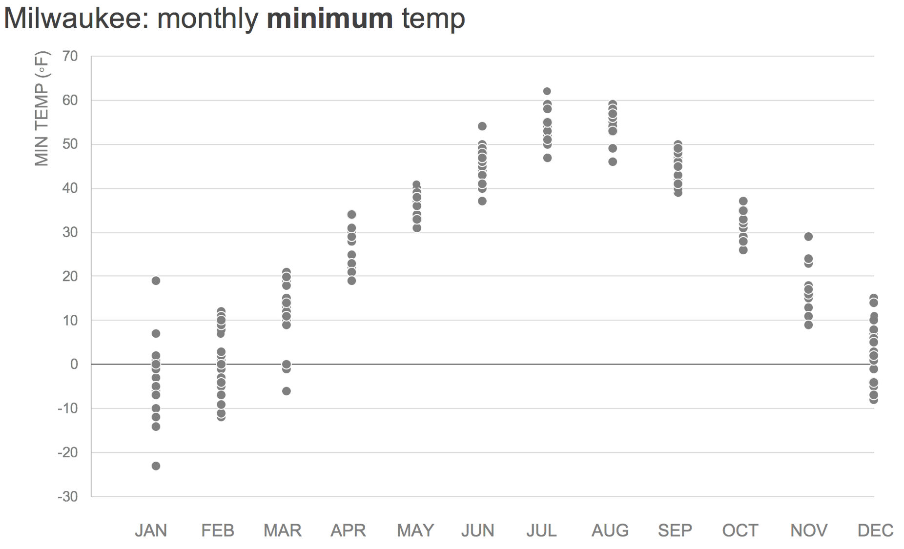
DATA SOURCE: weather.gov/climate
Interesting. Notice how some month’s minimum temps are clustered close together—for example, minimum temperatures in September are pretty consistently in the 40’s. Whereas the minimum temperatures in some other months are more spread out. In fact, January seems to have the highest variation in minimum temperatures: one year (2006), the lowest temp was 19 degrees. That lowest point in January? That’s this year, at -23 degrees!
To get a better view of January specifically, since that appears to generally be the coldest month (we’ve made it through the worst!), I might plot just the minimum temperatures in January:
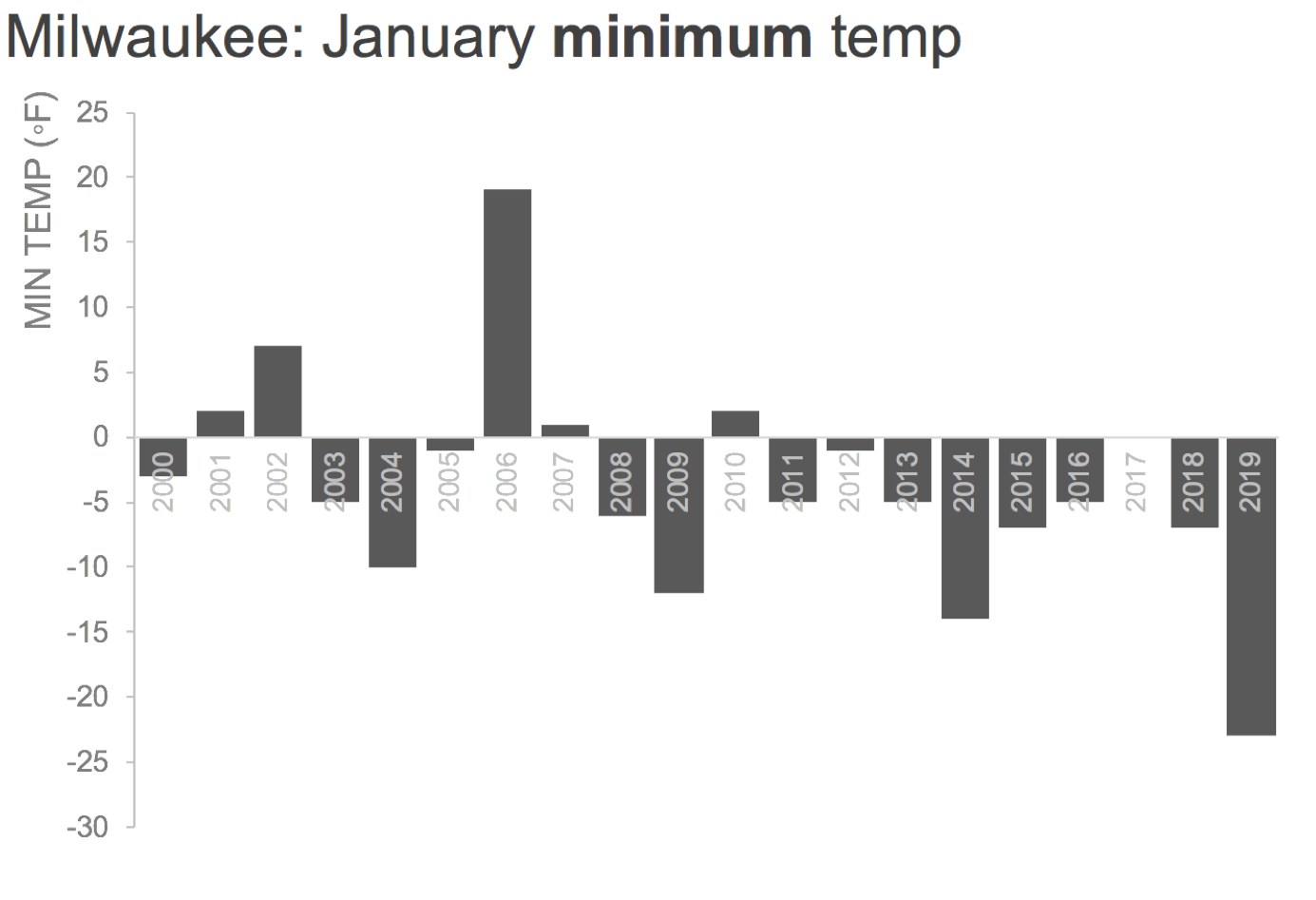
Now we see it clearly: January 2006 seems to be an outlier (unusually warm minimum temp), and so does January 2019. Yes, it routinely gets quite cold here. But this polar vortex has indeed caused unprecedented cold (at least relative to the past couple of decades).
If I wanted to have a bit of design fun, I might tweak my bars into pseudo-icicles:

No, the icicles probably aren’t the best view of the data from an effectiveness standpoint, but they are fun! If interested, you can download my Excel workbook with the preceding graphs. All of that is prelude, with a couple of examples, leading up to this month’s challenge…
the challenge
My challenge to you: visualize the variance in data. This can be accomplished in a summary manner, for example a histogram that shows the bucketed distribution or via a range like I showed in one of the views in this post. Perhaps you’ll create a boxplot to visualize quartiles and possibly layer on some other descriptive stats. Have you ever made a violin plot? This could be a good opportunity. Or perhaps you’ll create a scatterplot or a beeswarm and actually plot all the individual points. There are likely additional approaches that I haven’t mentioned here. I look forward to seeing it all!
DEADLINE: Monday, February 10th by midnight PST. Full submission details follow (be sure to email it to us, taking note of specifics below, for inclusion in recap post!). You're also welcome to share at any point on social media using #SWDchallenge.
SUBMISSION INSTRUCTIONS:
Make it. Identify your data and create your visual with the tool of your choice. If you need help finding data, check out this list of publicly available data sources. You're also welcome to use a real work example if you'd like, just please don't share anything confidential.
Share it. Email your entry to SWDchallenge@storytellingwithdata.com by the deadline. Attach your image as a .PNG. Put any commentary you’d like included in the follow up post in the body of the email (e.g. what tool you used, any notes on your methods or thought process you’d like to share); if there’s a social media profile or blog/site you’d like mentioned, please embed the links directly in your commentary (e.g. Blog | Twitter). If you’re going to write more than a paragraph or so, I encourage you to post it externally and provide a link or summary for inclusion. Feel free to also share on social media at any point using #SWDchallenge.
The fine print. We reserve the right to post and potentially reuse examples shared.
We look forward to seeing what you come up with! Stay tuned for the recap post in the second half of the month, where we’ll share back with you all of the visuals created and shared as part of this challenge. Check out the #SWDchallenge page for past challenge details and recaps.
Just in case you can’t picture the kind of cold I’ve described, here’s a visual:

The frozen tundra…I mean, frozen over Lake Michigan, as seen on my flight home on 1/30/19.