
forty-five pie charts? never say never
This week, I saw a visualization with 45 pie charts in it—and I loved it.
Avid followers of storytelling with data—actually, even casual acquaintances of storytelling with data—are likely aware of our general position on pie charts. While we wouldn’t go so far as to call them evil (at least, not anymore), we do emphasize their limited utility compared to other common chart types. They make it hard to compare across multiple charts, small differences between values are hard to see, labeling is challenging...you get the idea.
Despite these limitations, there are still a few cases where a pie works: showing that a certain value within a dimension is a very large, or small, percentage of the total; emphasizing that the displayed values compose 100% of all values; or showing a single part-to-whole comparison.
In most other cases, however, the benefits of other chart types outweigh the benefits of the pie.
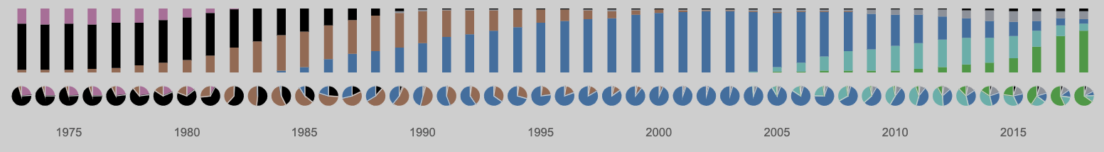
This is why it was so surprising to me to see this visualization from Ash Shih, entitled “The Beat on Recorded Music Revenue.” It is a large-format, single-panel dashboard that was created for a recent data visualization challenge: Tableau’s IronViz feeder contest about music.
Ash chose to focus on the business of the music industry in America. His viz shows how the dominant format of recorded music has changed over time, as measured by the total sales revenue across the industry.

This can properly be called a “dashboard,” but it is serving a different purpose than many business dashboards do; once we focus in on the intent of this piece, we can see why pie charts were a valid choice for the creator to make.
Normally, when we think of dashboards, we think of tools that are created specifically to allow an analyst to explore data and uncover insights—not as tools to be used to report our insights to a specific audience. In our workshops, we draw a clear distinction between exploratory analysis (the part where you look for the interesting information) and explanatory analysis (the part where you communicate that information to a specific interested party).
In a business environment this distinction is often pretty clear and easy to draw. In the wider world of public data visualization, however, these lines can be blurred. We can find ourselves creating, and consuming, hybrid visualizations. They have some of the functions of dashboards, such as interactivity and exploration, but also some of the structure of an explanatory analysis, such as a clearly defined context, specific pre-selected insights made clear through annotation, and even some elements of a story structure.
Ash’s piece is an example of just such a hybrid visualization. The left-hand piece of the dashboard is the background information, the important details that set up our expectations for what is to follow. This is what we would call the “plot” of our story, if this were a pure explanatory analysis.
The right-hand piece, which dominates the overall design, stacks several common and less-than-common charts vertically along the same x-axis timeline:
A stacked area chart, showing annual sales by recorded music format;
A dot plot, meant to evoke the sliders on a mixing board through visual metaphor, showing the overall annual sales across all formats;
A single marker for each year, colored to denote the music format with the plurality of sales in that calendar year;
A 100% stacked area chart, showing the percentage of annual sales attributable to each music format; and
A pie chart, serving as a double-encoding of that same percentage of annual sales by music format.
As an exploratory dashboard, it is designed to allow the audience to interact directly with the displayed data, and so there are more details available in tooltips by hovering or clicking on different pieces of the chart. However, the piece as a whole shares many more characteristics of an explanatory piece.
Annotations abound on the chart, and the text of the annotations are colored appropriately to tie in with the formats that they reference. While there are six distinct colors for data in the chart (one for each format: vinyl; 8-track; cassette; compact disc; digital download; and streaming), most years have only two or three simultaneous formats, so the colors don’t overwhelm.
That particular quality of this dashboard brings us to the interesting, surprisingly successful element therein: an effective small-multiple pie chart array.

In this case, the pies aren't meant to be readable as a down-to-the-percentage-point representation of the data at a glance. They give a general sense, year-by-year, of how the landscape of the music industry changed formats. The colors pair well together and the transitions appear smooth, when looking at the nearly 50-year timeline as a whole.
The details are easily available on demand by highlighting any specific pie piece; the colors are unified across the entire dashboard, so individual labels aren’t necessary; and ultimately, this strip of pies is meant more as a data-driven aesthetic design element, but one that also displays macro changes in the industry over a long period of time.
A reasonable person could argue that the 100% stacked bar chart directly above those pies accomplishes the same thing, with a greater ease of comprehension:
To which I would reply: yes, it does. That’s probably why Ash included it. More importantly to the aesthetics of the piece, the combination of the two charts evokes knobs and visual readouts on a mixing board, to go along with the other stacked charts above them.
Understanding your audience is an essential component of creating a successful communication; and when we consider the choices that other designers have made in their works, we might do well to consider that we don’t always know what audience those designers had in mind, or what drove their decisions.
I could speculate that Ash’s intended audience might have been the general public, the judges for the competition, the data visualization community, or some combination of all three; in that scenario, being bold and visually arresting might have been a higher priority than maximizing the efficient transfer of information.
It’s not every day that you see so many pies in one place, and come away thinking, “Hey, that was great! It worked really well!” Nevertheless, it’s the position that I’m taking, because in that context, for that particular piece, Ash had a vision in mind and a considered rationale for why pie charts were the right choice. They served a purpose, and in serving that purpose they performed admirably.
In a higher-stakes, corporate situation, my position would probably be different, of course; but an absolutist “no pies, ever” rule, as Jon Schwabish has reminded us, is an oversimplification; it makes an ironclad rule out of something that is really just a guideline.
Ash’s bold swing is a reminder to us that there are very few absolutes when it comes to communicating effectively with data, and that understanding the context of our presentation—and, charitably, trying to put ourselves in the minds of other creators, before we criticize their choices—can at times lead us down some pretty unusual paths. Once in a blue moon, a small multiple pie chart is an acceptable option.
Just, don’t make a habit of it.