expect the expected
I thought I’d share with you an interesting topic that came up in a recent workshop. We were discussing the following monthly time-series chart, where the time component is listed diagonally along the x-axis.

We chatted about the challenges of using diagonal text—mainly that it’s slower to read compared to horizontally oriented text. To address this, I suggested moving the year into a super-category axis label, which would create enough space to horizontally fit the monthly abbreviations.
At this point, a workshop attendee questioned whether it would also be okay to label every other month, instead of pulling out the year.
It’s a good question. While it would, in fact, create enough space to orient the remaining text horizontally, it would also create a different challenge: it would undermine our audience’s expectations. Labeling every other month deviates from standard graphing conventions. When we deviate from the norm, it can introduce confusion and draw unnecessary attention. We’re used to thinking of time in intervals of days, or months, or quarters, or even years. It’s less common, though, to think of time in two-month chunks—especially when our data is aggregated at the monthly level.
This isn’t to say we should never deviate from normal graphing conventions, but we should have a good reason for doing so—a reason that makes up for any unintended consequences.
What other design decisions might also take our audience by surprise—going against normal graphing expectations? I’ll outline a few.
Axis labels in the subtitle
Typically when we think of a standard chart, we imagine an L-shape representing the vertical and horizontal axis—labeled directly. As an alternative, sometimes the vertical axis label is moved to the subtitle. Although it’s unexpected, it can work well with a horizontal bar chart—especially when the category labels differ in length. Here’s an example from the community. For other scenarios, you might stick with standard axis label placement, so your audience doesn’t have to hunt to determine what they are looking at.

Vertical axis on the right-hand side
As described above, we typically think of our vertical axis along the left-hand side. There’s no rule that says we have to do this—in fact, historically speaking, the vertical axis was commonly found on the right—but today, the left side is popular and feels most natural. For more thoughts on when you might deviate or how others feel about the right-side axis placement, check out Jon Schwabish’s related article.

Time oriented vertically
In the Western world, time is most natural to read moving from left-to-right. This is a construct that we learn at an early age, which means with time-series data we often put time along the horizontal axis moving in that order. (Time is also thought of as an independent variable, which is typically displayed on the x-axis—another convention!) Occasionally, time gets moved to the vertical axis, which can feel uncomfortable or cause you to do a bit of mental gymnastics to determine the trend. It also brings up another challenge: do you orient the time with the most recent date at the top or the bottom?
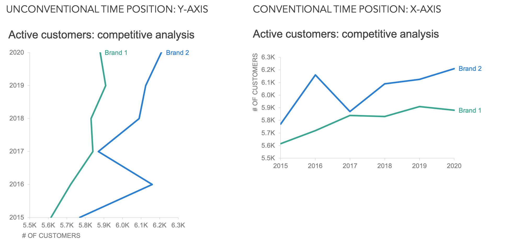
As you browse the above scenarios, take notice of how you react when seeing the unconventional technique compared to the conventional variation. Which option feels more natural, or more comfortable?
Some may argue that deviations are perfectly fine, but I can say from experience that I’ve implemented each of these techniques and met resistance. Someone always points out their initial confusion.
For example, below is a graph that I created as part of a community exercise.

I didn’t realize that by labeling only the first letter of each month I’d confuse my audience. For me, this is a familiar convention, but I received feedback from community members that they found this unsettling. You can read the back-and-forth and commentary about my design choice in my community submission (complete the exercise to unlock). In hindsight, I can see how this is a less-common way to display monthly labels—especially starting with August. Given the amount of attention the horizontal axis drew, I’d opt for three-letter abbreviations in the future. It’s a good reminder that people expect the expected.
That said, there are times where you can use the unexpected to your advantage. Maybe you want to draw attention to the axis, so deviating from the norm might work in your favor—causing the reader to pay close attention to the structure of your graph. That said, conventions exist for a reason, and when you stray from them, you risk confusing or distracting your audience. Let their expectations work in your favor so that their attention can instead be focused where you want it to be: on your critical insights.