five questions for better data communications
This post originally ran as a five-day series earlier this year—by request, we’re running it again in its entirety.
As we share what we’ve learned—and continue to learn—on how to bring data to life, we recently added a new makeover page, which illustrates concrete tips with real-world examples. On the topic of makeovers, this post outlines five questions to ask yourself when designing a graph for explanatory purposes. Devoting time holistically to these components will improve your value as a data communicator.
Before we get to the five questions, let me pose one to you. Have you ever created a graph only to be met with requests for more data? As an example, spend a moment considering the following visual:

I empathize with the plight of this anonymous creator. In previous roles, I frequently created visuals that looked like this, and was left frustrated when requests came back for “more data.” I slowly came to realize that I was assigning my audience the tedious task of figuring out for themselves what the takeaways were. My visuals should have been highlighting the interesting things to those seeing them for the first time. The five questions we’ll be discussing in this series will help us to do just that.
QUESTION 1: What elements can I eliminate?
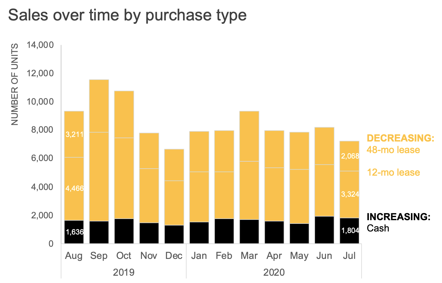
Our dataviz tools are a frequent source of unnecessary visual clutter. These seemingly minor things—borders, gridlines, excessive data labels, legend, and title positioning can make our visuals appear more complicated than they really are. Take another look at the original chart at the onset of this post—what clutter would you remove?
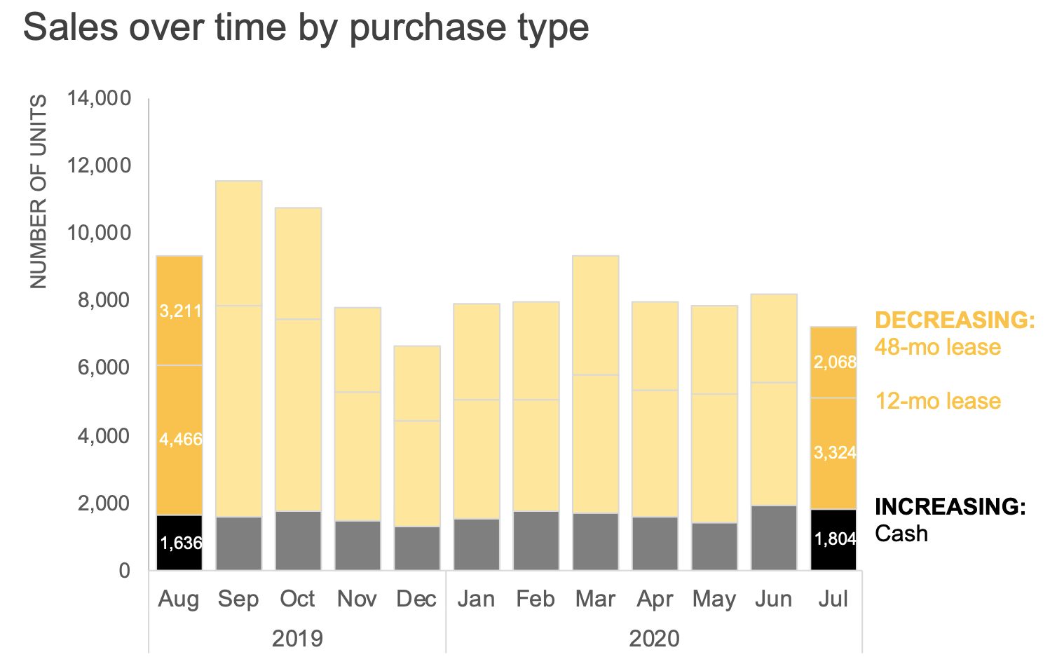
I’m inclined to eliminate the superfluous borders, gridlines, and numeric labels. I can also move the legend directly next to the data, reducing the mental effort of going back and forth between the category labels and the graph. Finally, I’d advocate left-aligning the chart title so that it’s not hanging out awkwardly in the middle. Making these changes leaves a more approachable, cleaner, and organized visual:

In the spirit of removing elements which don't add value, you may be wondering whether I need the black total line; we’ll discuss this and additional changes soon.
These steps took me less than five minutes in Excel, although it once took longer and became more second nature with repetition. Notice how a few simple changes go a long way towards making the graph feeling less complicated—consider how you might apply the tactics illustrated here in your own work. For additional practice, try the SWD community exercise strip away the non-essential.

If you’re like me, I still want to make further improvements. Let’s move on to our second question.
QUESTION 2: Am I using color intentionally?
To create more impactful explanatory visuals, develop the habit of using color in a purposeful way. When applied thoughtfully, color is arguably the most important decision you make when focusing your audience’s attention where you want it.
One way to start is by overriding the default color palette of your data viz tool and start with nothing emphasized. In the example we’ve been discussing, I’ll accomplish this by making the entire graph grey:

I mentioned earlier that we’d revisit why I initially preserved the Total line. When I eliminate color, notice how this line nearly blends into the top of the bars—evidence that we can indeed remove it, since the height of the bars also encodes the total.
Before I strip it away entirely, however, let’s assume my audience is used to seeing it there, and if I make too many changes all at once, it might be jarring to them. In that case, I could introduce color sparingly to draw attention to the total decline over time. Let’s assume our brand color is yellow, so I’ll employ it to illustrate intentional, yet sparing, use of color within the required template constraints.

However, if I don’t have a good reason to maintain the total line line, I can remove it entirely to avoid redundancy. We’ll look at another way to visually display the total soon.
Next, let’s explore other ways we can use color. The original graph (shown again below) had a couple takeaways outlined at the bottom. One point called out is that the volume of 48-month lease units decreased 36%.

I could elect to focus my audience’s attention on the takeaway by moving it to the beginning of my annotation while using sparing emphasis in the graph and consistent color to tie the text and data together visually.

Perhaps we would like our audience to have a more general understanding of relative increases and decreases across purchase types. I could use color to distinguish between the two:
I could even play with intensity to draw more emphasize on the first and last months:
Check out the difference when color is used intentionally:

Are there further improvements we can make? Absolutely—this certainly isn’t the only way to emphasize the takeaways. Let’s have a look now at our third question and different ways to visualize the data.
QUESTION 3: What’s easiest to see in my graph?
Data can be visualized many different ways, creating an often daunting task to select the best chart to use. We also sometimes complicate our audience’s experience, packing too much information into a single graph, in the hopes that it will answer every possible question. Instead of making the Swiss Army Knife of charts, we might instead create different views of the same data, examine what each iteration allows a viewer to see, and then decide which version(s) to share with our audience.
I’ll start by splitting the data into two graphs. Recall that we would revisit how to display the Total trend more effectively than layering it onto the bars. Let’s instead use a separate line chart for the decline over time:

One benefit of showing just one component at a time: now I have space to add context through supporting annotation (recall the clunky blue arrows in the original graph that attempted to serve this purpose).

Next, let’s explore a few different ways we could visualize the breakdown of purchase types. What’s easiest in the existing stacked bar is to examine the trend for Cash because it’s at the bottom allowing for a common baseline at the x-axis. However, as we move up the stack, comparing the 12-month lease series over time is a harder task, because there’s no consistent baseline any longer.

If I want my audience to compare each series individually, I might unstack and show the data as a line graph:

If the month-to-month variations are less important, I might consider plotting only the first and final months with a slopegraph to get a quick sense of the change:

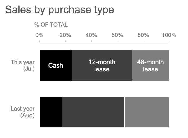
As another alternative, if the relative composition is what I want to focus on, I could opt for a 100% stacked horizontal bar:
I’ve created four different ways to visualize the purchase type breakdown, as shown below. While these certainly aren’t the only four options, I can now evaluate each iteration for what it allows my audience to easily see.

Which view would I choose? My answer depends on our next question. To decide which of these views might work best, I should step back and consider:
QUESTION 4: What action does my audience need to take?
When communicating with data, always consider what broader purpose it serves. Too often, we don’t pause and think about the context (understandable in the real-world maelstrom of deadlines, constraints and organizational politics!). Rather, we force the visuals that we used to analyze the data upon our audience, hoping they’ll come to the same conclusion.
One strategy for considering the underlying context is to form a Big Idea. This thought exercise forces you to think about what’s at stake for your audience and what they need to do, leaving you with a concise and compelling action statement. This single sentence then becomes your guidepost for evaluating individual graphs: does it help reinforce the overarching goal?
Although we don’t have the full context behind this example, let’s assume that the audience is a new senior product manager developing next year’s promotional strategy and needs to understand recent changes in the marketplace. I’ll use the Big Idea worksheet to form my single-sentence main message:
To offset a 24% sales decline due to COVID-19 and increase market share next year, consider how customers are opting for different purchase types as we form our new promotional strategy.
The action my audience needs to take is to use their newfound understanding of shifting purchase types to develop future promotional strategies. Having identified the next step, I can now choose which graph(s) will best drive this discussion. I’ll opt for the line graph to show the historical total sales decline, paired with the slopegraph to emphasize the shift in purchase types:

Am I done yet? While the graphs are more aesthetically pleasing than the messy original, they still don’t answer the question “so what?” to someone seeing them for the first time. To mitigate this, we’ll pull it all together with our fifth and final question and build a compelling slide for our audience.
QUESTION 5: Have I used words effectively?
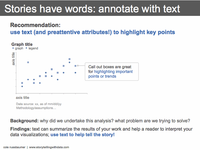
In data visualization, words can be more powerful than we realize. When designing graphs, the non-negotiable text includes explicit axes labels, descriptive chart titles, supporting annotations, and footnotes with relevant methodology and assumptions. Never assume it's apparent what’s being shown—make it your default to include this important context so your audience doesn’t have to guess what they’re seeing.
Resist leaving it up to your audience to figure out the overarching “so-what?” Rather, make a habit of stating the main takeaway in words in a prominent place. Effective slide titles are one strategy for making sure the point isn’t missed.
Additionally, use annotations and subtitles to help your audience understand your visuals:
Now turning back to the example we’ve been improving, let’s assume my audience has asked for a summary of my findings on one slide. My single-page view could look like the visual below. This amount of text would serve me best as a leave-behind or send-around, rather than flashed up a live presentation.

Check out the improvement from the original! We removed the non-essential elements, used color purposefully, iterated through different graphs, considered the broader context and used text to make the takeaways unmistakeable.

To improve your value within your organization, ask yourself these five questions the next time you need to create a graph for someone else. If you’re time-constrained, the biggest bang for your buck will be questions 2 and 4: the power pairing of color and words.

For more examples of visual transformations, check out the before-and-afters in our newly launched makeover gallery. Then, practice honing your data storytelling muscle by undertaking an exercise in the SWD community (it’s free!).