how do I graph three or more dimensions?
Through virtual and in-person workshops around the globe, we have taught tens of thousands of people how to communicate effectively with data. This series captures some of the noteworthy questions we hear during those sessions—and our answers.

When we have three or more dimensions to show, how do you recommend we do it? I worry that my audience might not be able to make sense of it all.
This is a great question. As analysts we are often asked to consider multiple dimensions at once, and investigate complex relationships among these variables. In doing so, we may use visual analyses to explore and find patterns and outliers. The graph types we use to do this tend to be complicated and less intuitive than a simple bar chart or line chart. They might make sense to a trained observer, but to an unfamiliar audience, they’re at best confusing and at worst impenetrable.
Rather than use exploratory visuals to communicate multidimensional findings, try using one of these options, listed in increasing order of preference.
1. Bubble chart
A bulked-up version of a scatter plot, bubble charts are probably most strongly associated with the late Hans Rosling, who used them to great effect in videos for the BBC and for TED talks. Bubble charts place data points on an X and a Y axis, and then add additional characteristics (like color, size, marker type, and possibly motion) to encode even more dimensions.
Here is an example bubble graph, using a famous dataset about petal and sepal dimensions of three different varieties of irises (created in 1936 by Robert Fisher).

The complexity of bubble charts introduces a hurdle that your audience has to clear. These graphs ask a reader to keep track of a large number of variables for each data point at the same time. In this particular example, a point’s position in space relates to an iris’s petal length and width, the color is the sepal width, marker size is the sepal length, and symbol type is the variety of iris.
For a reader unfamiliar with this data, it is hard work to draw any insights out of this graph. By presenting so many dimensions at once, you run the risk that your audience may opt out of doing this work and move onto something else.
2. Small multiples
Also called panel charts or trellis charts, small multiple charts can be used to break down multivariate datasets and show pairwise comparisons across any two dimensions.
Here’s that same iris dataset as a small multiple:
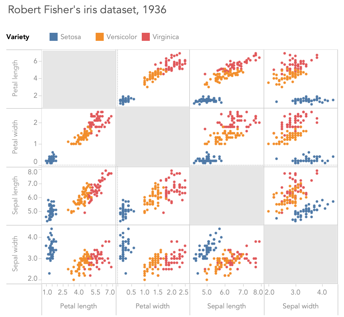
In this view, each iris variety is a different color. We can compare any of our four measurements on the vertical axis with any other measurement on the horizontal axis.
A small multiple chart still requires some close reading to find the insights, but we can see a bit more information than we could in the bubble chart. For instance, we can see that Virginicas usually have longer and wider petals than Versicolors, while there is more of an overlap in those varieties’ sepal lengths and widths.
3. Animating and/or using multiple graphs
Ideally, when we are ready to present multidimensional data to an audience, there will be some specific takeaways to highlight. Rather than present the exploratory graphs we used to find those insights, we can choose simpler graphs that make those findings unmistakable.

By choosing simpler graphs and revealing them one by one, or by building a single complicated graph piece by piece while you narrate each new element, you can take your audience on a journey of understanding.
A sophisticated investigation with a complicated outcome is much more likely to be understood and well-received by an audience if they can take it in gradually, via simpler visualizations, rather than if we ask them to try to grasp the entire multidimensional analysis all at once.
How do you visualize multidimensional data? Let us know in the comments below.