If you've followed our work for a while, you've heard us say many times that what you present and what you send around should not be the same.
The reason comes down to who is communicating the story. In a live presentation, you are there to guide your audience. Your slides can be sparse, because your voice fills in the context. When you send materials around, whether as a pre-read beforehand or a leave-behind afterward, the page has to do all of that work on its own. Those are two different jobs, and one set of slides rarely does both well. Try to make them do both, and you often end up with a slideument—something too dense to present, and not quite clear enough to stand alone.
When I make this point in workshops, it’s not uncommon for someone to raise their hand and say some version of: "That sounds great, but my boss wants one deck to present and share."
Let's explore how to work within this real-world constraint. First, I'll probe whether the requirement is as firm as it seems. If it is, I'll walk through strategies to help one deck do double duty.
First, understand why
Before you start building materials to be both presented and read, pause and ask: why does it have to be the same output? The answer usually falls into a few buckets.
Leadership wants one version of the truth. That's a fair concern, and it's about consistency, not about the slides themselves. You can build both versions from the same content, numbers, and message. It is the same story but different materials depending on how the information is consumed.
There isn't time to build two. Also fair. But consider the cost of the alternative, which is a presentation that loses the room, or a send-around deck nobody can follow. (Stay tuned, because this one may be getting easier. More on that at the end.)
People follow along in their own copy. If your audience is reading or jumping ahead while you talk, they're not listening to you. Try asking them to close the file. Or share your screen so everyone is looking at the same thing at the same time.
My suggestion is to push back where you can. Often, a conversation is enough to explain why separate materials work better, and many stakeholders will agree once they understand the reasoning.
But sometimes the answer is still "we need one deck." If that’s the case, here are some approaches to make that work.
Design every slide to stand on its own
Before any other tactic, start with words to clearly convey your intended message.
Takeaway titles. Too often, slide titles describe the topic, for example "Primary reason for choosing a competitor." Instead, use the title to state the so what, such as "Price is the top reason for losing to the competition." A reader skimming your deck on their own gets the point immediately.
Annotations. Put the main points right on the chart, next to the data they describe. A short note pointing to the spike, the dip, or the gap does the explaining you would otherwise do out loud.
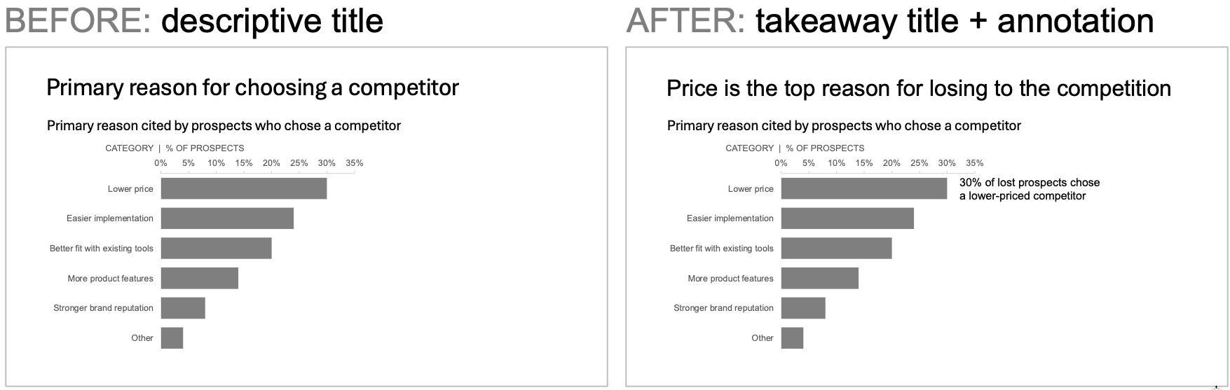
Thoughtful text helps in both settings. Without you in the room, a reader still gets the story. And when you present, those same words keep you on message and give your audience something to anchor to. Let’s consider some additional tactics to use.
Use one slide multiple ways
These next strategies work directly on the slide itself. The same slide works whether it’s presented or read, but you use it differently in each setting.
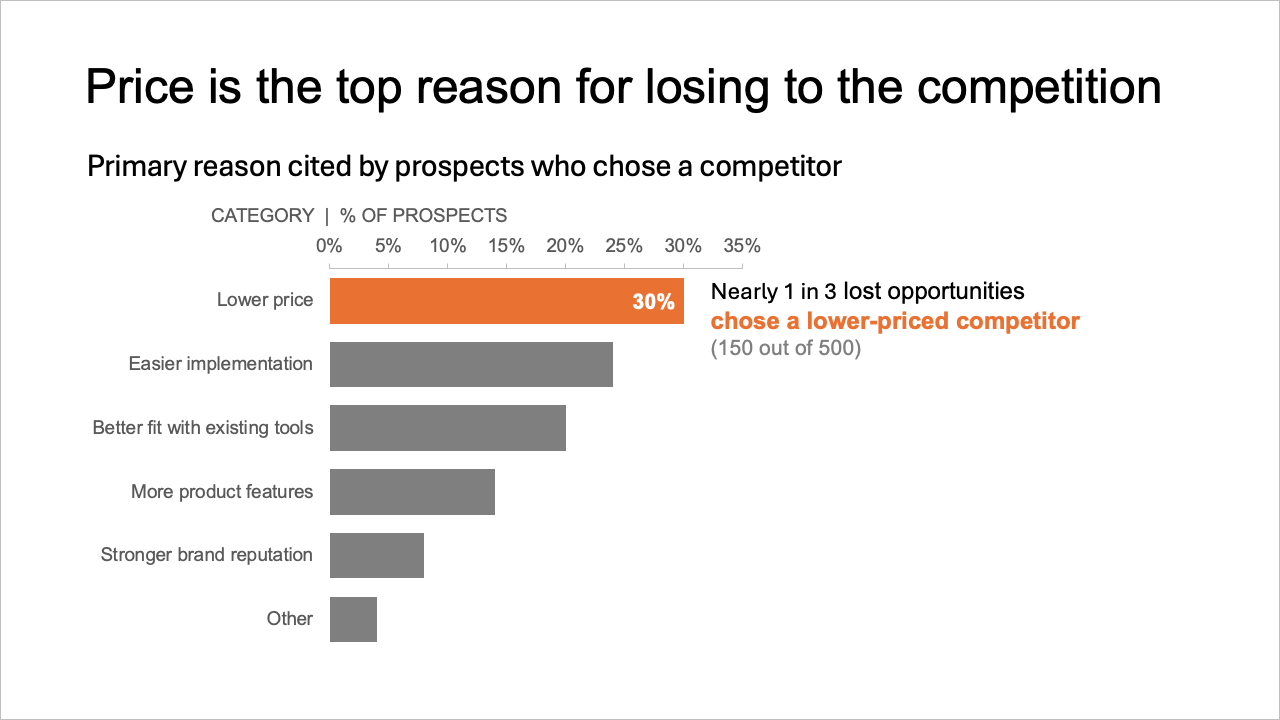
Visual cues. Use color, bold, and contrast to direct attention to what matters most. When you present, these signals help your audience know where to look as you talk. When someone reads on their own, the same cues guide their eyes to the important part. This also lets you keep supporting details on the slide without emphasizing them. Push secondary text and data to the background by making them gray. It's still there for the reader who wants it, but it doesn’t compete for attention when you present.
Animation. Build a graph piece by piece. Live, you reveal one element at a time and talk through each as it appears, so your audience focuses on exactly what you're discussing. Animation also allows you to take the same data further than a static slide can, making it more engaging in a live setting.
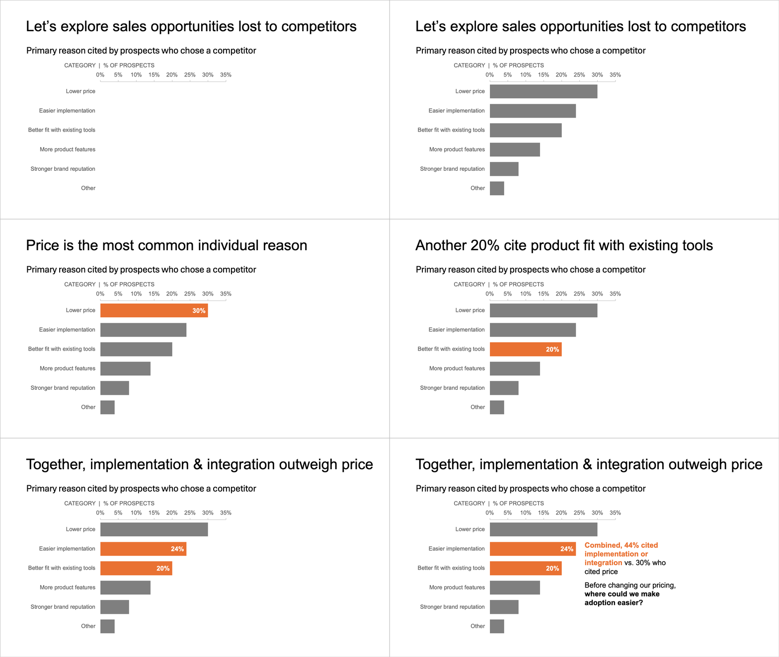
Keep in mind that when you send the file around or export it, the reader sees only the final build. So, plan your animation so that the finished slide is complete and makes sense on its own.
White boxes. Think of white boxes as the reverse of animation. Instead of building up to the full slide, you start with the final view and cover parts of it. Place white shapes over the details you don't want your audience reading yet, and remove them as you go. One important thing to know is that these added elements are only part of your live version. Before you send the deck, delete them. Otherwise, your reader gets a slide with holes in it. For more tips, check out this video for three ways to animate in PowerPoint.
Insert elements to skip when presenting
The following strategies add content around your main slide. The reader uses them, but the presenter skips them when sharing live.
Provide a summary up front or detail in the back. Organize the deck so it works in both settings. Start with a summary slide that tells the whole story or put the supporting detail in an appendix at the end. When you present, you focus on the main slides in the middle and leave the others for independent review.
Hidden slides. Sometimes detail fits best right after the slide it supports. That's where hidden slides come in. Place the detail slide exactly where a reader would want it, then hide it. It won't show during the presentation, but it will be there when you share the content.
Speaker notes. Use speaker notes to capture what you would say out loud. For the reader, they can fill in the context your voice would normally provide. The challenge is that readers may never see them. Most people view a deck in slide view or as an exported file that drops the notes. If you're counting on speaker notes, share the deck in a format that includes them and tell your reader where to find those details.
What if the constraint goes away?
Let's come back to where we started. When I ask why the deck has to be the same, the most common answer is time. Building two versions takes longer than building one.
But that math is changing. AI tools can now take a presentation version and create a standalone version in minutes, adding the explanation you'd normally give out loud. They can also work the other way to pare a dense send-around report down to a sparse set of slides you can present. For more on using AI in your data storytelling, check out our AI resources.
This raises a good question: if the cost of making two versions is close to zero, is "one deck" still the right rule? I'd suggest revisiting it. In either case, the strategies above still apply. Takeaway titles, clear structure, and strategic use of color make both versions better.