logic in order
There should be logic in the order in which you display information.
This probably sounds obvious when you read it. Yet, like so many things that seem obvious when we read them or hear them or say them out loud, it's interesting to me how often we don't put into practice those things that seem like they should be obvious. This is an example of that.
While I would say my intro sentence is universally true, I'll focus in this post on a very specific example to illustrate the concept: leveraging order for categorical data in a horizontal bar chart. This is based on a real makeover for an upcoming workshop, but I've anonymized it here for illustrative purposes.
Let's say you work at a company that sells a product that has various features. You've recently surveyed your users to understand whether they are using and how satisfied they've been with each of the features. You now have data from this that you'd like to make use of. The graph you create might look something like the following:
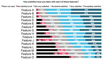
This is the actual graph that was presented, with the exception that I've replaced the actual descriptive feature names with Feature A, Feature B, and so on. There is an order here - if we stare at the data for a bit, we find that it is arranged in decreasing order of Very Satisfied + Completely Satisfied. Which might suggest that is where we should pay attention. But from a color standpoint, my eyes are drawn to the bold black Have not used. And when we stop to think about what the data shows, perhaps the areas of dissatisfaction would be of most interest?
Part of the challenge here is that the story, the "so what" of this visual is missing. We could tell a number of different stories and focus on a number of different aspects of this data. Let's look at a couple of ways to do so, with an eye towards leveraging order as we do.
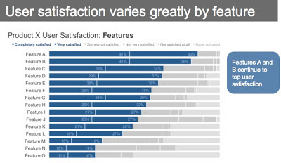
First, we could think about highlighting the positive story: where our users are most satisfied.

Sidenote: In all cases, this data warrants the inclusion of a footnote that says something like, Responses based on survey question, "How satisfied have you been with each of these features?" and also has the necessary details to help put the data into context: how many people completed the survey, what proportion of total users this represents, whether those who completed the survey look like the overall user population, demographic-wise, when the survey was conducted, etc.
In the above, I've ordered the data clearly in order of decreasing Completely Satisfied + Very Satisfied - the same as in the original graph, but we've made it much more obvious here through other visual cues (namely, color, but also the positioning of the segments as the first series in the graph, so the audience's eye hits it first as it scans from left to right). I've also put some text at the top to help explain why your attention is drawn to where it is, and what you should be getting from the visual.
We can leverage these same tactics (order, color, placement) to highlight a different story within this data: where users are least satisfied.

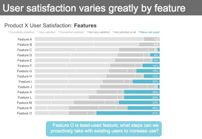
Or, perhaps the real story here is in the unused features, which could be highlighted as follows.

Note that in the above, you can still get to the differing levels of satisfaction (or lack thereof), but they've been pushed back to a second-order comparison due to the color choices I've made (whereas the relative rank ordering of the Have not used segment is the clear primary comparison on which my audience is to focus).
If we wanted to tell one of the above stories, we can leverage order, color, and placement as I've shown to draw our audience's attention to where we want them to pay it in the data. If we want to tell all three stories, however, I'd recommend a slightly different approach.
It isn't so nice to get your audience familiar with the data once, only to reshuffle it and show a different view. So let's go back to our base visual and preserve the same order (so our audience only has to familiarize themselves with the detail once), highlighting the different stories one at a time through strategic use of color.

Above is our base visual. If I were presenting this to an audience, I'd use this version to walk them through what they are looking at: survey responses to the question, "How satisfied have you been with each of these features?", with responses ranging from the positive Completely satisfied at the left to Not satisfied at all and finally, Have not used at the far right. Then I'd pause to tell each of the stories, in succession.
First, comes the exact same visual we started the last series with that highlights where users are the most satisfied:
This is followed by a focus on the other end of the spectrum: where users are least satisfied:

Note how it isn't as easy to see the relative rank ordering of the features highlighted above as it was when they were put in descending order (mainly, because they aren't aligned along a common baseline to either the left or right), but we can still relatively quickly see the primary areas of dissatisfaction (Features J and N) since they are so much bigger than the other categories. I've added a call out box to highlight this through text as well.
Finally, preserving the same order, we can draw our audience's attention to the unused features:
Note that here, it is easier to see the rank ordering (even though the categories aren't monotonically increasing) because of the alignment to a consistent baseline at the right of the graph. Here, we want our audience to focus mainly on the very bottom feature in the graph - Feature O. Since we're trying to preserve the established order and can't do this by putting it at the top (where the audience would encounter it first), we can use the call out box to help draw attention to the bottom of the graph.
The above views show the progression I'd use in a live presentation. The sparing and strategic use of color lets me direct my audience's attention to one component of the data at a time. If you were creating a written document to be shared directly with your audience, you might compress the above views into the following:

When I process the above, I see the bold "Features" in the graph title. Then I'm drawn to the dark blue bars, which I follow across to the dark blue text box, which tells me what's interesting about what I'm looking at (you'll note my text here is mostly descriptive, partly due to the anonymity of the example; you'd perhaps want to use this space for something more insightful). Then, I hit the orange text box and read it and glance back leftward to see the evidence in the graph that supports it. Finally, I read the aqua text box at the bottom, and can look back upward to the graph to see the data it describes.
As I describe this, there is one final view I want to create (though as I write this sentence ahead of actually doing so, I'm skeptical that it will be effective). My final idea here is to make it very clear the specific place in the data the audience should look to for evidence of what is described in the text, while still setting the series apart from one another using color. Here's where I landed:

This actually works better than I anticipated. Note that it does make it harder for your audience to form other conclusions with the data, since I've drawn attention so much to the particular points that I want to highlight. But I'd argue that typically once you've reached the point of needing to communicate, there should be a specific story or point that you want to highlight (vs. let your reader draw their own conclusions). The above is definitely too dense for a live presentation (rather, I'd recommend stepping through it, story by story, as shown previously), but could work well for a document that is going to be shared.
One final note - I should mention that in some cases, there is intrinsic order in the data you want to show (ordinal categories). For example, instead of features, if our categories in this case were age ranges (0-9, 10-19, 20-29, etc.), we'd want to keep those categories in numerical order (this provides an important construct for the audience to use as they are interpreting the information) and then can use the other methods of drawing attention shown (color, placement) to direct our audience's attention to where we want them to pay it.
In case it's of interest, the excel file used to create the above visuals can be downloaded here.