
We help people and organizations create graphs that make sense and weave them into compelling, action-inspiring stories
With a focus on simple lessons and practical application, we equip and inspire individuals to take data storytelling to the next level

understand the context

choose an effective visual
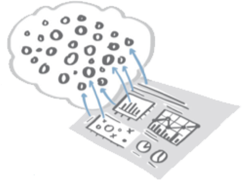
eliminate clutter

focus attention
tell a story
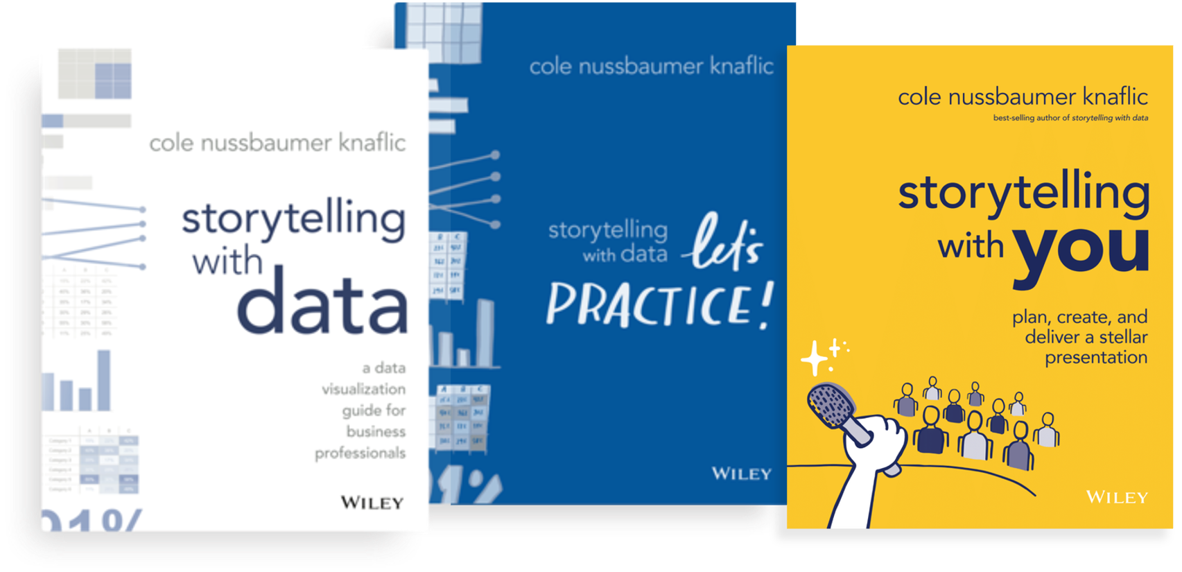
Three best-selling books cover the fundamentals of visualizing data and presenting powerfully, plus guide readers through hands-on practice
Our workshops and presentations have benefited more than 25,000 people around the world
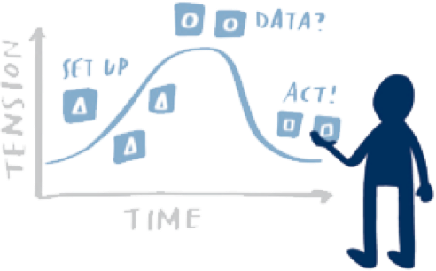
Experience SWD lessons firsthand in inspiring sessions geared to help people understand the value of effective data storytelling and impart skills to build individual and team confidence and credibility. Transition your work from acceptable to exceptional!

Change the way your organization communicates with data
We offer a range of virtual and on-site sessions—from short presentations and webinars that enlighten and excite to engaging workshops that facilitate skill development in a hands-on setting—customized to meet your team’s specific data storytelling needs.

Invest in your development and attend a workshop
In our public workshops, individuals from a wide range of roles, organizations, and industries come together to learn effective data storytelling through an interactive and hands-on day of learning.
Join the SWD community to practice and be supported in your journey to better data storytelling
Are you interested in improving your personal data visualization and communication skills? Join our community to connect with others, share your work, practice, and give and receive feedback. Building good habits is the key to success, and the SWD community is here to encourage you!

We have experience working
with clients across many industries


Our customers love us!
Here’s what some of our workshop participants have said…
The SWD workshop was one of the best sessions I have attended in a long time. Not a dull moment—it was interactive and kept my mind engaged. It has changed the way I share data.”
Engaging, informative, and superbly delivered with practical advice that’s easy to implement. Well done!”
You challenged my way of thinking for preparing and producing a quality presentation. Thank you SWD, you have changed my professional life!”
Check out the latest…
BLOG
it’s okay to use multiple graphs
No rule says we have to limit ourselves to a single graph when visualizing data—especially when communicating several series with different levels of detail or varying magnitudes. Alex demonstrates the impact of using multiple graphs in this quick makeover.
PODCAST
ep 75: The Data Storyteller’s Handbook with Kat Greenbrook
In this episode, Cole talks with New Zealand-based data storyteller, Kat Greenbrook, about her new book, The Data Storyteller’s Handbook: How to create business impact using data storytelling.
VIDEOS
How to: create a bullet chart
Do you want to learn how to create a bullet chart in Excel? As bullet charts aren't part of the standard set of graphing options in Excel a little creativity is required.
This video tutorial goes step-by-step through the process and creates three variations: actual and target as overlapping bars, with a target line and including performance bandings.