
and the winner is...
A big thank you to everyone who participated in the data viz challenge earlier this month (and thanks for your patience in awaiting this recap). As you may recall, the challenge was to help a philanthropic organization communicate a bunch of data about their various affiliates. If you're interested in a refresher on the details, you can find the challenge post with the full description here.
In this post, in addition to announcing the winner, I'll show a quick recap and my reactions to each of the submissions.
Submission 1: Peter Osbourne
You can view Peter's full description of his thought process in the comments of the post linked above. His main point was that, depending on the story one wishes to tell, a summary metric like averages may do the trick. Below is a snapshot of his workbook (he added the columns after the yellow one; full workbook can be downloaded here). In his comments, he makes a great point about figuring out what the story is first and then determining what data you have that best supports it (vs. putting together data and then trying to form the story).

Submission 2: Jon Schwabish
Jon decided on an interactive Excel graphic (download available here), which allows you to toggle across the various affiliates to get relevant detail on each. I really like the simplicity of the visual design used here. Great use of preattentive attributes in the line graph to make the blue line stand out from the others.

Submission 3: Lubos Pribula
Lubos continued the interactive Excel dashboard trend (downloadable here). I like the use of color to visually tie the line graph to the tabular data below (though we should be careful about the red-green color combination, which can be difficult for those who are colorblind). I also like the embedded bar charts within the tables at the bottom, which allow you to quickly visually compare aggregate measures across the various affiliates.

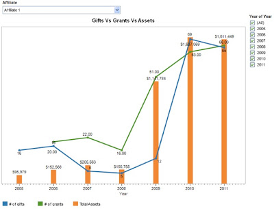
Submission 4: Gautham
Gautham created a dashboard in Tableau (if you don't have Tableau, you can download Tableau Reader here; Gautham's dashboard can be downloaded here). This dashboard allows you to view a single affiliate at a time and see a visual of their total assets in bars and number of gifts and grants via lines. This is useful if you want to compare the number of gifts and grants, or get a sense of the over time trends for a specific affiliate.
Submission 5: Rupert Stechman
Rupert took an unconventional approach to his data viz and went old school with pen and paper (which I love!) and created a sort of heatmap showing net change in assets over time by affiliate. Here's what he came up with (his blog post is here):

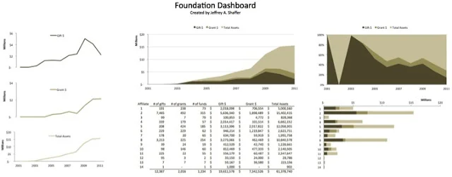
AND THE WINNER IS... Submission 6: Jeff Shaffer
Jeff created both a Tableau dashboard (downloadable here) and an Excel dashboard (pictured below; downloadable here). He doesn't win because he submitted dashboards in multiple formats, but rather because his visual is the one the foundation said they could see themselves using.
Here's what the philanthropic organization said:
Thank you so much for trying to help us get a visual for our data. Your readers are much more skilled than I, and did some really interesting things with the data. I think Jeff Shaffer came closest to getting us something like what we need. His dashboard approach would be really useful in some instances."
Personally, I would have had a hard time choosing a winner (one reason I'm happy the philanthropic group made the decision for me!) - there are components I like from each of the visuals and I think each could work well, depending on what story you want to tell and who the audience is. This is a great reminder how important those pieces are - it's really difficult to create the perfect visualization without a good understanding of what story we want to tell and who we want to tell it to. We should absolutely spend time up front establishing that (and coaching our colleagues and clients to do so) before we create the supporting visual.
9/4 UPDATE: Jeff graciously agreed to put together a "how to" for creating the dashboard above, which you can download here.
Cole's non-competing submission
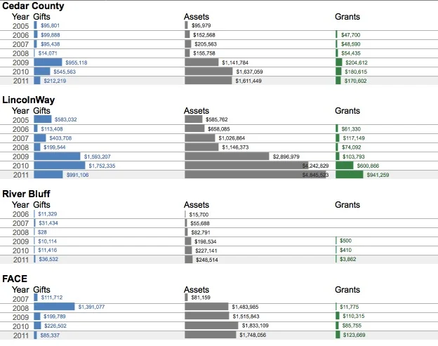
And I of course couldn't help but build my own visualization of this data as well. I did not go the interactive dashboard route, because the description made it sound like it was important to understand the trends for a given affiliate while also being able to compare those to other affiliates (hard to do in a dashboard that focuses on one affiliate at a time, though a couple of the above submissions address this in different ways). Here's a snapshot of what I came up with (I just show 4 here, but this approach continues for each of the affiliates; the Excel file is downloadable here):
Thanks, all, for playing (and Jeff, my offer stands to have you write a guest blog post if you're interested!). Let me know if you think I should pose challenges like this again in the future!