
the right amount of detail
In my workshops, we spend time discussing the importance of context when it comes to putting yourself in a position to create an effective data visualization. In my mind, there are two flavors of context that are important. First, there is the context that you as the data visualizer must know: who you want to communicate to (your audience) and what you need them to know or do (the call to action). When it comes to creating the visual communication, the second type of context also becomes important: the context that your audience needs to know in order to make sense of the information you are attempting to communicate. This often leads to the question: how much detail is the right amount of detail to show?
The answer is... it depends.
I started off writing this post with the assumption that the right amount of detail for a given situation depends on a lot of things, but as I sit here and think about how to articulate it, I'm landing on just two things that I believe are most important: 1) the method of communication and 2) the level of trust your audience has in you. Let's discuss each of these briefly and then we'll look at an example.
The method of communication
When you present something in a live setting, you are in nearly complete control. You can respond to audience cues and questions. You can get away with having less context and detail physically written down or shown because you are there to fill in any blanks. This is not the case in written communication, where the level of explicit detail must be higher because you are not there to facilitate the flow of information but rather must count on your words and visuals to paint the full picture (and address at least first-order questions). Because of this, the level of detail necessary for written communication is much higher than for a presentation.
The level of trust your audience has in you
If you have an established, trusting relationship with your audience, you can get away with showing less detail without your audience questioning it. On the other hand, if you haven't established a basis of trust with your audience, you may need to show more detail explicitly so that your audience doesn't feel you are somehow trying to mislead by only showing the parts that back up your story and ignoring the rest.
When thinking about the audience's level of trust, be sure to keep the ultimate audience in mind. If you're preparing something that someone else (let's call her Mary) will be presenting, think about not only how much trust Mary has in you, but also how much trust Mary's audience has in her and use this as your guide for determining the appropriate level of detail.
One thing to try to anticipate when considering the right amount of context and level of detail is what questions your audience will have. Of these, think about which need to be answered explicitly in your communication directly vs. which can be addressed on the fly. In a live presentation, one feature you can leverage is the hyperlink. If you can anticipate potential questions and have visuals or data you can use to address but only want to leverage them if the conversation turns that direction, you can include that detail in an appendix, then create a hyperlink on the given slide in the main presentation that points to the relevant slide in the appendix. If the question comes up, this gives you a seamless way to jump to the appropriate slide (but doesn't force it in the progression in the event that the question doesn't come up and you don't have to address it). Make sure to also make a link from the appendix page back to your main presentation so you can continue with the planned flow.
Let's look at a quick example of how we might think through the above as we're creating a specific visualization. The following is a generalized example from a recent consulting project. Let's assume here that this is one slide that's part of a broader presentation to the head of Marketing for our company and that the story we want to tell is around the most important features based on the survey feedback.
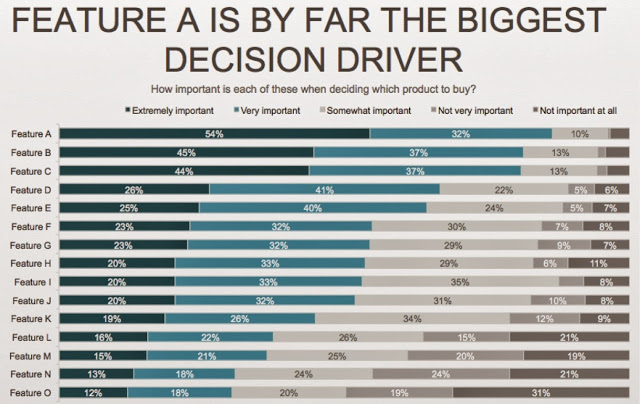
When we're thinking about what level of detail to show here, there are a couple different decision points:
- Can we combine response categories? Currently, there are five response categories that range from Extremely important at one end, to Not important at all at the other. Could we combine some of the categories to make the information easier to consume? What information would we lose by doing so? Even if we don't combine categories, there are things we can do to draw more attention to some and de-emphasize others that will allow us to keep the detail there without it becoming visually overwhelming.
- Can we show fewer features? There are currently 15 features shown - this is probably the complete picture of all of the features we asked about in the survey. We could think about reducing this to just the features we want to focus on and get rid of the rest. Or again, if we don't feel comfortable eliminating them entirely, perhaps there are things we can do to draw attention to some and de-emphasize others that will allow us to preserve the detail without it feeling so cumbersome to our audience to consume.
Let's look at a couple possible solutions.
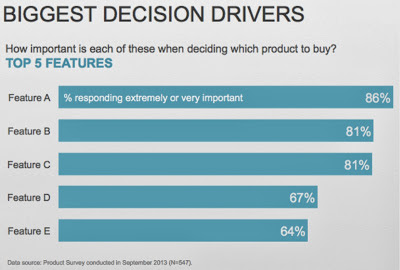
If our audience trusts us and we're comfortable with a minimalist approach, we could reduce the visual above to something like the following:
If the above feels like we've taken too much away, below is an alternate view that preserves nearly all of the detail from the original visual, but uses emphasis and de-emphasis to make it easier to consume and less visually overwhelming for our audience.

Note that in both cases above, I've also added a footnote with some details about the survey. This is detail that needs to be there, but can be de-emphasized (make it small, grey, put it at the bottom).
If we're presenting this information live, I'd suggest going with the minimalist version: there's less detail there to process, which means your audience can listen to what you're saying vs. focus their attention on deciphering the graph. Keep the full version on hand so you can address questions that might come up (having a printed version of it you can refer to if necessary can work well), or you could put the detailed version in the appendix and leverage the hyperlink strategy discussed above to jump to it only if there are questions on survey feedback on the other features. This could work well in a written report as well, where you can put a footnote that says "Survey feedback on full feature suite can be found in the appendix on page x" or something to that effect.
In case you want to look at this example more closely, the PowerPoint file that contains the above visuals and underlying data can be downloaded here.
What's your reaction to the above? What other considerations should we have in mind when it comes to determining the right amount of detail to show?
Note: it struck me in the middle of writing this post that I started out writing about context but ended up with discussion focused more on the level of detail (vs. broader context). Rather go back and rewrite, I'm going to go ahead and post, with some minor edits and the hope that the discussion above isn't confusing. There are certainly other aspects of context that are important when it comes to specifically understanding the data that is shown as well, but I think discussion there is probably more situation-specific so haven't addressed that at all here but rather focused my discussion on level of detail.