our tools don't know the story
A question that frequently arises in our workshops is “What tools do I need to tell stories like you do?” Many are surprised to hear the answer: we’re tool-agnostic. Rather, the concepts we teach are universal. No matter if you’re using Excel, Tableau, PowerBI, R, SAS, or something else, the tools themselves don't know your data, your organization, or your audience like you do. That’s where an analyst adds value by bringing the data & its underlying story contextually to life.
Today’s post was inspired by a real-world makeover of data originally created in a tool highly regarded for data visualization. The client was visualizing advertising data across multiple countries. Their initial visualization looked similar to the one below. (Note: I’ve anonymized the data to preserve confidentiality).

This chart shows two dimensions of advertising effectiveness: reach (how many users saw an ad) and engagement (how many users clicked on the ad) across several countries (United States, Germany, Great Britain, China, and Brazil). The higher these numbers, the better.
Upon further exploration, we see that the magnitudes of reach and engagement are very different across countries. In China, 52% of users were reached compared to 68% in Brazil. With engagement, the magnitude of the difference is even more pronounced: China’s engagement is 6%, half of Brazil’s 12%.
Imagine yourself as a decision maker tasked with determining an action plan from these results. If the analyst presented you with the visual above, what conclusions might you draw? An informal poll of readers might return multiple answers, which demonstrates the danger of letting our tools "tell the story" for us.
Don’t assume two different people looking at the same graph will come to the same conclusion. Add value by highlighting key takeaways for your audience.
An important distinction made in the book, storytelling with data, is the difference between exploratory and explanatory analysis. Exploratory analysis is what we do to find interesting things in our data. For example, the analyst might have asked many questions during the exploratory phase, including (but not limited to):
1. How have these metrics changed over time?
2. Are there geographical differences when drilling down by country?
3. What is the revenue impact of this data?
4. Are there noticeable patterns in users’ behavior that can be used for predicting next quarter’s results?
After exploratory analysis, then we move to explanatory analysis. Explanatory analysis is where we take the interesting thing we found via exploratory analysis and communicate it to our intended audience. In explanatory analysis, often times that requires creating a different visual or using a different tool than we used in the exploratory phase.
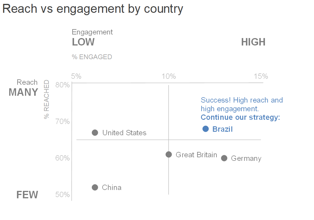
Let’s assume that what’s relevant in this data is the varying levels of reach & engagement and therefore, each country needs its own strategy for next year. If that’s the interesting conclusion, how might the analyst communicate this? One option is to use the initial design and visual cues like color and annotations to focus attention appropriately:

In this version, I’ve preserved the horizontal bars, sorted by reach in descending order, and decluttered by removing the border and grid lines. While this a step in the right direction, it still takes a lot of work to read all this text and mentally process the different takeaways:
1. Low engagement/high reach
2. High engagement/high reach
3. High engagement/low reach
4. Low engagement/low reach
Perhaps a different visual would make this more visually apparent. Since these takeaways fall into four quadrants, a scatterplot is another alternative:

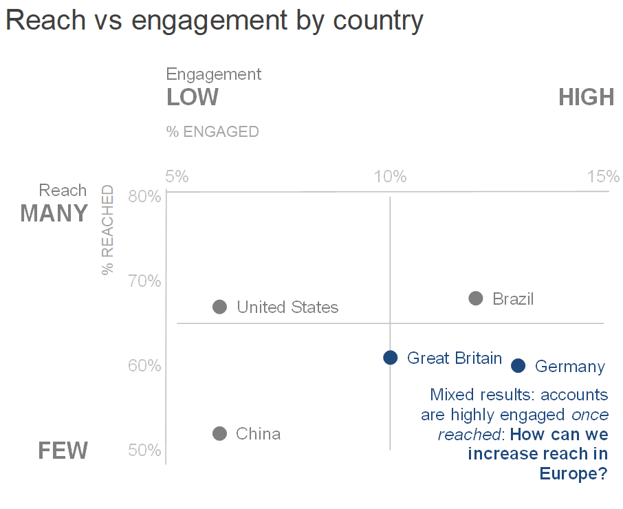
We now have a visual with a well-labeled construct on how to interpret the data. The categories on the axes (Many/Few, Low/High) help the audience understand the range of values and where each country falls on that range. For further reading on the importance of categorization, check out this post.
Finally, I’d add back the color & annotations, while being thoughtful about how the audience will intake the information. For example, in a setting where only the Brazil team is present, I might focus attention only on their data:
Or the European countries, where the results are mixed:
Both views would be important considerations in knowing the audience for our explanatory analysis.
Scatterplots are often used with scientific data, but in this case work well for visualizing categories of differing takeaways. This works because of the additions of text and categorization, which helps the audience process the information. Remember, never make your audience do more work than necessary to understand a graph!
If all the takeaways need to be on one view, I can still leverage the scatterplot while being strategic about the use of color to focus attention appropriately.

In conclusion, there’s a huge difference between simply showing data from the exploratory phase vs. using data tell the a story in explanatory analysis. Check out the difference between the remade view above vs where we started:

We have a wide disposal of great tools for visualizing data, but our tools will never know our data’s story like we do. We can add value to our roles and our organizations by bringing the story to life.
If interested, you can download the Excel file with the above graphs.
Want more on story? Check out Episode 2 of the SWD podcast, where Cole discusses her thoughts on, "What is story?" She makes a distinction between story with a lower case 's' (the takeaway, or the so what—the way "story" was used in this post) and Story with a capital 'S,' which has a shape (plot, twists, ending—a narrative arc). Also stay tuned for the next post here, where Cole will recap and share the 75+ annotated line graphs received in response to the latest #SWDchallenge.
Update from Cole: We have a couple of additional views to share based on reader comments. First, the following view is similar to the final visual above, only with text moved out of the graph itself to the side.

This next graph was created by Daniel Zvinca, which follows what he calls his "obsessive concern for a flexible design."
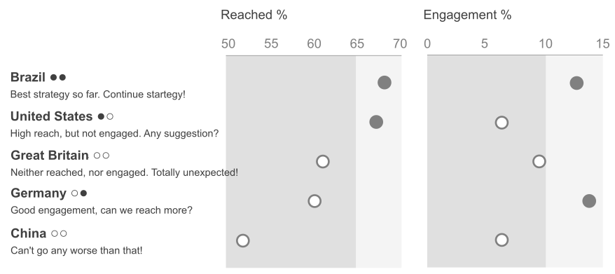
He notes that he preserved color for potential additional enhancement and outlines the following benefits of this view:
- More metrics can be added or just one can be used (works fine for 1, 2, ...5 metrics).
- More countries can be added. When number is higher, gridlines ever 5 countries or so would help localize the associated values.
- Any metric is clearly encoded/decoded and can be used for sorting.
- Comments do not require special care, they never overlap (unless they are too long).
- They can be defined for several performance levels (e.g. Likert scale intervals). For purpose of this design, bad=dark background, good=light background.
Nice idea, Dan, and thanks for sharing! Thanks also to everyone who has commented and contributed to the discussion, both here and on other posts.