#SWDchallenge: rebrand it!
Let’s talk about brand. First, a caveat: I am definitely still learning when it comes to this aspect of design. This will be fun, because I’m personally going to gain a lot through this month’s challenge. I hope you will, too.
In our workshops, conversations about brand often come up when we talk about color or in response questions related to required slide templates. Discussion points around brand are often brought up as complaints. We try to shift the discussion to one of creativity-inspiring constraints: “How am I going to communicate effectively if I’m forced to use three shades of green?” …sounds like a fun puzzle to solve! Branding can be an awesome component of visualizing data when we apply it thoughtfully.
Companies go through great amounts of time and expense to create their brand elements: logos, colors, fonts, templates, and related style guidelines. Beyond being required to use these, there can be value in rolling branding into how you visualize data—it helps create a cohesive look and feel can add personality into your data communications. Branding done well goes beyond the specifics of font and color into creating feelings, associations, and perhaps even an emotional response. On a related note, many companies have style guides and increasingly data visualization style guides (Jon Schwabish has been collecting the latter and shares them here) that can lend insight into designing communications in the style of a particular brand.
There’s also something interesting about rebranding a graph: taking a visual originally done in a certain style and changing it entirely. I did this a couple of times for an exercise in my forthcoming book and the process highlighted unexpected learnings for me. While the book won’t be available for a few more months, in the meantime I’d like to share related insight—and give you an opportunity to experience considering brand generally and practice branding a graph specifically—via this #SWDchallenge.
I have an easy time making a graph in the storytelling with data style. This should be no surprise. I’ve cultivated this style as I’ve graphed many thousands of graphs over the years. But the process of taking one of these graphs and remaking it through the lens of another brand made me hyper-aware of the many small decisions I make that impact the overall look and feel of SWD graphs. We can learn nuances about our design choices, preferences, and proclivities through this process of rebranding a graph. Let’s look at an example.
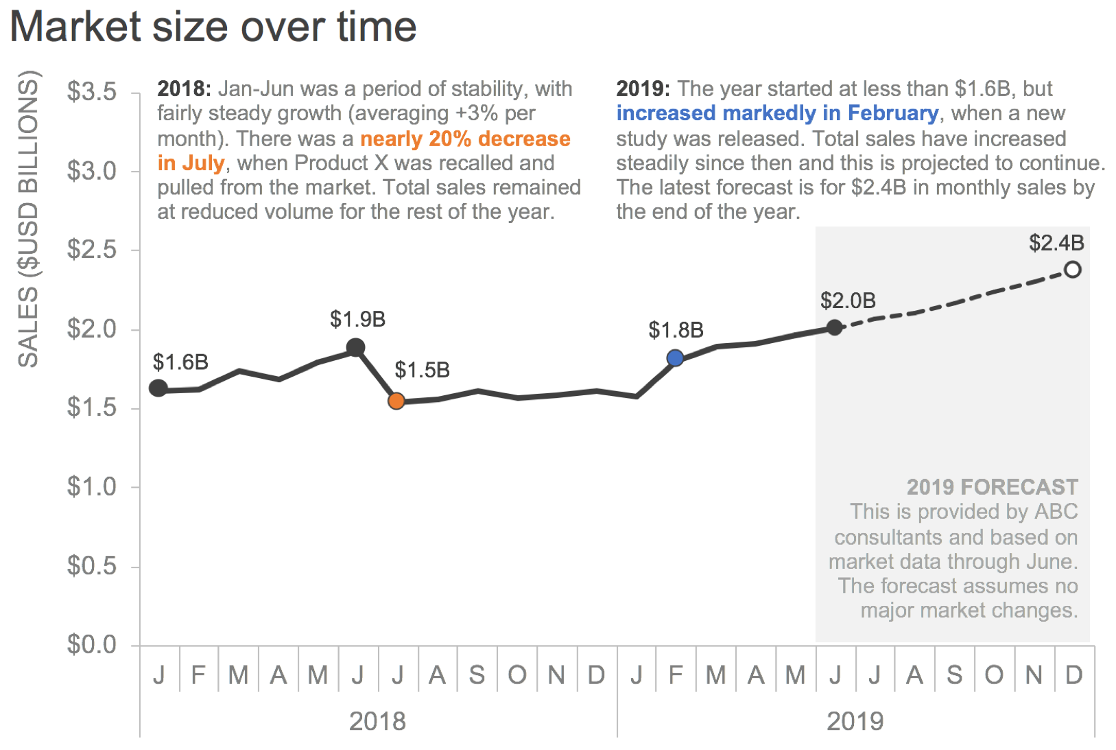
Take the following graph. The storytelling with data typical look and feel has been applied. The font is Arial (it’s basic and I love it!). Both y-axis title and graph title are justified at upper left, with the former in all caps to create a clean frame for my graph. Most elements are grey except sparing use of color to direct attention (orange for a negative callout and associated data point, brand blue for positive data point and corresponding comment). Things are generally titled, labeled, and annotated. There is a good amount of detail, but much of it is pushed to the background for easy scanning and so we can easily focus on the data.
I’m going to rebrand this graph in a totally different style. For inspiration, I’ll use San Pellegrino. I have some immediate associations with this brand, but want to do a little targeted research to build a slightly more robust picture for myself. First, I look at their website. Then I do some Google image searching and browse products, logos, and advertising. I seek out a style guide and find this (“itineraries of taste”—a different sort of guide than I was imagining, though this does give me more insight into the brand!). Here are a few images I gathered over the course of this process:

Next, I list a dozen words I associate with the brand: bright, crisp, citrus, bubbly, fine, Italian, worldly, refined, expensive, international, stylish, luxury. I do a Google search for “San Pellegrino font” and learn it’s probably a custom font, but find Modesto, which people say is reasonably close. I download a free version. I grab colors from the logo and labels for my palette (related resources: Coolers.co has a tool that grabs colors from photos and Canva has a pretty good article on brand colors; I went the easy route and used Excel’s eyedropper to pull colors from the pics I’d gathered). I’m set to begin rebranding. An hour or so later, here’s what I created:

The bottle label ended up being my primary resource in the redesign. I realized quickly that Modesto, a heavy serif font, would need to be used sparingly. I paired it with Century Gothic, which had a round look similar to some of the less prominent bottle label text. I played with a light blue background inspired by the label for the entire graph, but ended up giving up on that (too much blue, and when there was that much solid it actually didn’t feel on-brand) in favor of using it for the footer text only. I moved things around and played with line weights, styles, and borders. I noted the website and ads were quite minimalistic in use of written words, so I adjusted annotations to include less detail and pithier text. The logo star might be overkill (and potentially get into the area of trademark concerns, though I’m hoping since this is simply an illustrative exercise that it isn’t an issue), but I couldn’t help but have a little fun!
Check out the side-by-side—the same graph but VERY different look and feel:

Ready for your fun? You’re up next!
the challenge
Rebrand this graph in the style of your choice (the link will download Excel file with data and graphs above; you are welcome to use any tool). Feel free to take liberties as you’d like with the specifics of the data for the purposes of the exercise. In your commentary, in addition to the brand—which can be anything (your company, a sports team, a university, use whatever you’d like as inspiration for your design!)—please outline the steps you took to get familiar with it and how that played into your redesign. Share any specific resources used and learnings from your process, too! IMPORTANT:
DEADLINE: Monday, June 10th by midnight PST
SUBMISSION INSTRUCTIONS: upload your visual and related commentary via at storytellingwithdata.com/SWDchallengeSUBMIT. (DO NOT EMAIL: we are no longer monitoring the old alias!) Feel free to also share on social media at any point using #SWDchallenge. IMPORTANT if sharing on social media: include a prominent disclaimer on your redesigned graph that this is fake data for an illustrative branding exercise. For inclusion in the summary recap post, submissions must be officially submitted to us (still a time-intensive process and we aren’t able to scrape Twitter and other social media sites).
I’m excited to see what you come up with! I’m already imagining with glee the visual we’ll create with the many iterations of this graph, branded in different styles. Stay tuned for the recap post later this month, where we’ll share back with you all of the visuals created and shared via form as part of this challenge. Until then, check out the #SWDchallenge page for past challenge details and recaps. Have fun!