
how to make a better pie chart
A friend called me recently and started our conversation with: “I know you dislike pie charts, but…can you help me create one?”
Spoiler alert: I don’t hate pie charts. They’ve received a bad rap over the years and with good reason—they are very commonly used when another chart type would be better suited. The appropriate use case for a pie chart is expressing a part-to-whole relationship. Their limitation is that it can be difficult to accurately judge the relative size of and compare the segments. To see examples of the correct use case for pies, check out what is a pie chart? and you can read more about the ongoing debate with these related articles: the great pie debate and an updated post on pies.
My general recommendation on pies is that if you can clearly articulate why a pie chart is a more effective choice than another type of graph, then you’ve appropriately considered that it will satisfy your scenario. In today’s post, I’ll highlight a specific use case for a pie chart—and show how you can create an improved one.
Let’s use my friend’s scenario to illustrate. She is a sales manager for a mid-size equipment manufacturer and is preparing for an upcoming sales meeting with her team. She wants to communicate the degree to which her salespeople are losing sales deals. She used her tool to create a chart similar to the one shown below.
Spend a minute studying this visual: what can you easily conclude about the data? What changes might you make?
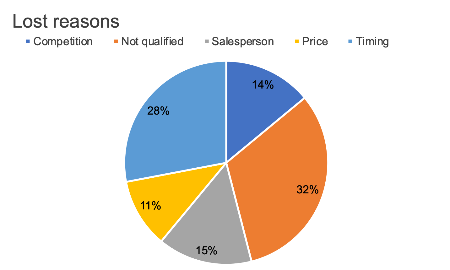
I came up with five changes I would make to the existing chart. I’ll address those momentarily, but first we had an in-depth discussion on why she was sold on a pie chart. Her rationale was that she wanted her audience—salespeople at her organization—to understand that they were losing nearly two-thirds of their deals for two reasons: not qualified and timing. We discussed the various limitations of pie charts and the trade-offs and she’d decided she’d be comfortable with them. One question I posed: how important was it that her audience have a sense of the volume of deals—that they be able to accurately judge the magnitude of the categories (lost reasons) relative to each other?
After a thorough discussion, we both felt comfortable that the pie chart’s part-to-whole relationship worked for what she needed—to convey that a large percentage of deals were being lost for two specific reasons and to focus her audience’s attention on identifying a possible solution.
With this intent in mind, I walked her through the five steps I’d take to design a more effective pie than what her tool created by default. There may be others you considered; I’ll focus here on those that sufficed given the context of her scenario:
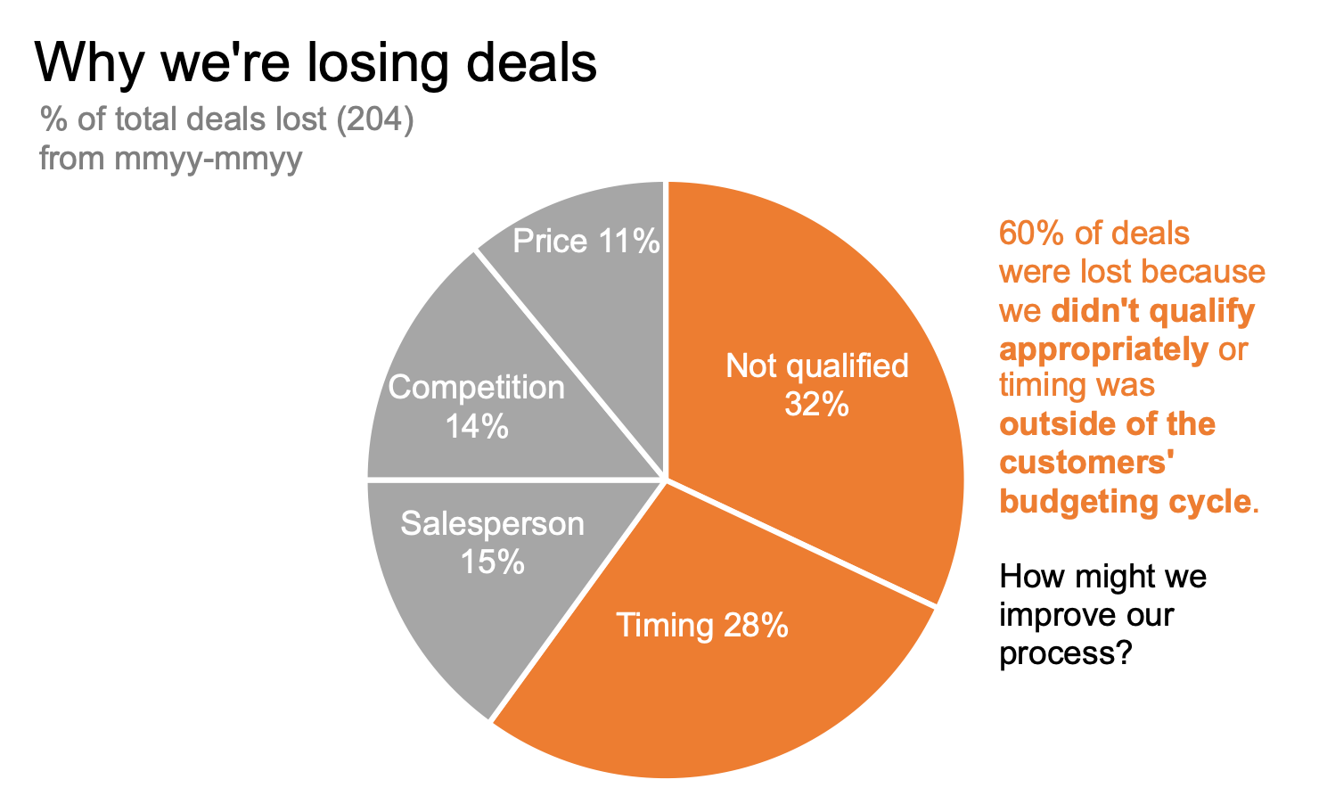
Sort meaningfully: In this case, this means ordering the data so that the largest categories (not qualified and timing) appear at the top of the chart.
Eliminate the legend: Labeling the categories directly reduces the work of going back and forth between the legend at the top and the data below.
Specify what is being shown: I’ll include a more specific chart title and a descriptive subtitle specifying the metric being graphed (% of total deals lost with the volume of deals lost for context).
Add a takeaway and call to action: I’ll add annotations near the data to answer the question, “so what?”
Use color sparingly: I’ll use color thoughtfully to direct the audience’s attention.
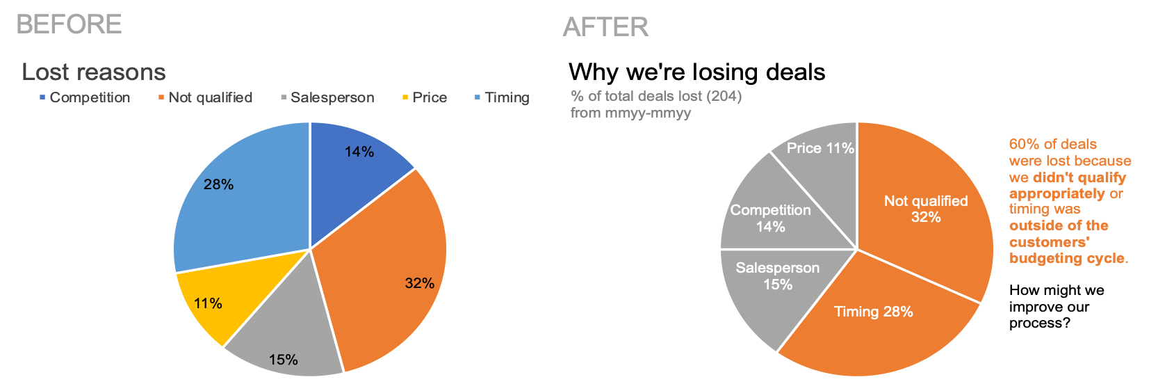
Check out the impact of these changes in the visual below. You can download the file to see how I created this in Excel.
Broadly speaking, these five changes greatly improve this default pie chart—but they’re actually not specific to pies. Rather, these are steps I find myself taking nearly every time I design a chart. Consider my changes together with those you may have identified: where might you apply the same to your own work?
For more on improving pies, practice flexing your data storytelling muscle with the alternatives to pies exercise in our SWDcommunity.