what is a table?
Adding onto the table-themed challenge this month, we bring you another article from our back-to-basics series called what is…?, where we break down some common topics and questions posed to us. We’ve covered much of the content in previous posts, so this series allows us to bring together many disparate resources, creating a single source for your learning. We believe it’s important to take an occasional pulse on foundational knowledge, regardless of where you are in your learning journey. The success of many visualizations is dependent on a solid understanding of basic concepts. So whether you’re learning this for the first time, reading to reinforce core principles, or looking for resources to share with others—like our comprehensive chart guide—please join us as we revisit and embrace the basics.
Tables are a common way to show data, but in my current work, I don’t create them frequently. Admittedly, when I come across a table, I often choose to visualize the data. I should clarify that I am not proposing that we never build tables. Instead, let’s understand their benefits and shortcomings so we can be thoughtful about when to use them and how to design good data tables.
What is a table?
A table organizes data into a tabular structure, consisting of rows and columns. They are intuitive to read, reasonably easy to build, and they are incredibly flexible. Unlike some of the previous charts we’ve discussed—bars, pies, lines, etc.—tables are not constrained to a specific type of data or underlying relationship. They might contain numerical values, text, symbols, or even a combination of data types. For these reasons, tables are common and favored by many.
While seemingly simple on the surface, tables are more complex than they appear. It’s easy to think they are interchangeable with other basic visuals like bars and lines, but there is an important distinction to understand: we process tables differently from graphs. Tables interact with our verbal communication system, meaning we read them. Our eyes scan across rows and down columns. In comparison, graphs interact with our visual system. Our visual system is much faster at processing large quantities of information, especially when there is a pattern or shape we want to convey. Understanding this up front helps us realize when it’s appropriate to use a table, or said another way when our audiences should read the data rather than decode a visual.
When should you use a table to communicate data?
Let’s explore a handful of business scenarios where it makes sense to use a table.
You have varied data. Sometimes we need to communicate related metrics with multiple units of measure or varying ranges. Executive summaries, scorecards, demographic breakdowns and metadata are things that come to mind. In this case, the end-user will likely reference these items to look up specific values, so a table is an effective choice. Also, tables aren’t subject to the same two-dimensional space constraints as graphs, so it can be easier to display different units and ranges within a single view.
Your audience has different needs. Tables can be great when you have a diverse audience. I’ve already mentioned that tables are intuitive, but they also enable each end-user to look up specific values. If you anticipate your audience will want to scan for different data, tables can be a nice solution.
You’re reading line by line. Discussing numbers and budget line items within a table are common among finance or accounting audiences. A former director of mine had an accounting background, and as a result, developed an affinity for tables. He learned how to spot patterns within tables so well that he requested data tables over graphs. I bring this up for a good reason—if your audience has a strong desire for tables, recognize that this is another excellent reason to use them.
You’re supplementing the main story. When communicating data for explanatory purposes, we rarely show all of the data, instead opting to highlight the main takeaways. There can be value in providing audiences with the complete dataset or additional breakdowns, especially if your audience will want to look up details at a later time or explore the data independently. To meet this need, consider linking to an underlying table or adding a detailed table to an appendix.
When shouldn’t you use a table to communicate data?
There will always be exceptions, but two main instances come to mind when it may not be ideal to use a table. Both of these scenarios relate to how we process tables.
You are presenting your data live—in person or virtually. If you share a data table in a live presentation, your audience is likely going to start reading it. Unfortunately, we cannot actively listen and read simultaneously: if your audience is reading the table, they’ve tuned you out. In this situation, I’d recommend a graph (generally, less taxing and time-consuming to process) over a table. If you are required to use a table during a presentation, consider how your audience will interpret it. Can you pause, giving them time to read, and then continue talking? Is there a way to limit unnecessary rows and columns or direct attention to a subset of the data, making the table faster to digest?
You want to emphasize a pattern or shape in the data. Imagine you want to share a seasonal pattern you’ve identified within some continuous monthly data. To spot this in a table, you’d have to compare and hold several monthly values in your head, which is a mentally taxing process. If there is a pattern or something significant about the shape of your data, a graph will be a better choice over a table. That said, it’s possible to add visual components to a table—will explore this further momentarily.
How can you design a better table?
Nearly every tip shared below has to do with making tables easier to scan. Tables typically contain large amounts of detail, so we should take intentional steps to make them easy to consume.
Clarify horizontal or vertical. Tables are consumed either across rows or down columns. Prevent your audience from assuming which way to scan by adding visuals cues. There are several ways of doing this; two of my preferred methods are to add a summary series and leverage white space. If I anticipate my audience will want to summarize the data in a total or average, then adding a summary series—and visually differentiating it—can save them a step and guide them when reading.

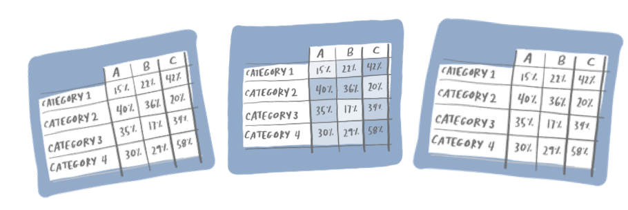
Remove unnecessary borders and shading. Many table defaults include heavy borders and shading. These can help separate headers from the data or establish categories and summary values, but their presence should be minimal. My preference is to use border lines over shading since it allows me to then use color more strategically—as in a heatmap (more on this next).

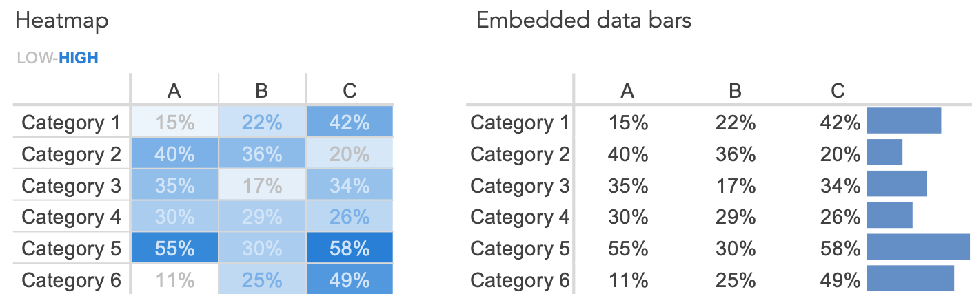
Incorporate a visual element. Consider adding visual elements to help draw attention to the most important data or to communicate a pattern. You could add color, sparklines, or even data bars. One specialized case is known as a heatmap, where saturation of color is used to visually represent relative values. See the related posts on improving a table, embedding horizontal bars, and a heatmap makeover for specific examples.
Order intentionally. When we process a page, we typically start at the top and move from left to right, in a zig-zag pattern down the page. This is also true for a table and can help us decide how to order rows and columns. If there is an important metric or summary value, it may make sense to move this to the upper left of the table—so it’s one of the first things your audience sees. Keep in mind that this won’t be appropriate in all scenarios. If your table includes a time component, for example, consider leveraging the natural construct of time moving from left to right—even if recent data is most important.
Use super-category labels. Creating higher-level labels adds structure to a table, making it easier to navigate. Super-category labels also have the added benefit of limiting redundancy (check out this related post on the power of categorization). Consider the case of an executive summary table containing KPIs for a handful of business units. Instead of listing each KPI separately, group related KPIs together, so someone can quickly identify all related measures for a specific department.
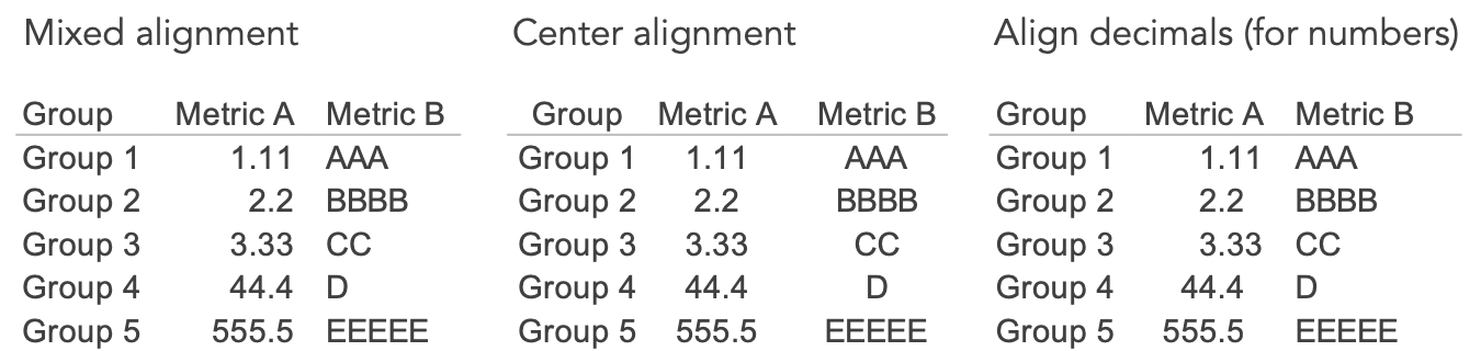
Align thoughtfully. A number of approaches exist for how to justify data within a table. One popular preference is to left-align text and right-justify numbers. This is a great guideline, but not a rule. Instead, aim to be thoughtful about the alignment you use. Does center alignment allow for white space to visually distinguish columns? If using decimals, is it easier to compare relative values if you align decimals points? Play with different options and see which works best for your data. (On a related note, certain typefaces allow for tabular alignment creating columns of numbers; to learn more, read Matthew Ström’s article on designing better tables.)
When a table is designed well, its form enables useful function. The organized, tabular structure fades to the background, allowing audiences to quickly find pertinent details. To see more table designs and practice creating a table, check out this month’s SWD challenge.
Continue your journey through our full what is…? series by browsing other common displays like lines and pies, or explore our comprehensive chart guide page for additional chart types.
Learn with us! Check out our current workshop schedule and set yourself apart from the mess of 3D exploding pie charts with the principles of effective data communication.
